In the vignette on logistic regression
(vignette("logistic-regression-diagnostics")), we
considered diagnostics for the most common type of GLM. But many of the
same techniques can be applied to generalized linear models with other
distributions and link functions.
To illustrate this, we’ll consider a bivariate Poisson generalized linear model:
pois_pop <- population(
  x1 = predictor(runif, min = -5, max = 15),
  x2 = predictor(runif, min = 0, max = 10),
  y = response(0.7 + 0.2 * x1 + x1^2 / 100 - 0.2 * x2,
               family = poisson(link = "log"))
)

pois_data <- sample_x(pois_pop, n = 100) |>
  sample_y()

fit <- glm(y ~ x1 + x2, data = pois_data, family = poisson)
In other words, the population relationship is \[ \begin{align*} Y \mid X = x &\sim \text{Poisson}(\mu(x)) \\ \mu(x) &= \exp\left(0.7 + 0.2 x_1 + \frac{x_1^2}{100} - 0.2 x_2\right), \end{align*} \] but we chose to fit a model that does not allow a quadratic term for \(x_1\).
We’ll consider the same diagnostics as we used for logistic regression, but consider the special problems for Poisson regression, illustrating what you must consider for each type of GLM.
Empirical link plots
Again, before considering the fitted model, we could conduct an exploratory data analysis. In a GLM, the linear predictor \(\beta^T X\) is assumed to be linearly related to \(Y\) when transformed by the link function, and so it should be linear when plotted against \(\log Y\). We can sort of do this for this data, producing the plots below:
p1 <- ggplot(pois_data, aes(x = x1, y = y)) +
  geom_point() +
  geom_smooth() +
  scale_y_log10() +
  labs(x = "X1", y = "Y")

p2 <- ggplot(pois_data, aes(x = x2, y = y)) +
  geom_point() +
  geom_smooth() +
  scale_y_log10() +
  labs(x = "X2", y = "Y")

p1 + p2
#> Warning in scale_y_log10(): log-10 transformation introduced infinite values.
#> log-10 transformation introduced infinite values.
#> `geom_smooth()` using method = 'loess' and formula = 'y ~ x'
#> Warning: Removed 28 rows containing non-finite outside the scale range
#> (`stat_smooth()`).
#> log-10 transformation introduced infinite values.
#> log-10 transformation introduced infinite values.
#> `geom_smooth()` using method = 'loess' and formula = 'y ~ x'
#> Warning: Removed 28 rows containing non-finite outside the scale range
#> (`stat_smooth()`).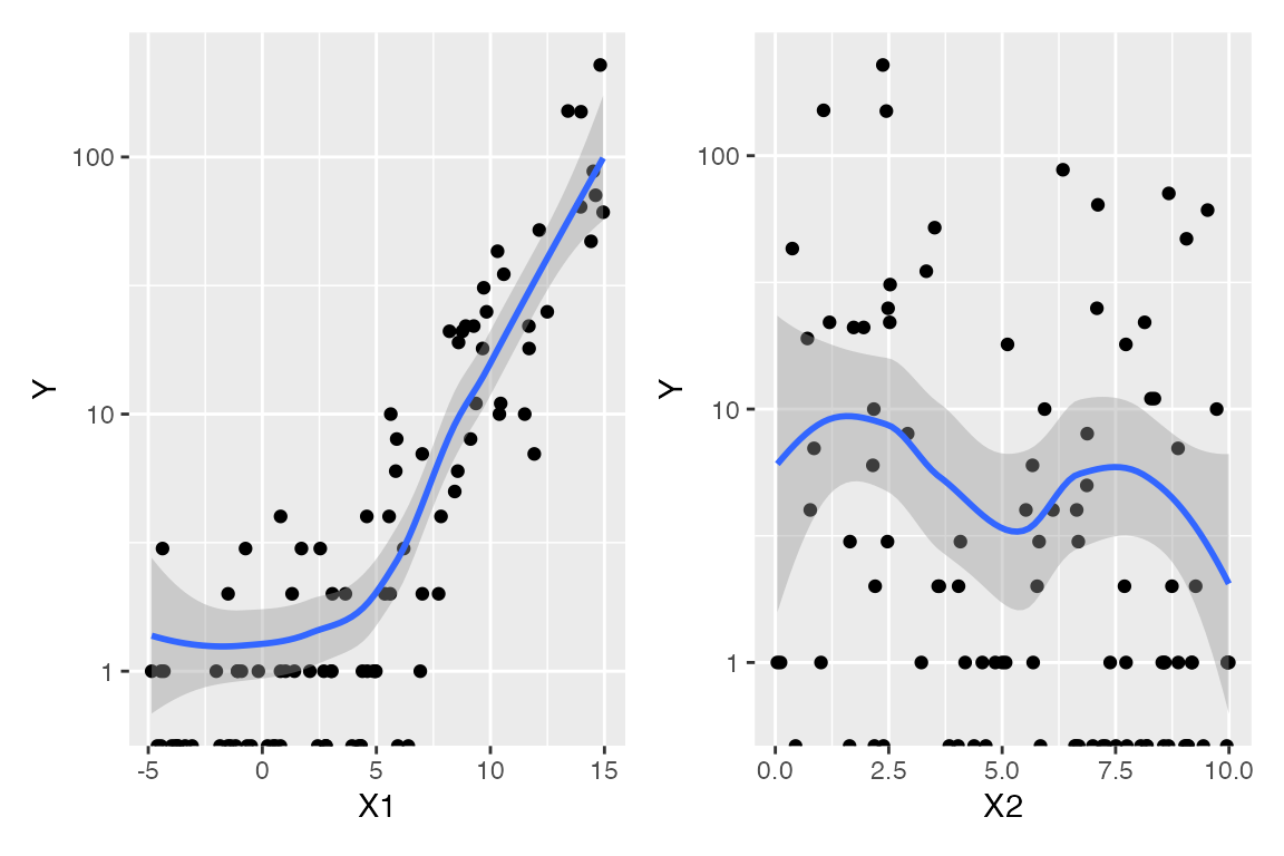
The “sort of” caveat is because there are many observations with \(Y = 0\), and \(\log 0 = - \infty\). These are represented on the plots as the dots on the very bottom, and as the warning messages indicate, these values are ignored when producing the smoothed trend. Hence they limit our ability to judge the overall trend and whether the marginal relationship is linear or not.
Instead, we can break the range of each predictor into bins, and
within each bin, calculate the mean value of x1 and
y for observations in that bin. We then transform the mean
of y using the link function (the log in this case). If the
model is correct, plotting these values against x1 should
reveal a linear trend. Since each bin will likely include some values
with \(Y > 0\), the mean will be
greater than 0, and the transformation will not produce \(-\infty\). We can repeat the same process
for x2.
The bin_by_quantile() function helps us here by grouping
the data into bins, while empirical_link() automatically
uses the Poisson link function to transform the mean of the
corresponding y values:
p1 <- pois_data |>
  bin_by_quantile(x1, breaks = 8) |>
  summarize(x = mean(x1),
            response = empirical_link(y, poisson)) |>
  ggplot(aes(x = x, y = response)) +
  geom_point() +
  labs(x = "X1", y = "log(Y)")

p2 <- pois_data |>
  bin_by_quantile(x2, breaks = 8) |>
  summarize(x = mean(x2),
            response = empirical_link(y, poisson)) |>
  ggplot(aes(x = x, y = response)) +
  geom_point() +
  labs(x = "X2", y = "log(Y)")

p1 + p2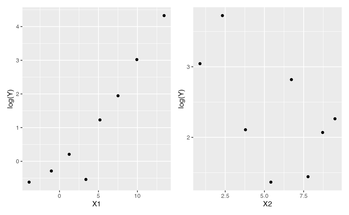
These plots are easier to read, but it is still hard to detect the nonlinearity.
Naive residual plots
Using the fitted model, we can produce plots of standardized residuals. Plotted against the fitted values (the linear predictor), they do indicate some kind of trend, but the plot is difficult to interpret, and it does not tell us which predictor is the problem.
# .fitted is the linear predictor, unless we set `type.predict = "response"` as
# an argument to augment()
augment(fit) |>
  ggplot(aes(x = .fitted, y = .std.resid)) +
  geom_point() +
  geom_smooth(se = FALSE) +
  labs(x = "Fitted value", y = "Residual")
#> `geom_smooth()` using method = 'loess' and formula = 'y ~ x'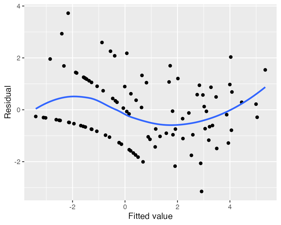
Plots against the predictors suggest something is wrong with
x1, but again, they are somewhat difficult to
interpret:
augment_longer(fit) |>
  ggplot(aes(x = .predictor_value, y = .std.resid)) +
  geom_point() +
  geom_smooth(se = FALSE) +
  facet_wrap(vars(.predictor_name), scales = "free_x") +
  labs(x = "Predictor", y = "Residual")
#> `geom_smooth()` using method = 'loess' and formula = 'y ~ x'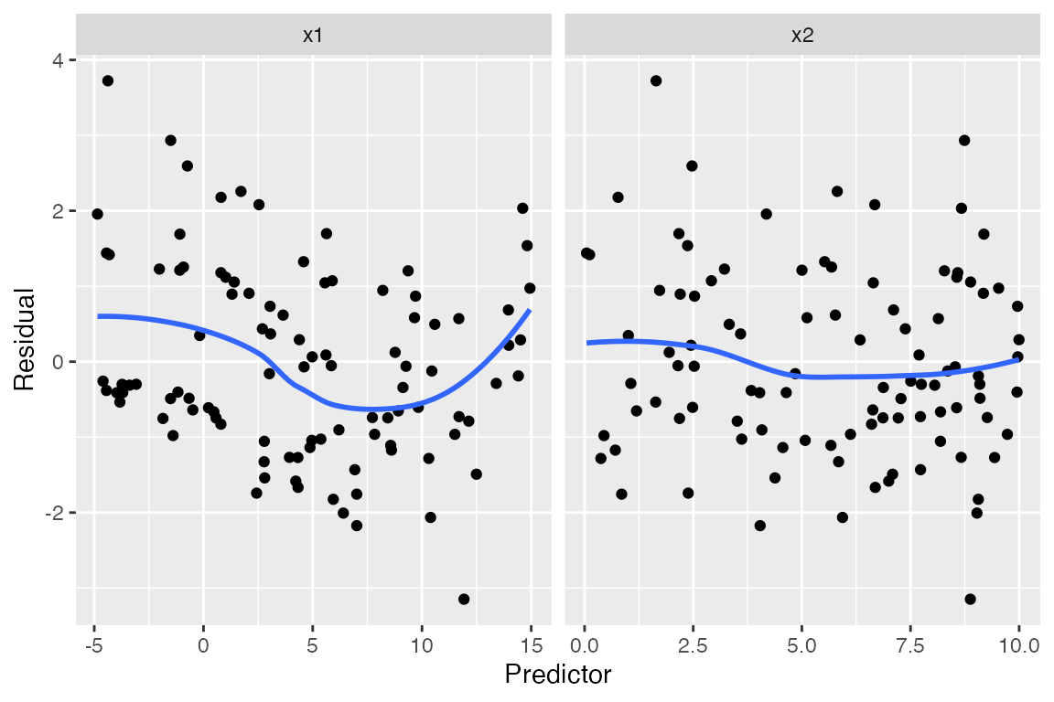
In a lineup, we can compare the residual plots against simulated ones where the model is correct, making it at least clearer that the problem we observe is real:
model_lineup(fit, fn = augment_longer, nsim = 5) |>
  ggplot(aes(x = .predictor_value, y = .std.resid)) +
  geom_point() +
  geom_smooth(se = FALSE) +
  facet_grid(rows = vars(.sample), cols = vars(.predictor_name),
             scales = "free_x") +
  labs(x = "Predictor", y = "Residual")
#> decrypt("QUg2 qFyF Rx 8tLRyRtx KZ")
#> `geom_smooth()` using method = 'loess' and formula = 'y ~ x'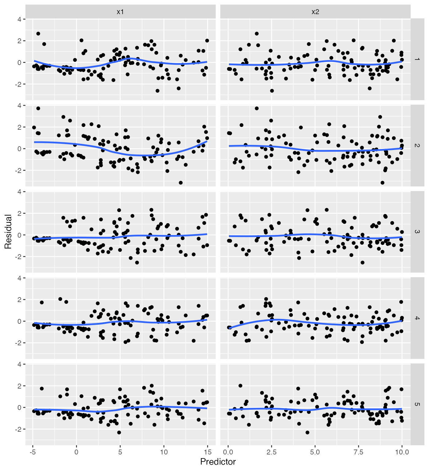
(Of course, in applications one should do the lineup before viewing the real residual plots, so one’s perception is not biased by foreknowledge of the true plot.)
Marginal model plots
For each predictor, we plot the predictor versus \(Y\). We plot the smoothed curve of fitted values (red) as well as a smoothed curve of response values (blue), on a log scale so the large \(Y\) values are not distracting:
augment_longer(fit, type.predict = "response") |>
  ggplot(aes(x = .predictor_value)) +
  geom_point(aes(y = y)) +
  geom_smooth(aes(y = .fitted), color = "red") +
  geom_smooth(aes(y = y)) +
  scale_y_log10() +
  facet_wrap(vars(.predictor_name), scales = "free_x") +
  labs(x = "Predictor", y = "Y")
#> Warning in scale_y_log10(): log-10 transformation introduced infinite values.
#> log-10 transformation introduced infinite values.
#> `geom_smooth()` using method = 'loess' and formula = 'y ~ x'
#> `geom_smooth()` using method = 'loess' and formula = 'y ~ x'
#> Warning: Removed 56 rows containing non-finite outside the scale range
#> (`stat_smooth()`).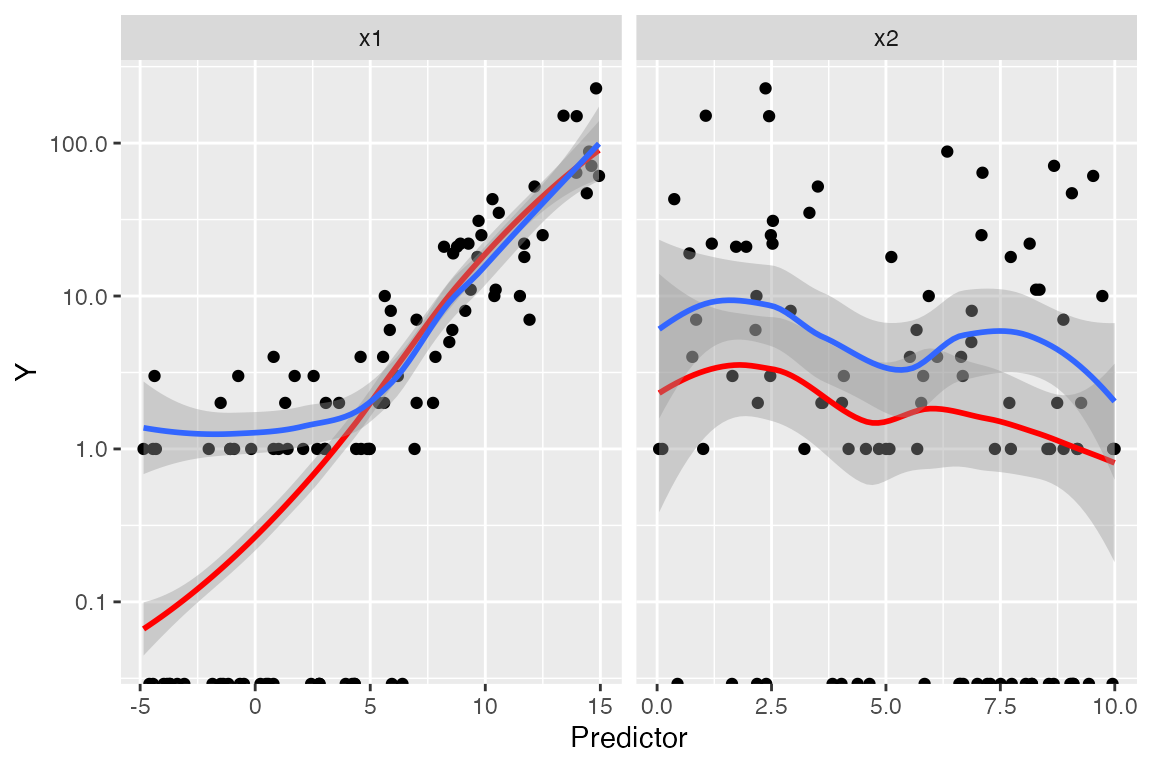
The red line is a smoothed version of \(\hat \mu(x)\) versus the predictors, while
the blue line averages \(Y\) versus the
predictors. Comparing the two lines helps us evaluate if the model is
well-specified. We again have trouble with observations with \(Y = 0\), as on the log scale these are
transformed to \(-\infty\).
Nonetheless, the plots again point to a problem with
x1.
Partial residuals
The partial residuals make the quadratic shape of the relationship somewhat clearer:
partial_residuals(fit) |>
  ggplot(aes(x = .predictor_value, y = .partial_resid)) +
  geom_point() +
  geom_smooth() +
  geom_line(aes(x = .predictor_value, y = .predictor_effect)) +
  facet_wrap(vars(.predictor_name), scales = "free") +
  labs(x = "Predictor", y = "Partial residual")
#> `geom_smooth()` using method = 'loess' and formula = 'y ~ x'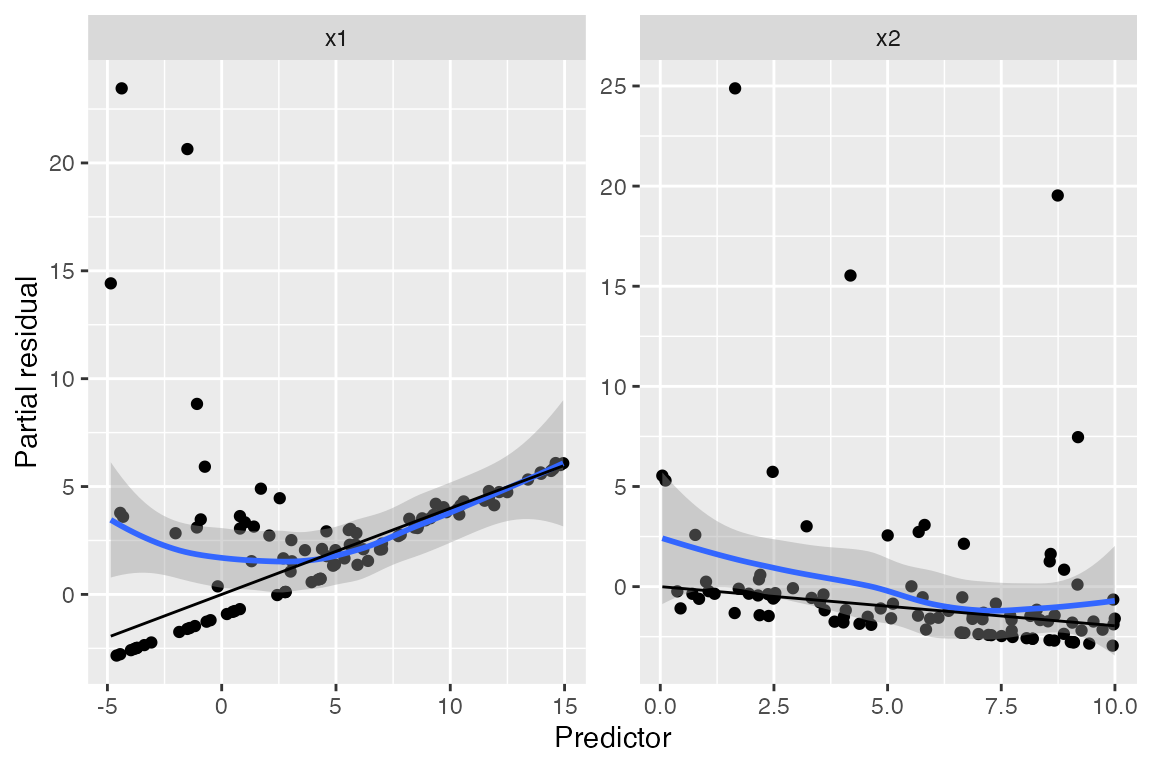
We can see curvature on the left-hand side of the plot for
x1, while the plot for x2 appears (nearly)
linear.
Binned residuals
Binned residuals bin the observations based on their predictor values, and average the residual value in each bin. This avoids the problem that individual residuals are hard to interpret because \(Y\) is only 0 or 1:
binned_residuals(fit) |>
  ggplot(aes(x = predictor_mean, y = resid_mean)) +
  facet_wrap(vars(predictor_name), scales = "free") +
  geom_point() +
  labs(x = "Predictor", y = "Residual mean")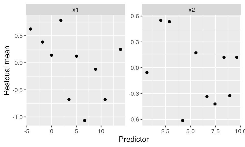
This is comparable to the marginal model plots above: where the marginal model plots show a smoothed curve of fitted values and a smoothed curve of actual values, the binned residuals show the average residuals, which are actual values minus fitted values. We can think of the binned residual plot as showing the difference between the lines in the marginal model plot.
We can also bin by the fitted values of the model:
binned_residuals(fit, predictor = .fitted) |>
  ggplot(aes(x = predictor_mean, y = resid_mean)) +
  geom_point() +
  labs(x = "Fitted values", y = "Residual mean")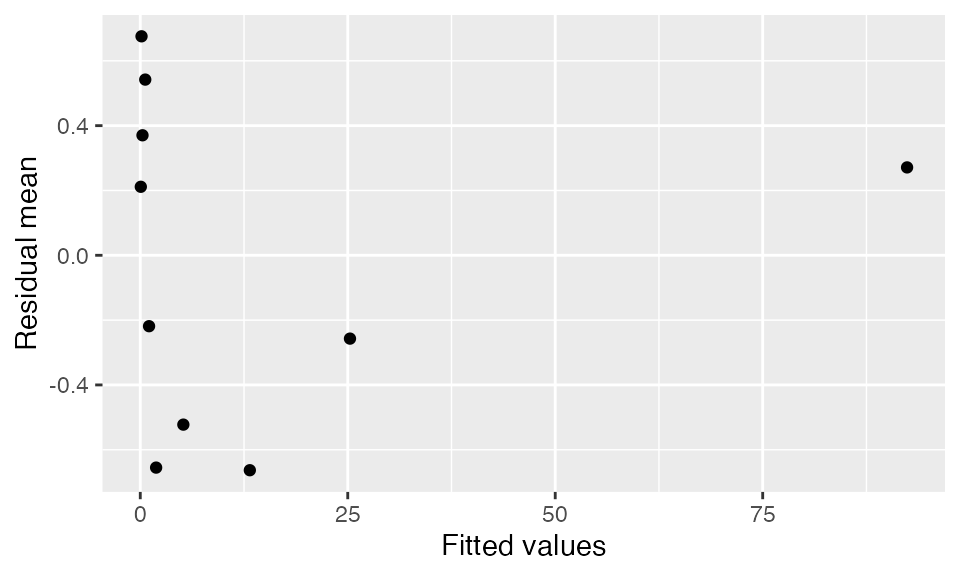
Randomized quantile residuals
Randomized quantile residuals use randomization to eliminate the
banding patterns present in standardized and partial residuals; see
augment_quantile() for the technical details. Randomized
quantile residuals are uniformly distributed when the model is correct,
and can be plotted against fitted values and the predictors just as
standardized residuals can be:
augment_quantile(fit) |>
  ggplot(aes(x = .fitted, y = .quantile.resid)) +
  geom_point() +
  geom_smooth(se = FALSE) +
  labs(x = "Fitted value", y = "Randomized quantile residual")
#> `geom_smooth()` using method = 'loess' and formula = 'y ~ x'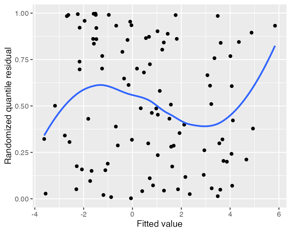
augment_quantile_longer(fit) |>
  ggplot(aes(x = .predictor_value, y = .quantile.resid)) +
  geom_point() +
  geom_smooth(se = FALSE) +
  facet_wrap(vars(.predictor_name), scales = "free_x") +
  labs(x = "Predictor", y = "Randomized quantile residual")
#> `geom_smooth()` using method = 'loess' and formula = 'y ~ x'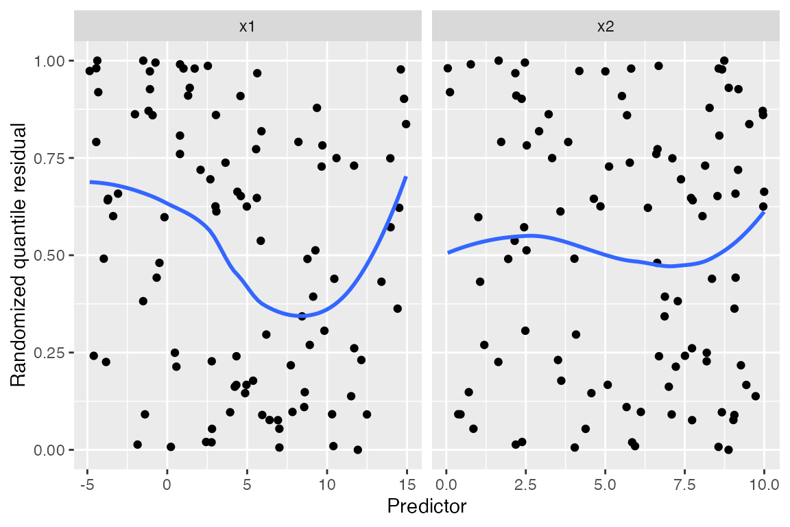
Here the unusual relationship with x1 is much easier to
spot than in the other residual plots above, and the smoothed trend line
shows a clear curved shape. While it would be difficult to guess the
correct model using only this plot, we can at least tell that additional
flexibility is required and begin making changes.
It is also useful to use a Q-Q plot to check whether the randomized quantile residuals are uniformly distributed:
augment_quantile(fit) |>
  ggplot(aes(sample = .quantile.resid)) +
  geom_qq(distribution = qunif) +
  geom_qq_line(distribution = qunif) +
  labs(x = "Theoretical quantiles", y = "Observed quantiles")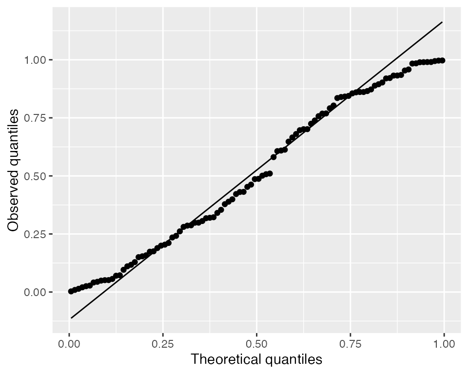
Here they appear roughly uniform, but heavy-tailed randomized quantile residuals would indicate there are more large residual values (positive or negative) than expected, which would suggest there is overdispersion.
Limitations
As we can see, the graphical methods for detecting misspecification in GLMs are each limited. The nature of GLMs, with their nonlinear link function and non-Normal conditional response distribution, makes useful diagnostics much harder to construct.
There are several factors limiting the diagnostics here. First, in
the population we specified (pois_pop), most \(Y\) values are less than 10, and there are
many zeroes. In this range, the conditional distribution of \(Y\) given \(X\) is asymmetric, since it is bounded
below by zero, making plots hard to read; and we want to use log-scale
plots so the relationship is linear, but the frequent presence of \(Y = 0\) makes these less useful.
Second, partial residuals for GLMs are most useful in domains where the link function is nearly linear. As noted by Cook and Croos-Dabrera (1998):
But if \(\mu(x)\) stays well away from its extremes so that the link function \(h\) is essentially a linear function of \(\mu\), and if \(\mathbb{E}[x_1 \mid x_2]\) is linear, then fitting a reasonable regression curve to the partial residual plot should yield a useful estimate of \(g\) within the class of GLMs.
That is, for partial residual plots to work well, the range of \(x\) needs to be limited so that the link function is approximately linear. But here the range of \(X_1\) and \(X_2\) is large enough that the link is decidedly nonlinear. For instance, if we fix \(X_2 = 5\) (the middle of its marginal distribution) and vary \(X_1\) across its range in the population, the mean function is exponential:
ggplot() +
  geom_function(fun = function(x1) {
    exp(0.7 + 0.2 * x1 + x1^2 / 100 - 0.2 * 5)
  }) +
  xlim(-5, 10) +
  labs(x = "X1", y = "μ(x1, 5)")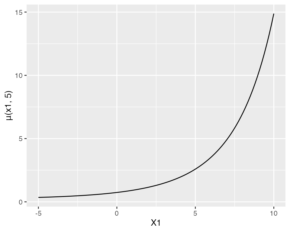
If \(X_1\) were restricted to a smaller range, this curve would be more approximately linear, and the partial residual plots would give a better approximation of the true relationship.
The randomized quantile residuals avoid these problems, and work much better as a general-purpose means to detect misspecification in GLMs. But they do not share the useful property of partial residuals—which, under ideal circumstances, reveal the true shape of the relationship, making it easier to update the model.
In short, graphical diagnostics for GLMs are possible, and model lineups make it easier to distinguish when a strange pattern is a genuine problem and when it is an artifact of the model. But determining the nature of the misspecification and the appropriate changes to the model is more difficult than in linear regression. No one diagnostic plot is a panacea.