Statisticians spend a lot of time writing about their analyses and results so that bosses, clients, coworkers, or students can read and understand their work. For many statisticians, being able to clearly write and explain their work is just as important as being able to do the work, as this excerpt from a Google data scientist job description makes clear:
Ability to communicate is strongly correlated with impact. From this perspective, an analyst requiring a front person to make their case would be a problem. Note that communication doesn’t have to be through live presentations. It can be written. The analyst’s role is not just in doing the analysis but also making sure its consequences are delivered to and understood by those who need to act. Arguments take place in language.
But every genre of writing—statistical report, romance novel, reddit post, history exam essay, literary criticism, or news article—has its own conventions and styles. You may be a good writer for another genre, but statistical writing is different, and you shouldn’t write a statistical report like you’d write an essay for your high school English class.
Professional statistical writing is also different from the writing you may have done in previous statistics courses. In introductory courses, instructors often ask you to write out every model formula, state all model assumptions, give every null hypothesis in mathematical notation, include diagnostic plots for every model, and so on—because they are using the writing to evaluate your understanding of statistics. But in professional writing, these elements may not appear. When writing for other statisticians, it is not necessary to write out the assumptions for linear models because they know them already; when writing for non-statisticians, it is not useful to write out hypotheses in mathematical notation because they won’t understand the math. Good professional writing, then, must know its intended audience, and it is professional writing that we will try to produce in this course.
In this chapter we will review some of the basic features of common styles in statistical writing. This is not a writing course, though (and you should consider taking a writing course!). For a more comprehensive reference, consider Nolan and Stoudt (2021).
24.1 IMRaD structure
IMRaD is a common organization for statistical reports (and research reports in other fields). IMRaD stands for Introduction, Methods, Results, and Discussion, plus perhaps an abstract or executive summary. It became a common style for scientific papers in the 1940s, and by 1980, almost every medical journal article followed the format (Sollaci and Pereira 2004). By now, many articles using data to answer scientific questions, in many fields, follow the IMRaD format either exactly or with slight modifications.
Popularity is not, in itself, a reason to follow the format. But it has two great advantages:
As you learn how to write, having a defined format will make it easier for you to organize your ideas in a way that is coherent and logical.
Following a common format means your readers will know what to expect in each section and will know where to look to find things.
Let’s examine each section in turn.
24.1.1 The abstract and executive summary
In writing for academic audiences, the convention is for articles to begin with a short abstract that summarizes the paper and its conclusions. To understand what should go in an abstract, it may be helpful to consider how they were used for much of the 1900s. Before scientific papers could easily be downloaded from the Internet, when finding a paper you were interested in required calling libraries and requesting a photocopy be mailed to you, there were abstracting services. These compiled the abstracts of papers published in a particular field and mailed them to subscribers periodically. Subscribers could read through the abstracts, find papers of interest to them, and then go about finding or requesting a copy of the full article.
Abstracts, then, are meant to stand alone. They summarize what the article is about and what conclusions it reaches so the reader can decide if the paper is relevant to them. The abstract should not contain acronyms only defined later in the report, mathematical formulas, figures, or tables, and it should be limited to a few paragraphs at most. Many academic journals limit abstracts to 250 or 500 words. Because abstracts are often the first thing a reader will see—and will determine whether they bother to read the rest of your work—it is important to ensure they are clear and interesting.
For example, here is an abstract from the journal Psychological Science, reporting on experiments studying an important topic:
The current work estimated the relative importance of joke and audience characteristics for the occurrence of amusement. Much psychological research has focused on stimulus characteristics when searching for sources of funniness. Some researchers have instead highlighted the importance of perceiver characteristics, such as dispositional cheerfulness. Across five preregistered studies (Ns = 118–54,905) with varied stimuli and perceiver samples (website visitors, students, Mechanical Turk and Prolific users), variance-decomposition analyses found that perceiver characteristics account for more variance in funniness ratings than stimulus characteristics. Thus, psychological theories focusing on between-persons differences have a relatively high potential for explaining and predicting humor appreciation (here, funniness ratings). Crucially, perceiver-by-stimulus interactions explained the largest amount of variance, highlighting the importance of fit between joke and audience characteristics when predicting amusement. Implications for humor-appreciation theories and applications are discussed. (Rosenbusch et al. 2022)
Notice how this abstract sets up the problem to be solved, its context in relation to previous psychological research, the studies that were conducted, a summary of the results, and how those results help resolve the problem. This is exactly what other researchers in the field would want to know, concisely described in just one paragraph. Without any of those individual components, the abstract would be much less useful to those readers.
Some journals require structured abstracts, which are abstracts broken into individual subsections mandated by the journal, each containing only a sentence or two. These force the authors to be more explicit in the abstract about their goals and methods, and can be useful for readers. Here is an example from BMJ:
Objectives To determine whether parachutes are effective in preventing major trauma related to gravitational challenge.
Design Systematic review of randomised controlled trials.
Data sources Medline, Web of Science, Embase, and the Cochrane Library databases; appropriate internet sites and citation lists.
Study selection Studies showing the effects of using a parachute during free fall.
Main outcome measure Death or major trauma, defined as an injury severity score > 15.
Results We were unable to identify any randomised controlled trials of parachute intervention.
Conclusions As with many interventions intended to prevent ill health, the effectiveness of parachutes has not been subjected to rigorous evaluation by using randomised controlled trials. Advocates of evidence based medicine have criticised the adoption of interventions evaluated by using only observational data. We think that everyone might benefit if the most radical protagonists of evidence based medicine organised and participated in a double blind, randomised, placebo controlled, crossover trial of the parachute. (Smith and Pell 2003)
The exact format of structured abstracts is often dictated by the journal based on the needs of their subject area. The structure forces authors to be very clear about their goals, the methods used, and specific results of interest.
The executive summary is similar to the abstract but for a different audience: an executive summary explains your conclusions for non-technical readers, rather than for other technical experts. If you are writing a consulting report or a proposal for consideration by your bosses or management, you may not need a formal abstract, but you do need to summarize your results so that non-statisticians can understand them. Executive summaries are often seen in reports in industry and government that may be read by executives, politicians, managers, and other non-technical decision-makers.
Because executive summaries are explicitly for people who want to know your conclusions, not your methods and the technical details, they should be written clearly and should focus on the problem to be solved, the conclusions reached, and any limitations in those conclusions, without resorting to technical terms. Readers with sufficient technical knowledge can read the rest of your report for those details.
Executive summaries vary in length. Long government reports might be a hundred pages long and have a five-page executive summary that is full of bullet points and perhaps a graph of a key result. A shorter report might have a page-long executive summary.
If it helps, think of abstracts and executive summaries as the “tl;dr”1 section of your report. Abstracts are for fellow workers in your field, executive summaries are for your boss who doesn’t know much about data science. And just like a tl;dr, don’t be surprised if people don’t read past the abstract or executive summary, so make it count.
24.1.2 Introduction
After the abstract, the Introduction section is the first thing readers will read. The Introduction states the problem to be solved, why it is important, and the current knowledge about that problem. The idea is to show what is known, show there is a gap that needs to be filled, and then explain how your work fills that gap.
While those sound like many of the things included in an abstract, the Introduction is not simply a restatement of the abstract. Introductions expand on the problem and current knowledge about it, often including several paragraphs (or even several pages) of background material summarizing past work, including references and detailed discussion. This background usually leads to showing a gap in the past work—a question that remains to be answered or a problem that hasn’t been solved.
The Introduction will often preview the methods you used and the results you obtained, but not in depth. When writing for a non-technical audience, technical details should be kept out of the introduction as much as possible; it’s only when you’re writing for a technically sophisticated audience that will understand your methods (and will want to know about them in detail) that the Introduction should spend more than a few sentences on the methods.
24.1.3 Methods
The Methods section is the meat of your statistical writing. It begins by describing the data you used and how it was collected, so readers understand the experiment or sample that generated it. Often there is a table summarizing the data by breaking it down by categories. For example:
Randomized controlled trials in medicine often include a table breaking down the patients included in the study by demographics: age, gender, ethnicity, and whatever other features might be relevant to the study. These often show separate demographics for the treatment and control groups, so readers can be convinced they’re comparable. For example, see Table 2 of Helgestad (2024) or Table 1 of Kanstrup et al. (2024).
Reports on surveys include tables giving the demographics of their respondents, perhaps compared with the demographics of the population that was sampled so that sampling bias can be assessed. For example, see Table 2 of Salomon et al. (2021).
Papers on designed experiments often give tables showing the number of experimental units assigned to each treatment, and summaries of any covariates that were not controlled.
Notice that these tables describe the sample—the people or units included in the data—and not the response variables. The goal is for the reader to understand who is included and how representative the data is, so they can put the results in context.
Next, the methods section describes the methods you used to answer the research questions. This includes any diagnostics necessary to justify your choice of methods, but it does not include the results of those analyses, which come in the next section.
Discussing methods without showing their results can feel odd, and it may feel artificial to discuss how you chose your approach without showing any results that justify it. But when writing for a non-technical audience, you can expect your readers to skip through most of the Methods section, perhaps only reading the captions of any interesting-looking tables and plots. In academic journals for general audiences, the Methods section is often printed in smaller font or at the end of the article, because most readers are assumed not to care! Separating Methods and Results hence allows technical readers to get the detail they want, while other readers skip to the Results to find out what you learned.
24.1.4 Results
The Results section contains your main findings and results. First you will show the results of your analysis, giving any necessary tables, figures, and numerical results. Often this means presenting tables of regression coefficients (see Section 24.4 below) and giving hypothesis test results or confidence intervals in APA format (Chapter 25). Then your text will describe these results and comment on what they mean.
24.1.5 Discussion
The Discussion summarizes your results and then puts them in context. Were there any limitations to the analysis that mean the results cannot perfectly answer the desired questions? Are there additional questions that still need to be answered? Based on these results, what conclusions can be drawn and what recommendations can you make?
You should expect that hurried readers will skim your abstract, look at a few plots or tables that look interesting, and then jump directly to the Discussion to know what they should take from your work. (Yes, they will completely skip your Introduction, Methods, and Results except for the cooler-looking plots.) Your Discussion should hence be readable on its own.
24.2 Writing style
24.2.1 First-person active vs. third-person passive
It is common for authors to write reports in the third person, using the passive voice to describe their own actions. For example, here’s a mock paragraph I constructed based on the study by Rosenbusch et al. (2022):
Throughout all studies, it was predicted that rater characteristics would be more predictive of amusement than joke characteristics given the low interrater reliabilities (i.e., high interrater variance in humor ratings) observed in past research. […] Four published datasets that employed crossed (Rater × Stimuli) designs were used, to isolate variance in amusement due to rater characteristics from variance due to material characteristics.
Compare that to how the authors actually described their study, which is much more direct:
Throughout all studies, we predicted that rater characteristics would be more predictive of amusement than joke characteristics given the low interrater reliabilities (i.e., high interrater variance in humor ratings) observed in past research. […] We used four published data sets that employed crossed (Rater × Stimuli) designs to isolate variance in amusement due to rater characteristics from variance due to material characteristics.
You will often see advice to avoid the first person “I” or “we” in academic writing, but that advice is wrong. As Rodell (1936) wrote about writing by legal scholars,
One of the style quirks that inevitably detracts from the forcefulness and clarity of law review writing is the taboo on pronouns of the first person. An “I” or “me” is regarded as a rather shocking form of disrobing in print. To avoid nudity, the back-handed passive is almost obligatory:—“It is suggested—,” “It is proposed—,” “It would seem—.” Whether the writers really suppose that such constructions clothe them in anonymity so that people can not guess who is suggesting and who is proposing, I do not know. I do know that such forms frequently lead to the kind of sentence that looks as though it had been translated from the German by someone with a rather meager knowledge of English.
The passive voice can be appropriate if, for some reason, it is necessary to emphasize the actions that were taken and not who took those actions;2 but there is no general rule against using the active voice in academic writing, and you should instead choose whichever is clearest in a particular situation.
24.2.2 Complexity of writing
You do not need to write complicated sentences just because smart people write long sentences and, ergo, to look smart your sentences should be long. The goal is to arrange sentences so the reader can understand them easily. Sometimes that involves long sentences, sometimes short ones; but it always involves thinking about what the reader is looking for. See Gopen and Swan (1990) for examples of how to take reader needs into account while structuring your sentences.
24.3 Figures
As I have suggested above, you can expect your readers to read the abstract, skim the introduction, look at your figures to see if they’re interesting, and then jump directly to the Discussion section. Your figures should hence be well-chosen to illustrate important points. In fact, if substantive research questions can be answered with a plot—even if that plot has to be followed up with a model or test to formalize the results—then including that plot is extremely useful for the reader.
All figures should be numbered. Remember that depending on formatting and space, the figure may end up on a different page from the text that refers to it. The text should hence refer to the figure by number, rather than referring to the “plot below” or the “figure above”. You can see many examples of this throughout this book.
Take care to ensure figures are simple, easy to read, and labeled. All axes should have meaningful labels with units, whenever possible; shorthand variable names should be replaced with meaningful names (like “Median SAT math scores” rather than “SATMTMID”); legends should be labeled; text should be a reasonable size and not ludicrously small or huge.
Most importantly, take care to ensure your figures have a point. Each figure should contribute something: it should help the reader understand the kind of data you’re using, show why you picked a certain model, illustrate a problem you’re trying to solve, suggest the answer to a research question, or demonstrate a problem with a particular model. You do not need to include every plot of every variable. If captured in a dark alley by the Data Visualization Police, you should be able to justify why you used every plot in your paper.
If your figures have a point, you should be able to explain that point in a caption. All figures should have captions underneath, and the captions should say what is in the figure and what important things the reader should notice. Remember, readers are ignoring your main text entirely and just looking at the plots, so the captions should explain the figure well.
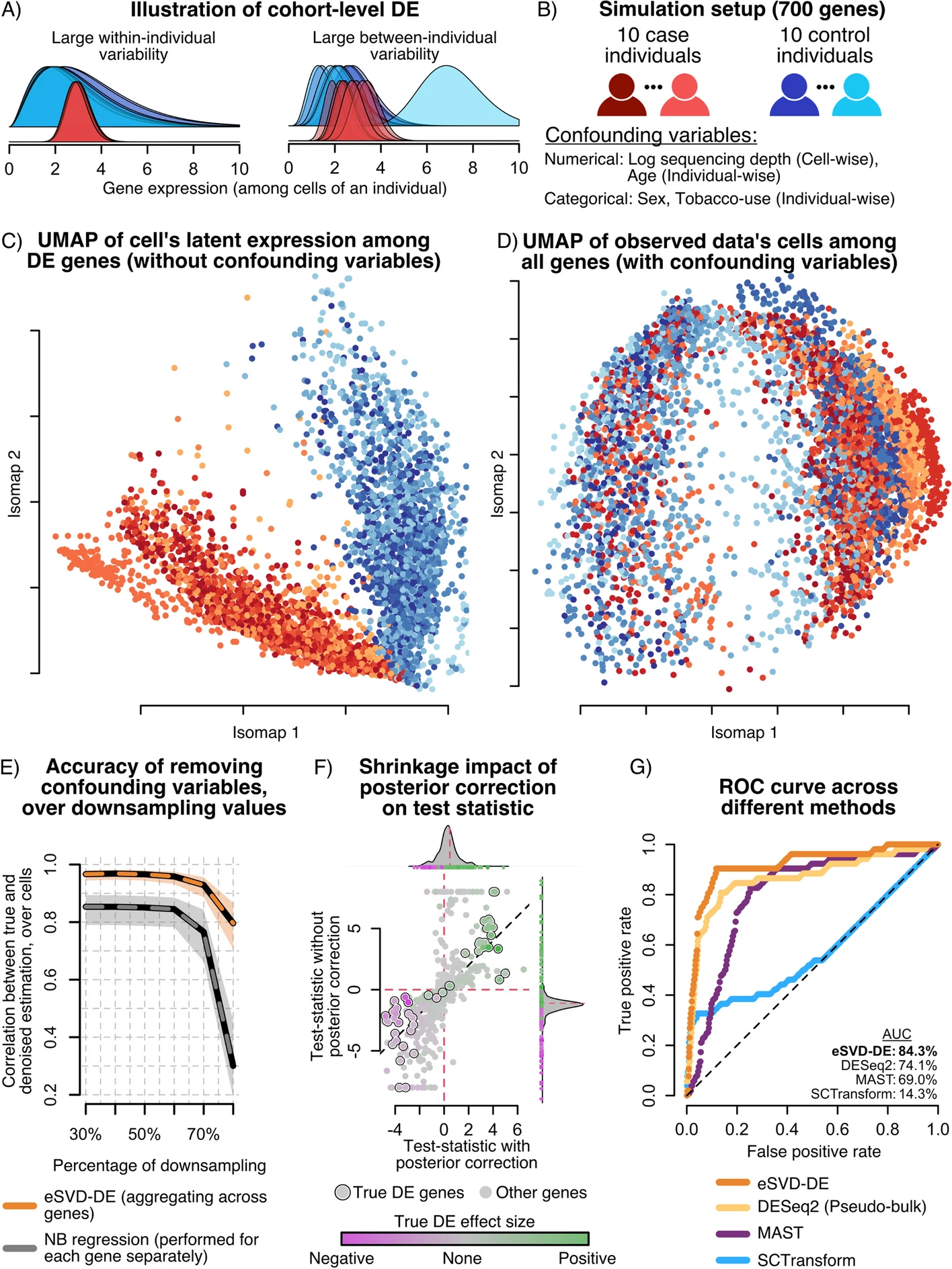
To take an extreme example, consider Figure 24.1 and its caption, reprinted from Lin et al. (2024). In the field of bioinformatics, papers often cram numerous plots into individual figures along with diagrams and flow charts indicating the analysis, and the figures are accompanied with enormous captions explaining their interpretation. Notice how parts C through G of the caption point out the key results in each plot; for instance, E through G point out how the proposed new method (eSVD-DE) outperforms the old methods in several different ways.
Figure 24.1: A Illustration of challenges for cohort-wide DE testing. B Setup for our simulation setup. C Isomap of the cells based on the true DE genes’ expression before introducing the confounding variables. No individuals concentrate tightly in any region on the Isomap manifold, and there is a strong separation between the cases (shades of red) and controls (shades of blue). D Isomap of the observed data based on all the genes. Cells from the same individual concentrate in the embedding, suggesting that confounding covariates additionally drive the difference in expression profiles among individuals. E Downsampling experiment, demonstrating that by pooling information across genes, eSVD-DE outperforms gene-by-gene Negative Binomial regression for regressing out covariate effects. F Illustration of the importance of shrinkage, where the x-axis and y-axis represent each gene’s test statistic with and without posterior correction, respectively. The genes are colored by their true log-fold change, of which the circled genes denote the top 50 genes with the highest true log-fold change. G ROC curve comparing four different methods, illustrating that eSVD-DE has more power than competing methods. The area under the curve (AUC) is shown for each method, where the percentage represents the area between the method’s curve and the diagonal line as a fraction of total possible area. The bolded method denotes the method with highest AUC. (Reprinted from Lin et al. (2024))
24.4 Describing models
Part of your report will explain the model you used, the covariates you chose, and so on. How you do this depends on the model and the audience.
If you’re using a model type that is widely known to your audience—such as linear regression, for readers in almost any field of applied science—you do not need to write out a model formula. People know what linear regression is, so you do not need to write that your model is \[
\text{bill length} = \beta_0 + \beta_1 \cdot \text{(flipper length)} + \dots +
e.
\] Instead, you can explain that you used linear regression, then present a table of predictors and coefficients, like Table 7.1. The table clearly indicates the predictors you used, any interactions or transformations, and so on. A knowledgeable reader will understand this. Such a table can be produced in R with the gtsummary package’s tbl_regression() function, which can be customized using all the fancy table features supported by gt. Other packages for similar goals include texreg and stargazer.
If you use multiple models for the same data, perhaps because your research question can be answered by comparing models with different terms or interactions, you can present them in the same table. For example, if in Example 7.3 we were unsure whether interaction terms were necessary, we could present models with and without interactions. This code uses gtsummary’s tbl_merge() to combine tables of both models and produce Table 24.1.
Table 24.1: Predicting bill length for penguins, with and without an interaction for species.
Characteristic
No interaction
Interaction
Beta
95% CI
p-value
Beta
95% CI
p-value
flipper_length_mm
0.22
0.17, 0.26
<0.001
0.13
0.07, 0.20
<0.001
species
Adelie
—
—
—
—
Chinstrap
8.8
8.0, 9.6
<0.001
-8.0
-29, 13
0.4
Gentoo
2.9
1.6, 4.2
<0.001
-34
-54, -15
<0.001
flipper_length_mm * species
flipper_length_mm * Chinstrap
0.09
-0.02, 0.19
0.10
flipper_length_mm * Gentoo
0.18
0.09, 0.28
<0.001
Abbreviation: CI = Confidence Interval
However, if you’re using a model that’s unusual in your field, it may be wise to write out the math. This is particularly common when developing statistical methodology, where you’re using a model you developed yourself.
24.5 Tables
Do not underestimate the value of a good table.
People love making complicated and colorful plots that attract the reader’s attention. But a well-structured table can capture the reader’s interest, encouraging them to spend time exploring numbers in the table: why is this one higher? How does this group compare to that one? And because tables give numbers directly, it can be easier to make specific comparisons. It’s also easier to present confidence intervals and uncertainty than it is in some kinds of plots.
TODO
24.6 Citation and credit
Students in the Western academic system are drilled with various rules about citation and plagiarism: direct quotes must be in quotation marks, text can’t be copied without attribution, citations must be formatted in very specific ways, and so on. But it’s easier to understand the rules if we understand why they exist.
In business, a business’s products are, well, its products. If you want to use them, you’ll have to pay for them. A business with successful products hence accumulates lots of money, which reflects its status and acclaim, and many customers. If you use its products without paying, you’re stealing them, and most people agree that’s bad. This is a fairly straightforward system.
Most academics, on the other hand, do not sell products. You do not get rich by writing academic papers, so money is not the measure of your success. Academics get reputations, promotions, and awards by having influential ideas: if many other people accept your ideas and build on your work, you eventually get tenure and a pile of awards. But that only happens if the people who use your work cite it and give you explicit credit for the ideas they’re building on. If they use your work but never mention your name, they get the benefit of your ideas, but you get no reward. If they use your work and pretend they did it, not you, they get the rewards and you don’t.
In other words, using ideas and results without citation is the academic equivalent of shoplifting a toaster from Target. Pretending they are your own ideas and results is like selling the stolen toaster for profit. And just as Target’s loss prevention officers will try to make your life difficult if they catch you sliding a panini press under your coat, academics will be very mad at you if they catch you using their ideas without citation. Generally, simply discussing an idea without citing the source is considered seriously impolite; directly copying and pasting content, or pretending you invented something that someone else deserves credit for, is considered plagiarism and worthy of severe punishment.
The norms of citation vary by academic discipline, but the general idea is that if you use novel ideas, text, figures, or data from other sources, then:
It should be clear which parts of your work come from other sources and which parts are your work. Copied text goes in quotation marks or block quotes; copied figures have a note saying “Reprinted from Wu (2020)”; data is acknowledged with a sentence explaining where it came from.
Clear citations are provided that allow the reader to easily find the original source.
Where the lines are drawn can vary. In statistics, if I mention that the \(t\) statistic has Student’s \(t\) distribution, nobody will mind if I don’t cite Gosset—everyone knows who deserves the credit, everyone knows what the \(t\) statistic is, and everyone knows how to look it up if they don’t.3 But if I say that eSVD-DE is a more powerful way to test for differentially expressed genes using single-cell RNA-sequencing data, I should probably cite Lin et al. (2024) and give them the credit.
The exact format of citations varies by field and academic journal, but the essential elements are author names, title, journal name (or book publisher), and a date. In modern times, academic publications have DOIs (Digital Object Identifiers) that can be used to instantly find the online version, and these should be included in the citation when available. In the olden days, academic journals were regularly compiled into volumes containing multiple issues (say, all issues from one year) bound together as one book, so citations contained a volume number and page number so you could find the paper in your library. Most journals still assign volume, issue, and page numbers even though nobody reads them in print, so most citation formats still require these.
Rather than worrying about the exact formatting details—do titles go in quotation marks? should the date go after the author list or after the title?—use the citation management system of whatever document format you use. If that’s LaTeX or Quarto, your citations go in a BibTeX file in a format that looks like this:
@article{Lin:2024,
author = {Lin, Kevin Z. and Qiu, Yixuan and Roeder, Kathryn},
title = {{eSVD-DE}: cohort-wide differential expression in single-cell {RNA}-seq data using exponential-family embeddings},
journal = {BMC Bioinformatics},
year = {2024},
volume = {25},
number = {113},
doi = {10.1186/s12859-024-05724-7}
}
The document format then provides commands to insert this citation into the text, and by choosing the right options (or by using a journal’s template files), it’s automatically formatted into a citation. In Microsoft Word, citation managers like Endnote or Zotero can automatically insert citations formatted in different styles.
24.7 Writing resources
For general questions of style and grammar, including examples of how specific words should be used, what punctuation is appropriate when, and discussion of thousands of specific terms and expressions, I can strongly recommend Garner’s Modern English Usage(Garner 2022). I keep a copy by my desk for reference. Think of it as a dictionary for English style and idiom.
For advice on describing quantitative results in academic writing, formatting tables, and presenting models, see Miller (2013). Some of its graphical advice is outdated, but there are numerous before-and-after examples of statistical writing showing how to clearly describe quantitative results.
For typography—meaning the use of page layout, punctuation, formatting, and whitespace to arrange your text—the standard reference is Bringhurst (2012). His book is far more detailed than you will likely ever need, but if you ever start thinking of making your own templates for reports (or your thesis), it’s an excellent reference.
Exercises
Exercise 24.1 (Table 1) Imagine you are conducting an analysis of the Palmer penguins data introduced in Example 7.3. As described in Section 24.1.3, your report’s Methods section should have a table summarizing the characteristics of the sample: what kinds of penguins are included, and what are their attributes?
Review the example tables referenced. Construct a table summarizing the penguins data. Include a descriptive caption. Ensure each column has a descriptive label and do your best to format the table to look like a published table, not a raw printout from R. You may find the gt package useful.
Bringhurst, Robert. 2012. The Elements of Typographic Style. v4.0. Hartley and Marks.
Garner, Bryan. 2022. Garner’s Modern English Usage. 5th ed. Oxford University Press.
Helgestad, Mette Bach AND Njor, Anne Dorte Lerche AND Larsen. 2024. “Increasing Coverage in Cervical and Colorectal Cancer Screening by Leveraging Attendance at Breast Cancer Screening: A Cluster-Randomised, Crossover Trial.”PLOS Medicine 21 (August). https://doi.org/10.1371/journal.pmed.1004431.
Kanstrup, Marie, Laura Singh, Elisabeth Johanna Leehr, et al. 2024. “A Guided Single Session Intervention to Reduce Intrusive Memories of Work-Related Trauma: A Randomised Controlled Trial with Healthcare Workers in the COVID-19 Pandemic.”BMC Medicine 22 (1): 403. https://doi.org/10.1186/s12916-024-03569-8.
Lin, Kevin Z., Yixuan Qiu, and Kathryn Roeder. 2024. “eSVD-DE: Cohort-Wide Differential Expression in Single-Cell RNA-Seq Data Using Exponential-Family Embeddings.”BMC Bioinformatics 25 (113). https://doi.org/10.1186/s12859-024-05724-7.
Miller, Jane E. 2013. The Chicago Guide to Writing about Multivariate Analysis. 2nd ed. University of Chicago Press.
Nolan, Deborah, and Sara Stoudt. 2021. Communicating with Data. Oxford University Press.
Rosenbusch, Hannes, Anthony M. Evans, and Marcel Zeelenberg. 2022. “The Relative Importance of Joke and Audience Characteristics in Eliciting Amusement.”Psychological Science 33 (9). https://doi.org/10.1177/09567976221098595.
Salomon, Joshua A., Alex Reinhart, Alyssa Bilinski, et al. 2021. “The USCOVID-19 Trends and Impact Survey: Continuous Real-Time Measurement of COVID-19 Symptoms, Risks, Protective Behaviors, Testing, and Vaccination.”Proceedings of the National Academy of Sciences 118 (51): e2111454118. https://doi.org/10.1073/pnas.2111454118.
Smith, Gordon C. S., and Jill P. Pell. 2003. “Parachute Use to Prevent Death and Major Trauma Related to Gravitational Challenge: Systematic Review of Randomised Controlled Trials.”BMJ 327 (7429): 1459–61. https://doi.org/10.1136/bmj.327.7429.1459.
Sollaci, Luciana B., and Mauricio G. Pereira. 2004. “The Introduction, Methods, Results, and Discussion (IMRAD) Structure: A Fifty-Year Survey.”Journal of the Medical Library Association 92 (3): 364–71. https://pmc.ncbi.nlm.nih.gov/articles/PMC442179/.
For example, when admitting that your company has made a terrible mistake. Or, rather, when admitting that a terrible mistake was made.↩︎
But this varies by field, as I mentioned. In legal scholarship, every fact is cited, no matter how trivial or well-known. An article about free speech in the United States will give a detailed citation to the First Amendment of the United States Constitution, even though every legal scholar in the US knows what the First Amendment is. As a result, legal articles usually have hundreds of footnotes giving citations for individual facts.↩︎