7 Interpreting Regressors
\[ \DeclareMathOperator{\E}{\mathbb{E}} \DeclareMathOperator{\R}{\mathbb{R}} \DeclareMathOperator{\RSS}{RSS} \DeclareMathOperator{\AIC}{AIC} \DeclareMathOperator{\bias}{bias} \DeclareMathOperator{\MSE}{MSE} \DeclareMathOperator{\VIF}{VIF} \DeclareMathOperator{\var}{Var} \DeclareMathOperator{\cov}{Cov} \DeclareMathOperator{\cor}{Cor} \DeclareMathOperator{\se}{se} \DeclareMathOperator{\trace}{trace} \DeclareMathOperator{\vspan}{span} \DeclareMathOperator{\proj}{proj} \newcommand{\condset}{\mathcal{Z}} \DeclareMathOperator{\cdo}{do} \newcommand{\ind}{\mathbb{I}} \newcommand{\T}{^\mathsf{T}} \newcommand{\X}{\mathbf{X}} \newcommand{\Y}{\mathbf{Y}} \newcommand{\Z}{\mathbf{Z}} \newcommand{\zerovec}{\mathbf{0}} \newcommand{\onevec}{\mathbf{1}} \newcommand{\trainset}{\mathcal{T}} \DeclareMathOperator*{\argmin}{arg\,min} \DeclareMathOperator*{\argmax}{arg\,max} \DeclareMathOperator{\SD}{SD} \newcommand{\dif}{\mathop{\mathrm{d}\!}} \newcommand{\convd}{\xrightarrow{\mathrm{D}}} \DeclareMathOperator{\logit}{logit} \newcommand{\ilogit}{\logit^{-1}} \DeclareMathOperator{\odds}{odds} \DeclareMathOperator{\dev}{Dev} \DeclareMathOperator{\sign}{sign} \DeclareMathOperator{\normal}{Normal} \DeclareMathOperator{\binomial}{Binomial} \DeclareMathOperator{\bernoulli}{Bernoulli} \DeclareMathOperator{\poisson}{Poisson} \DeclareMathOperator{\multinomial}{Multinomial} \DeclareMathOperator{\uniform}{Uniform} \DeclareMathOperator{\edf}{edf} \]
In multiple regression, the design matrix \(\X\) might have \(p\) columns, but these columns might not reflect \(p\) distinct observed predictor variables. We will distinguish between predictors or covariates, which are the measured values we have for each observation, and regressors, which are the values that enter into the design matrix. One predictor may translate into multiple regressors, as we will see below.
To keep things straight, let’s define some notation. Previously we considered models where \(\E[Y \mid X] = \beta\T X\), where \(X \in \R^p\) and \(\beta \in \R^p\). We then defined the design matrix \(\X \in \R^{n \times p}\) as a convenient way to stack all observations.
Let us instead assume \(X \in \R^q\), where \(q \leq p\), and the matrix \(\X\) is formed from the observations of \(X\), but might have additional columns involving transformations of their values. Hence \(X\) are the \(q\) predictors, but \(\X\) is a matrix of \(p\) regressors.
7.1 Intercept
The first and most obvious additional regressor is the intercept column. It is common to define the design matrix so that \[ \X = \begin{pmatrix} 1 & x_{11} & \cdots & x_{1q} \\ 1 & x_{21} & \cdots & x_{2q} \\ \vdots & \vdots & \vdots & \vdots \\ 1 & x_{n1} & \cdots & x_{nq} \end{pmatrix}. \] The column of ones represents an intercept, so that an individual observation \(Y\) is modeled as \[ Y = \beta_0 + \beta_1 X_1 + \dots + \beta_q X_q + e. \] We often use \(\beta_0\) to refer to the coefficient multiplying the column of ones, and so \(\hat \beta_0\) is the estimated intercept. This practice can sometimes cause confusion: if we have \(q\) predictors but \(p = q + 1\) regressors, it is easy to accidentally use the wrong number in calculations that depend on the model degrees of freedom. These calculations generally depend on the number of regressors, i.e., the dimension of the vector \(\beta\), not on the number of predictors.
The intercept \(\beta_0\) is the mean value of \(Y\) when all other regressors are 0: \[ \beta_0 = \E[Y \mid X_1 = 0, \dots, X_q = 0]. \] In some problems this may not be physically meaningful: If it is not possible for some regressors to be 0, the mean outcome when they are 0 is not relevant. For instance, if we are modeling the weight of adults as a function of their height, the intercept represents the mean weight of adults who have zero height. The intercept may be necessary for the model to fit well, but confidence intervals or hypothesis tests for it would not be of any scientific interest.
Additionally, we often use linear models because we think the relationship between \(X\) and \(Y\) may be locally linear—because we think a linear model will be a good enough approximation for our needs, even if the true relationship is not linear at all. If this is the case, interpreting the intercept \(\beta_0\) is unreasonable when it reflects behavior for values of \(X\) far from those we observed. Or, in other words, interpreting it may be unreasonable extrapolation. Interpreting the intercept, quoting confidence intervals, and conducting hypothesis tests for its value may only be useful when the intercept has a substantive meaning and we have observed \(X\) values nearby.
7.2 Continuous predictors
When we model individual observations as \[ Y = \beta_0 + \beta_1 X_1 + \dots + \beta_q X_q + e, \] the coefficients \(\beta_1, \beta_2, \dots, \beta_q\) are slopes. For example, \[\begin{multline*} \beta_1 = \E[Y \mid X_1 = \textcolor{red}{x_1 + 1}, X_2 = x_2, \dots, X_q = x_q] - {}\\ \E[Y \mid X_1 = \textcolor{red}{x_1}, X_2 = x_2, \dots, X_q = x_q]. \end{multline*}\] Or, in words, the coefficient \(\beta_1\) is the difference in the mean value of \(Y\) associated with a one-unit increase in \(X_1\), holding all other regressors constant. Our estimate \(\hat \beta_1\) is our best estimate of that difference.
Notice how carefully we have phrased this. Let’s unpack this interpretation in pieces:
- Difference in the mean value of \(Y\): The slope gives the relationship between \(\E[Y \mid X]\) and \(X\), not between \(Y\) and \(X\). Individual observations will be above or below the mean. If we happen to have two observations with \(X_1 = 1\) and \(X_1 = 2\), with all other regressors identical, the difference in their \(Y\) values is almost certainly going to be different from \(\beta_1\).
- Associated with a one-unit increase in \(X_1\): The meaning of the coefficient depends on the units and scale of \(X_1\). Changing the scale of the regressor will correspondingly change the scale of the coefficient. It may not make any sense to compare coefficients for regressors measured in different units: if \(X_1\) is measured in miles and \(X_2\) is measured in volts, \(\beta_1 > \beta_2\) does not mean the relationship between \(X_1\) and \(Y\) is “stronger” or “steeper”, or that \(X_1\) is “more predictive”.
- Holding all other regressors constant: The difference in means is between observations with all other regressors at the same values. But in real populations, the predictors may tend to be correlated with each other: compare units with \(X_1 = a\) and others with \(X_1 = a + 1\) and you may find systematic differences in the other regressors.
Example 7.1 (Hurdling) Suppose we want to understand what kind of physical features are associated with being good at hurdling. We obtain data from numerous hurdlers; our response variable is a score measuring how good they are, calculated from the events they have competed in, and two of the predictors are their height and weight.
If our estimated coefficient for height is positive,1 it would be tempting to say that, in our data, taller people are, on average, better hurdlers. But this would not necessarily be true. What is true is that in our data, taller people of the same weight are, on average, better hurdlers—that is, thinner people are better hurdlers. However, in the population of hurdlers, height and weight are likely correlated, because tall people tend to weigh more. It is entirely possible that the average taller person is a worse hurdler than the average shorter person, even if a taller person would on average be better than a shorter person of the same weight.
To express this another way, if we have two regressors \(X_1\) and \(X_2\) that are correlated in the population, \[\begin{multline*} \E[Y \mid X_1 = \textcolor{red}{x_1 + 1}, X_2 = x_2] - \E[Y \mid X_1 = \textcolor{red}{x_1}, X_2 = x_2] \neq{}\\ \E_{X_2 \mid X_1}[\E[Y \mid X_1 = \textcolor{red}{x_1 + 1}]] - \E_{X_2 \mid X_1}[\E[Y \mid X_1 = \textcolor{red}{x_1}]], \end{multline*}\] because on the right-hand side the outer expectations average over \(X_2\)’s conditional distribution given \(X_1 = x_1 + 1\) and \(X_1 = x_1\), whereas on the left-hand side the expectations are both for a fixed value of \(X_2\).
7.3 Transformed predictors
Continuous predictors can also be transformed to produce regressors. Rather than entering the continuous predictor \(X_1\) as a term \(\beta_1 X_1\) in the model, we can apply some function \(f(X_1)\) first. We may even enter a predictor as multiple regressors, each with a different transformation. For example, we could enter \(X_1\) as two regressors: \(X_1\) and \(X_1^2\), resulting in the model \[ Y = \beta_0 + \beta_1 X_1 + \beta_2 X_1^2 + e. \] This models a quadratic relationship between \(Y\) and \(X_1\). There are many physical relationships that involve polynomials, such as relationships between energy, velocity, and distance in physics, so there can certainly be cases where the true relationship between variables is indeed quadratic (or some other polynomial). For the same reason, square roots can often appear as reasonable transformations.
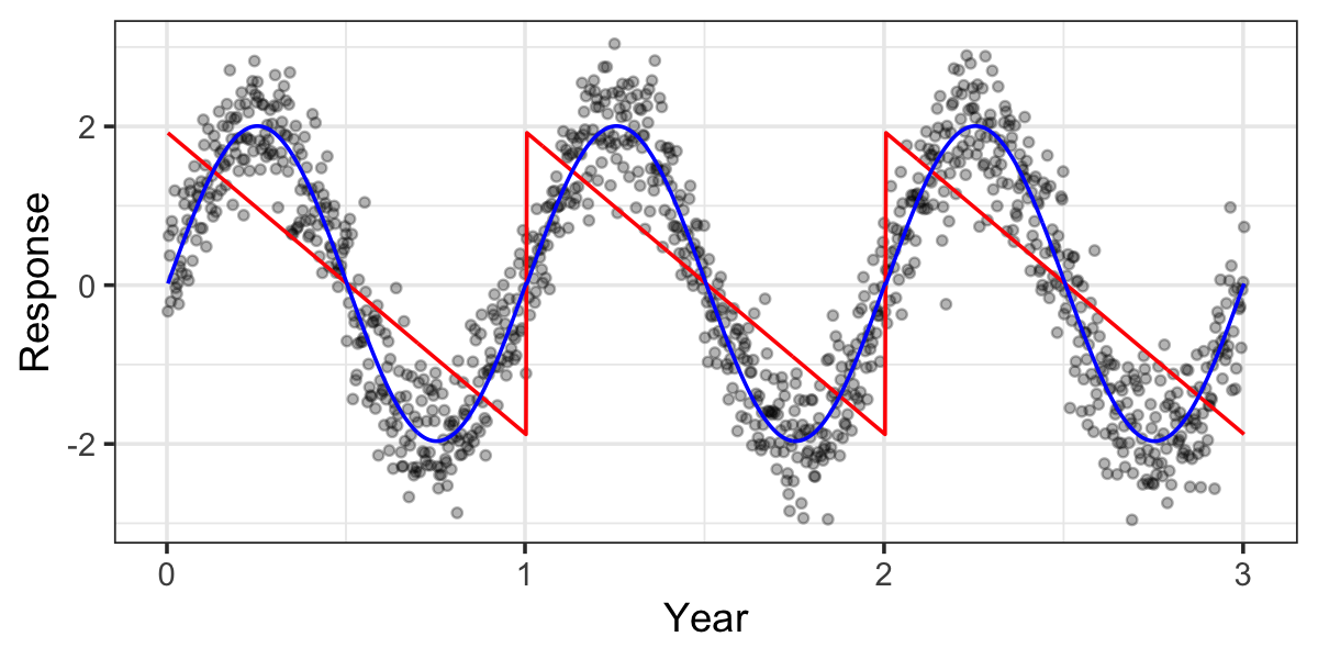
Other common transformations solve specific problems. For example, consider modeling a variable with seasonal variation, where one predictor is the time of year. Entering time of year as a linear regressor would be nonsensical: it would predict a linear trend from the beginning of the year to the end, then a sudden discontinuity at midnight on December 31st, as shown in Figure 7.1. Instead, a consider a periodic function as a transformation, such as a sine or cosine. If \(X_1\) is the day of year, from 0 to 364, then the transformed model \[ Y = \beta_0 + \beta_1 \sin\left(\frac{2 \pi X_1}{364} \right) + e \] predicts an oscillating trend that returns to its starting point at the end of the year. (However, this forces the maxima and minima to be on fixed dates each year; to allow them to vary, we’d have to also fit the phase as a parameter of the model.)
Logarithms also often appear as transformations. They naturally model relationships with diminishing returns, such as the relationship between income and happiness: for someone who can’t afford their rent, an extra $10,000 makes a dramatic difference, but for Jeff Bezos it’s hardly noticed. Log-transforming a predictor also makes its relationship with the response multiplicative, in that each multiple of the predictor is associated with a fixed increase in the response (Exercise 7.3).
Transformations make it more difficult to interpret model coefficients. The coefficient for a transformed predictor is the difference in the mean value of \(Y\) associated with a one-unit increase in the transformed value of the predictor, holding all other regressors constant. Hence we must think about a one-unit increase in the square of \(X\) or in the logarithm of \(X\), which is not particularly intuitive.
When a single predictor enters the model as multiple transformed regressors, the situation is more complicated. For example, consider a model where we allow a quadratic relationship between \(X\) and \(Y\) by including linear and squared terms. Can we say that the slope for the linear term is the mean change in \(Y\) associated with a one-unit change in \(X\), holding \(X^2\) constant? This can only be helpful when \(X = -1/2\), since then \(X^2 = 1/4\) before and after a one-unit increase in \(X\). For any other value of \(X\), we cannot increase \(X\) while holding \(X^2\) constant, so the coefficient cannot be interpreted separately from the coefficient for the quadratic term. In this case it may be better to summarize the relationship with a plot, such as a predictor effect plot (Section 7.7).
Polynomials and transformations can also be used as a general tool to fit nonlinear relationships. Old textbooks spent much time on procedures for trying various transformations of \(X\) to identify the transformation that produced the best fit, or procedures for adding polynomial terms to produce nonlinear fits. This was a reasonable approach when calculations had to be done by hand, since simple transformations can be done easily (if tediously); with modern computing, it makes much more sense to just use a general nonlinear regression technique when a linear model is inadequate. We’ll discuss these in more detail in Chapter 10 and Chapter 14.
7.4 Factors
Often a predictor is a factor: a qualitative or categorical variable that only takes on a fixed, discrete set of values, called levels. For example, a predictor that indicates whether a patient received the treatment or a placebo might be a binary factor; in surveys, respondents might report their occupation by picking from a fixed set of categories.
Typically we want to encode factors in the design matrix so that each level can be associated with a distinct slope or intercept in the model. To do so, we introduce dummy variables, which are regressors taking on only two values; a combination of several dummy variables might represent one factor. The values entered into the design matrix are also sometimes called contrasts.
In principle, the simplest dummy variable coding would encode a factor with \(k\) levels as \(k\) dummy variables, each either 0 or 1 depending. An observation that has the second level of the factor would have all dummy variables 0 except the second.
For example, consider a binary factor treatment_assignment with levels “treatment” and “placebo”. We might be interested in the model with formula outcome ~ treatment_assignment. We could write the model as \[
\begin{pmatrix}
y_1 \\
y_2 \\
\vdots \\
y_n
\end{pmatrix} =
\begin{pmatrix}
1 & 0 & 1 \\
1 & 1 & 0 \\
\vdots & \vdots & \vdots \\
1 & 1 & 0
\end{pmatrix}
\begin{pmatrix}
\beta_0 \\
\beta_1 \\
\beta_2
\end{pmatrix}.
\] Here the first column of \(\X\) is the intercept, the second is a dummy variable representing the “treatment” level, and the third is a dummy variable indicating the “placebo” level. The first observation received the placebo, the second received the treatment, and the last received the treatment. This implies that \[\begin{align*}
\E[Y \mid \text{treatment}] &= \beta_0 + \beta_1 \\
\E[Y \mid \text{placebo}] &= \beta_0 + \beta_2.
\end{align*}\] However, this model is not identifiable: there are infinitely many values of \(\beta\) that lead to identical estimated means, and hence identical \(\RSS\). There are several equivalent ways to describe this:
- A model with \(\beta = (0, 1, 2)\T\) predicts the same means as a model with \(\beta = (100, -99, -98)\T\).
- If \(\hat \beta\) minimizes the residual sum of squares, \(\hat \beta^* = (\hat \beta_0 + c, \hat \beta_1 - c, \hat \beta_2 - c)\T\) also minimizes the residual sum of squares for any \(c \in \R\).
- The model’s design matrix is linearly dependent, and so there is no unique inverse of \(\X\T \X\).
To avoid this problem, we usually choose a dummy coding scheme that has one fewer dummy variable. By default, R uses treatment contrasts.
Definition 7.1 (Treatment contrasts) For a factor with \(K\) levels, the treatment contrasts are \(K - 1\) binary dummy variables. The first level of the factor is omitted, and the remaining dummy variables \(k = 1, \dots, K - 1\) are defined by \[ \text{dummy}_k = \begin{cases} 1 & \text{if observation has factor level $k + 1$}\\ 0 & \text{otherwise.} \end{cases} \] In machine learning, this is often known as one-hot encoding with the first level dropped.
In the example above, the treatment contrasts would lead to the model \[ \begin{pmatrix} y_1 \\ y_2 \\ \vdots \\ y_n \end{pmatrix} = \begin{pmatrix} 1 & 1 \\ 1 & 0 \\ \vdots & \vdots \\ 1 & 0 \end{pmatrix} \begin{pmatrix} \beta_0 \\ \beta_1 \end{pmatrix}, \] and hence \[\begin{align*} \E[Y \mid \text{treatment}] &= \beta_0 \\ \E[Y \mid \text{placebo}] &= \beta_0 + \beta_1. \end{align*}\] The intercept \(\beta_0\) is hence interpreted as the mean value for treated patients, and \(\beta_1\) is the difference in means between treated patients and those who received the placebo. A hypothesis test for the null hypothesis \(\beta_1 = 0\) tests whether the treatment and placebo groups have identical means. The “treatment” level is hence the baseline level against which “placebo” is compared. We could also choose to keep all levels and omit the intercept from the model, which would also lead to an identifiable model.
The choice of baseline does not affect the model in the sense that it does not change the column span of \(\X\); it only changes the interpretation of \(\beta\). Other software packages may choose different contrasts; for instance, SAS omits the last level of a factor, not the first. Consequently, the main advantage of choosing different contrasts is simply convenience: for instance, if your research question is to compare a baseline level to other treatment levels, choosing contrasts so the baseline level is omitted (and part of the intercept) means tests of the coefficients for the other levels will be tests of whether those groups have different means than the baseline.
In R, any predictor stored as a logical vector (TRUE or FALSE) or character vector will be implicitly converted into a factor. One can also use the factor() function to create a factor and control the order of the factor levels; factors can also have labels assigned to each level, allowing you to create human-readable labels for levels that might be encoded in the data in less readable form. The forcats package provides useful utilities for reordering and manipulating factors.
R also allows the user to select the contrasts to use for a factor.
Example 7.2 (Contrasts in R) The iris dataset indicates the species of each observation with a factor. There are three species:
levels(iris$Species)[1] "setosa" "versicolor" "virginica" A model using species as a predictor will default to treatment contrasts. R can print the contrasts for us:
contrasts(iris$Species) versicolor virginica
setosa 0 0
versicolor 1 0
virginica 0 1The rows are factor levels; the columns are the dummy variables and indicate the dummy variable values used for each factor level. We can see setosa is omitted, since it is the first factor level, and there is an indicator each for versicolor and virginica.
But we can choose other contrasts by using the contrasts() function. (See its documentation for more details.) For instance, we can use “sum to zero” contrasts:
contrasts(iris$Species) <- contr.sum(levels(iris$Species))
contrasts(iris$Species)
[,1] [,2]
setosa 1 0
versicolor 0 1
virginica -1 -1These have different interpretations. TODO what are those interpretations?
7.5 Interactions
An interaction allows one predictor’s association with the outcome to depend on values of another predictor.
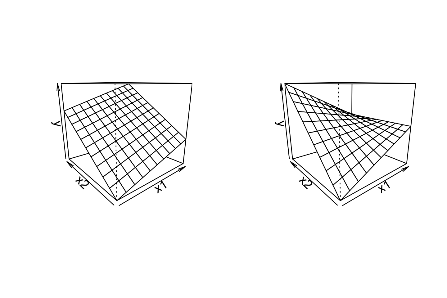
For example, consider a model with two continuous predictors and their interaction. We represent this with three regressors, in the model \[ Y = \beta_0 + \beta_1 X_1 + \beta_2 X_2 + \beta_3 X_1 X_2 + e. \] The \(X_1\) and \(X_2\) regressors are referred to as main effects, and the \(X_1 X_2\) regressor is their interaction. We can rewrite this model in two ways, allowing us to interpret it in terms of the original regressors: \[\begin{align*} Y &= (\beta_0 + \beta_2 X_2) + (\beta_1 + \beta_3 X_2) X_1 + e\\ Y &= {\underbrace{(\beta_0 + \beta_1 X_1)}_\text{intercept}} + {\underbrace{(\beta_2 + \beta_3 X_1)}_\text{slope}} X_2 + e. \end{align*}\] The first form expresses the linear association between \(Y\) and \(X_1\) as having an intercept and slope that both depend on \(X_2\); equivalently, in the second form, the slope and intercept of the association between \(Y\) and \(X_2\) depend on \(X_1\). Figure 7.2 illustrates this changing relationship: as one predictor changes, the slope of the relationship between the other predictor and \(Y\) changes, “twisting” the overall relationship.
Similarly, consider a model with one continuous predictor and one factor predictor with three levels. Using treatment contrasts (Definition 7.1), we have an intercept, three main effect regressors, and two interaction regressors: \[ Y = \beta_0 + \beta_1 X_1 + \beta_2 X_2 + \beta_3 X_3 + \beta_4 X_1 X_2 + \beta_5 X_1 X_3 + e, \] where \(X_1\) is the continuous predictor’s regressor and \(X_2, X_3\) are the factor regressors. Rearranging this, the relationship between \(X_1\) and \(Y\) can be written as \[ Y = {\underbrace{(\beta_0 + \beta_2 X_2 + \beta_3 X_3)}_\text{intercept}} + {\underbrace{(\beta_1 + \beta_4 X_2 + \beta_5 X_3)}_\text{slope}} X_1 + e. \] Here the intercept and slope depend on which of the three factor levels the observation has; the intercept is \(\beta_0\) in the baseline level, \(\beta_0 + \beta_2\) in the level represented by \((X_2, X_3) = (1, 0)\), and \(\beta_0 + \beta_3\) in the level represented by \((X_2, X_3) = (0, 1)\). We can similarly work out the interpretations of the slope.
When an interaction is present, the normal interpretation of coefficients as slopes (as described in Section 7.2) no longer holds for the predictors involved in the interaction. Returning again to a model with two predictors (\(X_1\) and \(X_2\)) and their interaction (\(X_1 X_2\)), the change in the mean of \(Y\) when \(X_1\) is one unit higher, holding \(X_2\) fixed, is \[\begin{multline*} \E[Y \mid X_1 = \textcolor{red}{x_1 + 1}, X_2 = x_2] - \E[Y \mid X_1 = \textcolor{red}{x_1}, X_2 = x_2] ={}\\ (\beta_1 + \beta_3 x_2) (x_1 + 1) - (\beta_1 + \beta_3 x_2) x_1 = \beta_1 + \beta_3 x_2. \end{multline*}\] Hence \(\beta_1\) only has its conventional interpretation when \(x_2 = 0\). For an interaction between a continuous predictor and a factor, this is just another way of saying that the interaction allows different slopes per factor level, but this problem is easy to overlook when interpreting interactions of continuous predictors.
Example 7.3 (Palmer Penguins) The Palmer Penguins dataset records size measurements for three species of penguins recorded by Dr. Kristen Gorman at the Palmer Station in Antarctica. Dr. Gorman recorded the bill length and flipper length for each penguin, among other features. The bill length and flipper length appear to be associated, as we can see in Figure 7.3, using the code below.
library(palmerpenguins)
library(ggplot2)
library(broom)

ggplot(penguins,
       aes(x = flipper_length_mm, y = bill_length_mm,
           color = species)) +
  geom_point() +
  labs(x = "Flipper length (mm)", y = "Bill length (mm)",
       color = "Species")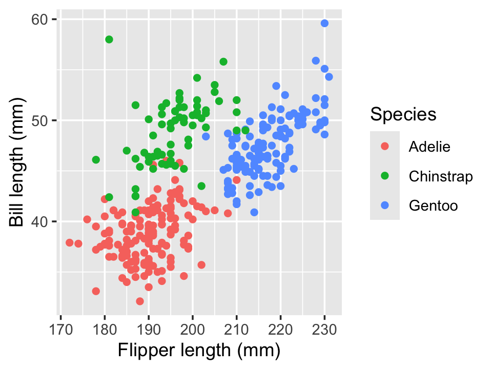
To assess if the slope of this relationship differs by group, we can fit a linear model with an interaction, using the formula syntax from Section 6.2. The coefficients are shown in Table 7.1.
penguin_fit <- lm(
  bill_length_mm ~ flipper_length_mm + species +
    flipper_length_mm:species,
  data = penguins
)| Characteristic | Beta | 95% CI | p-value |
|---|---|---|---|
| (Intercept) | 14 | 1.7, 25 | 0.025 |
| flipper_length_mm | 0.13 | 0.07, 0.20 | <0.001 |
| species | |||
| Adelie | — | — | |
| Chinstrap | -8.0 | -29, 13 | 0.4 |
| Gentoo | -34 | -54, -15 | <0.001 |
| flipper_length_mm * species | |||
| flipper_length_mm * Chinstrap | 0.09 | -0.02, 0.19 | 0.10 |
| flipper_length_mm * Gentoo | 0.18 | 0.09, 0.28 | <0.001 |
| Abbreviation: CI = Confidence Interval | |||
We interpret this as follows. For Adelie penguins (the baseline level), the association between bill length and flipper length is 0.13 mm of bill length per millimeter of flipper length, on average. But for chinstrap penguins, the association is 0.13 + 0.09 = 0.22 mm of bill length per millimeter of flipper length, on average.
Notice that in this model, we had three predictors (flipper length, species, and their interaction) and six regressors. The species predictor corresponds to two regressors, because it is a three-level factor, while the interaction predictor corresponds to two additional regressors, because each factor regressor is multiplied by the flipper length regressor.
Interactions between factor variables, or between a factor variable and a continuous variable, can often be used to answer substantive questions. Tests for whether the interaction coefficients are zero might be scientifically meaningful, provided they are interpreted correctly.
Example 7.4 Consider a study of a new treatment for dihydrogen monoxide poisoning. Suppose we have a binary treatment assignment (treatment or placebo) and a continuous outcome variable rating the patient’s symptoms one hour after treatment. We want to know if the efficacy of the treatment depends on whether the patient has antibodies for dihydrogen monoxide, measured by a test that indicates the presence or absence of antibodies.
We fit a model with the formula symptoms ~ treatment * antibodies, where both treatment and antibodies are binary factors. Let \(X_1\) be a binary indicator of treatment and \(X_2\) be a binary indicator of antibodies. If placebo and antibody absence are the baseline levels, this model would be \[
Y = \beta_0 + \beta_1 X_1 + \beta_2 X_2 + \beta_3 X_1 X_2 + e,
\] where the coefficients are interpreted as follows:
- \(\beta_0\): Average symptom rating for patients who received the placebo and had no prior antibodies
- \(\beta_1\): Difference between the mean symptom ratings of treated patients and untreated patients, for those patients without antibodies (because of the interaction)
- \(\beta_2\): Difference between the mean symptom ratings of patients with and without patients, for those patients who received the placebo (because of the interaction)
- \(\beta_3\): Additional difference beyond that given by the treatment coefficient, for patients with antibodies; or, equivalently, the additional difference beyond that given by the antibodies coefficient, for patients who were treated
It may be easier to see this as a table of values of \(\E[Y \mid X]\):
| Placebo | Treatment | |
|---|---|---|
| No antibodies | \(\beta_0\) | \(\beta_0 + \beta_1\) |
| Antibodies | \(\beta_0 + \beta_2\) | \(\beta_0 + \beta_1 + \beta_2 + \beta_3\) |
If the interaction coefficient \(\beta_3\) is zero, the difference in symptoms between patients receiving treatment and those receiving control is equal to \(\beta_1\), regardless of the presence or absence of antibodies. If \(\beta_3\) is nonzero, the difference between placebo and treatment depends on the presence or absence of antibodies.
It is sometimes tempting to include an interaction regressor but not the main effect regressors corresponding to it. This, however, is rarely a good idea, as it produces a model with strange restrictions on the effects included. For example, in Example 7.4, omitting the treatment main effect is equivalent to enforcing that \(\beta_1 = 0\); this would only allow a difference in symptoms between treatment and placebo for those patients with antibodies. In scientific settings we rarely have a reason to believe this is true a priori; it may be a question to be answered using the data, but it is rarely something we know in advance and want to enforce in our model.
Similarly, a test of whether the treatment main effect is equal to zero is a test of whether there is no treatment effect specifically among those with no antibodies; it does not test whether there is no treatment effect at all.
The rule that we include main effects when we use their corresponding interactions is known as the marginality principle, and can be formalized (Peixoto 1990). It suggests we should be careful when adding and removing main effects and interactions from a model, and should take care to interpret tests of main effects when their interactions are present.
Example 7.5 (Nelder (1998)) Consider measuring the response \(Y\) of cells to a drug given at dosage \(X_1\). The dose-response relationship is linear. An adjuvant is added at dosage \(X_2\); the adjuvant causes no response on its own, but merely enhances the effect of the drug. (For example, in vaccines, an adjuvant compound like alum can enhance the body’s immune response to the vaccine, though on its own alum cannot confer immunity to anything.) In this case, a model such as \[\begin{align*} Y &= \beta_0 + \beta_1 X_1 + \beta_2 X_1 X_2 + e\\ &= \beta_0 + (\beta_1 + \beta_2 X_2) X_1 + e \end{align*}\] is reasonable, since we know that when \(X_1 = 0\), there should be no association between the adjuvant dose \(X_2\) and \(Y\).
7.6 Causal claims
In all of our interpretations, of course, we must be careful about making causal claims. Statisticians are often tempted, or explicitly trained, to never make causal claims: to only speak of associations, and to never claim that a regression implies causality. This caution can be good, because with observational data, we usually can’t make causal claims: our regression estimates \(\E[Y \mid X = x]\), not \(\E[Y \mid \cdo(X = x)]\).
But as we discussed in Chapter 2, if we are confident in our causal model and can control for the necessary confounders, we can estimate a chosen causal path, such as the causal relationship \(X \to Y\). In this situation, our obligation is to make clear the limitations of our claims:
- If our regression model is misspecified or otherwise incorrect, our estimates may be wrong.
- If our causal model is missing important confounders, or we have measured some confounders incompletely or inaccurately, our estimates may include some bias from confounding.
- If our data comes from a specific sample or subset of a population, the causal claims may not generalize beyond it.
We also have to be careful about the scope of our causal claims. Choosing confounders to allow us to estimate \(X \to Y\) means we can interpret the coefficient for \(X\) causally; it does not necessarily imply that all the other coefficients in the model can be interpreted causally.
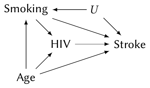
Example 7.6 (Causal effect of HIV on stroke) Westreich and Greenland (2013) present a cautionary example for the causal interpretation of coefficients. Suppose we have conducted an observational study on the effect of infection with human immunodeficiency virus (HIV) on the rate of stroke. Both strokes and HIV are known to be associated with age and smoking, and so we might construct the following causal diagram:
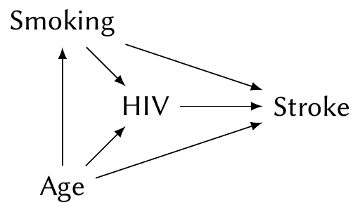
To estimate the \(\text{HIV} \to \text{Stroke}\) causal path, we must include age and smoking in our model. (We would likely use a logistic regression, which we’ll introduce in Chapter 12.) The coefficient for HIV then tells us the causal effect.
But consider the coefficient for smoking. This is not the total causal effect of smoking on stroke. The total causal effect includes two paths, \(\text{Smoking} \to \text{Stroke}\) and \(\text{Smoking} \to \text{HIV} \to \text{Stroke}\); because HIV is included in the model, we have blocked the second path, and the coefficient for smoking only includes the first.
Or consider the same situation with an unobserved confounder \(U\):
Despite the confounder, fitting a model with HIV, smoking, and age still allows us to estimate the \(\text{HIV} \to \text{Stroke}\) causal path. But the \(\text{Smoking} \to \text{Stroke}\) path is confounded by \(U\), and so the coefficient for smoking cannot be interpreted causally at all.
Westreich and Greenland (2013) call this the “Table 2 fallacy”: in many applied papers, Table 1 presents summaries of the sample and Table 2 presents the results of the key regression analysis. Researchers often report the causal effect of interest, and then causally interpret the coefficients for all of their control variables as well, even if the causal interpretation is invalid.
TODO sensitivity
7.7 Partial residuals and predictor effect plots
When we fit a complicated linear model, where many predictors have been expanded into regressors with interactions, multiple factor levels, and so on, it can be difficult to read the summary tables and interpret the model. What direction is the association between a particular predictor and \(Y\)? It might depend on the value of several other variables, depending on the interactions. We need additional tools to help us interpret the model.
7.7.1 Partial residuals for predictors
First, we can extend partial residuals. In Definition 5.5, we defined them in terms of the regressors. We can instead define them in terms of the predictors, allowing us to see the relationship between predictors and response as fit by the model.
Definition 7.2 (Partial residuals for predictors) Consider the model \(\E[Y \mid X] = r(X)\), where \(r(X)\) is a linear combination of regressors. Let \(\hat r(X)\) be the fitted model and let \(\hat \beta_0\) be its intercept.
Choose a predictor \(X_f\), the focal predictor, to calculate partial residuals for. Write the mean function as \(r(X_f, X_o)\), where \(X_f\) is the value of the focal predictor and \(X_o\) represents all other predictors.
The partial residual for observation \(i\) is \[ r_{if} = \hat e_i + \left( \hat r(x_{if}, 0) - \hat \beta_0 \right), \] where setting \(X_o = 0\) means setting all other numeric predictors to 0; factor predictors are set to their first (baseline) level.
In the case when all predictors enter as a single predictor, as in a simple linear model with \(Y = \beta_0 + \beta_1 X_1 + \dots + e\), this definition is identical to Definition 5.5. But suppose a predictor is represented by a main effect and interactions with several other predictors; Definition 5.5 would not make sense, but Definition 7.2 sets the other predictors to 0 (or their baseline) to calculate the residuals. Similarly, in Chapter 10 we will learn how to add regressors to allow nonlinear relationships, and the new definition allows \(\hat r(x_{if}, 0)\) to be nonlinear and produces residuals showing deviations from that nonlinear trend.
Partial residuals vary one predictor while holding the others fixed, and the same idea can be applied to visualize each predictor’s association with the response.
7.7.2 Predictor effect plots
In predictor effect plots, rather than calculating residuals, we vary one predictor while holding others fixed to visualize the relationships (Fox and Weisberg 2018). The change in \(Y\) while varying one predictor is called its effect, though you should not confuse this with a causal effect! We can make predictor effect plots for each predictor in our model.
Definition 7.3 (Predictor effect plot) Consider a regression model with predictors \(X \in \R^q\). Select a focal predictor \(X_f\). We can then partition the predictors so that \(X = (X_f, X_i, X_o)\), where \(X_i\) represents the set of predictors that have interactions with \(X_f\), and \(X_o\) represents the set of remaining predictors. (\(X_i\) and \(X_o\) can be empty sets.) The predictor effect plots for \(X_f\) are plots of \[ \hat r(x_f, x_i, x_o^a) \; \text{versus} \; x_f, \] where \(\hat r\) is the estimated regression function and \(x_o^a\) represents an average value of the other predictors. Multiple plots are made, each setting \(x_i\) to a specific value; for example, we might set it to multiple values across a range, or to each level of a factor, if the interaction is with a factor.
For the average value \(x_o^a\), continuous predictors may be set at their mean, while for factor variables, the expectation may be calculated by obtaining an estimate for each level of the factor and then averaging those estimates, weighted by the prevalence of each level.
Notice that instead of setting \(X_o = 0\), as in partial residuals, we set it to an average value. This shifts \(Y\) so the plotted values represent typical values; in other words, we can interpret \(Y\) as “the average value of \(Y\) when the other predictors are at their average values” rather than “when the other predictors are exactly 0”, which, depending on the range of the predictors, may not be realistic.
This definition is a little complicated, so let’s make several example plots based on Example 7.3. We will use the ggeffects package, which can automatically make effect plots for many types of models. Note that you also need to install the effects package; if it is unavailable, ggeffects will default to calculating effect plots differently from how we described them.
Example 7.7 (Penguin effect plots) Let’s construct an effect plot using the model we already fit in Example 7.3. We will select flipper length as the focal predictor. The set \(X_i\) contains the species predictor, because it has an interaction with the focal predictor, and the set \(X_o\) is empty. We need a plot for multiple values of \(x_i\), and since species is discrete, it’s reasonable to choose to make one plot per species. That is what the ggeffects package chooses automatically.
To make the plot, we use the predict_response() function and choose our focal predictor in the terms argument. We must tell it explicitly which variables to include in \(X_i\) by providing additional terms, so we tell it make a plot per species. The function returns a special data frame, and the package provides an S3 method for plot() (see Section 6.1) that constructs a plot using ggplot2. The code below produces the effect plot shown in Figure 7.4.
library(ggeffects) # install the effects package too

predict_response(penguin_fit,
                 terms = c("flipper_length_mm", "species")) |>
  plot() +
  labs(x = "Flipper length (mm)", y = "Bill length (mm)",
       color = "Species", title = NULL)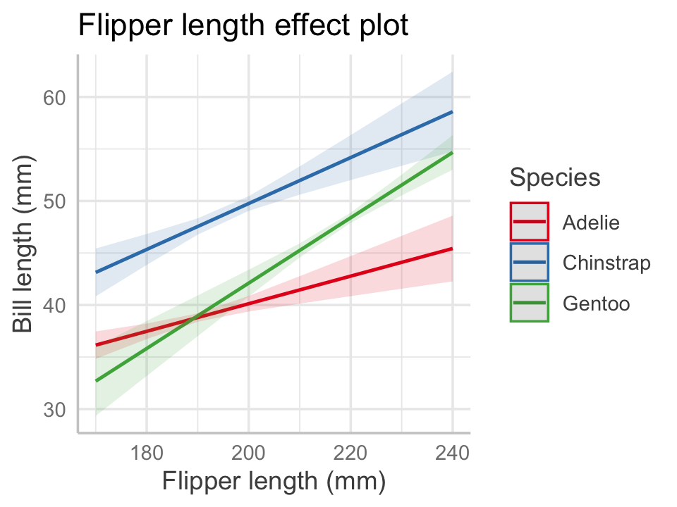
Notice how the multiple plots have been combined into one. By default, the plot includes 95% confidence intervals for the mean. We can now see graphically that the interaction allowed each penguin species to have a different slope and intercept.
Now let’s consider a more complicated situation by adding in body mass:
penguin_fit_2 <- lm(
  bill_length_mm ~ flipper_length_mm + species +
    flipper_length_mm:species + body_mass_g,
  data = penguins
)
If we make the same effects plot as before, body mass is in \(X_o\) and hence the plot uses its average value when drawing the lines, as shown in Figure 7.5.
predict_response(penguin_fit_2,
                 terms = c("flipper_length_mm", "species")) |>
  plot() +
  labs(x = "Flipper length (mm)", y = "Bill length (mm)",
       color = "Species", title = NULL)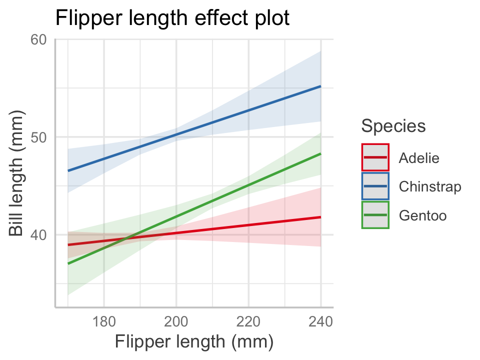
We could also ask for multiple plots at different values of body mass. The range of typical body masses seems to be from about 3,000 g to about 6,000 g, so let’s pick four reasonable values. The result is shown in Figure 7.6.
predict_response(
  penguin_fit_2,
  terms = c("flipper_length_mm", "species",
            "body_mass_g [3000, 4000, 5000, 6000]")
) |>
  plot() +
  labs(x = "Flipper length (mm)", y = "Bill length (mm)",
       color = "Species",
       title = "Flipper length effect plot",
       subtitle = "By body mass (g)")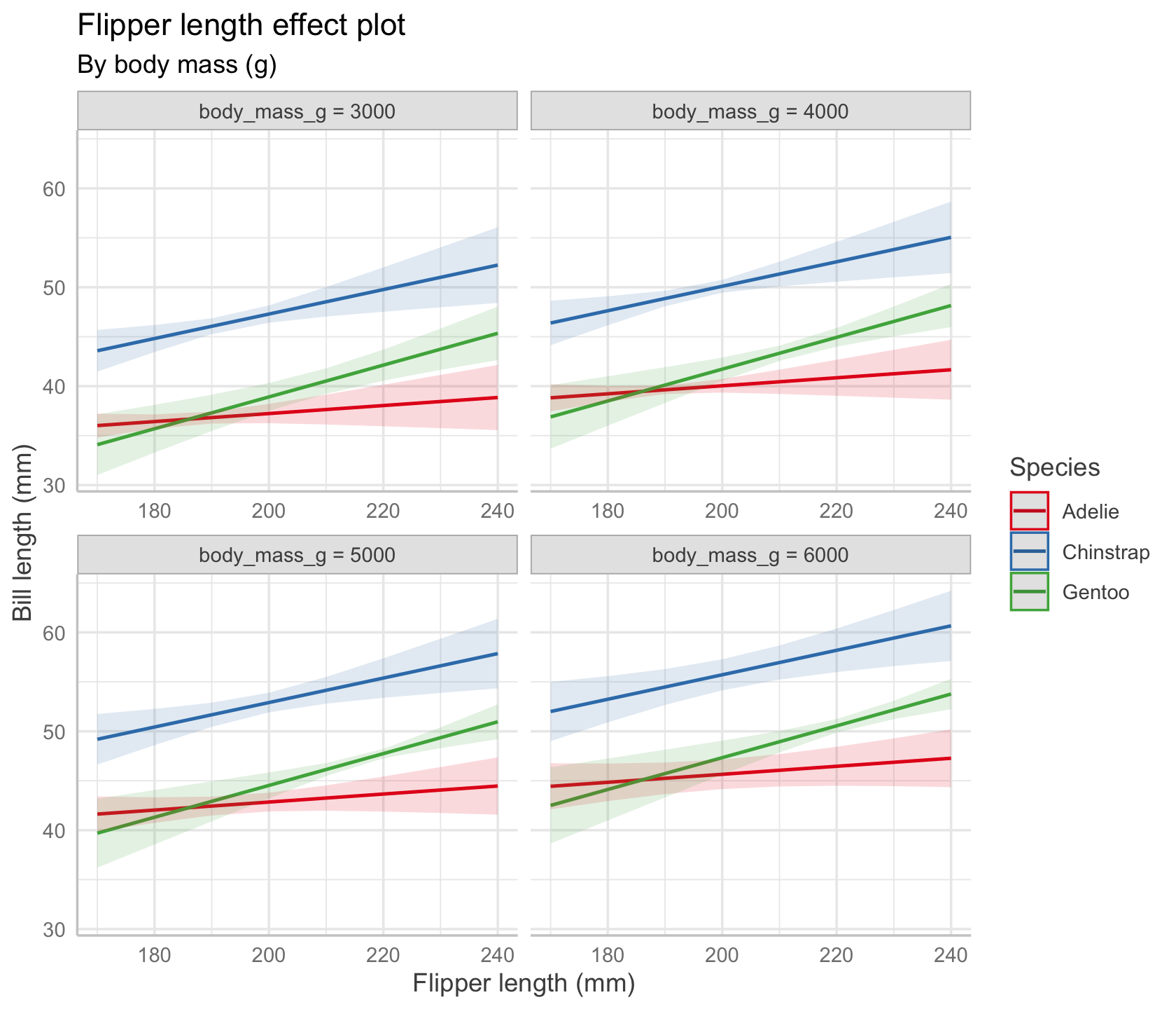
In our chosen model, there is no interaction between body mass and flipper length, so the lines in every plot have identical slopes; however, their vertical positions are different, because each plot sets a different fixed value of body mass.
Exercises
Exercise 7.1 (Cats) The MASS package includes a cats dataset that records the body weight and heart weight of adult cats. We’d like to fit a linear regression to predict heart weight from body weight.
- Fit a regression model and give a table showing the model parameters. For each coefficient, give a sentence in APA format (Chapter 25) interpreting the coefficient. Be sure to include 95% confidence intervals.
- Use the test statistics reported by R to test whether the slope of the relationship is nonzero. Report the results in APA format.
Exercise 7.2 (Inheritance of height) Early statisticians were inordinately fascinated with inheritance and genetics. This led to many early advances in the science of genetics, but was also used by some statisticians in the early 1900s to advocate for eugenics (i.e., improving society by selecting people from “the better stocks” and rejecting “inferior” people) and so-called “scientific racism”. In this problem we will try to make positive use of some data collected by Karl Pearson from 1893 to 1898, who was studying the inheritance of height.
Pearson’s data has 1375 observations of heights of mothers (under the age of 65) and their adult daughters (over the age of 17). The data is available in the alr4 package as the data frame Heights. We are interested in the inheritance of height from the mother to the daughter, so we consider the mother’s height (mheight, in inches) as the predictor of the daughter’s height (dheight, also in inches).
- Perform an exploratory data analysis. There are only two variables, so consider each variable on its own (such as with a histogram) and both together (such as with a scatterplot). Write a few sentences commenting on the variables and their relationships, pointing out any potential problems such as outliers, bimodal distributions, etc. (A good exploratory data analysis is a key part of any data analysis, and will inform your modeling choices and conclusions.)
- Fit the regression of
dheightonmheight. Report the fitted regression line and the estimated variance \(S^2\). - Give a test for whether the coefficient for
mheightis 0. Write your results and conclusion in APA format (Chapter 25). - Write a sentence interpreting the coefficient. Include a 95% confidence interval.
- Describe what it would mean if the coefficient were exactly 1, if it were less than 1, and if it were greater than 1, in the context of the scientific problem.
Exercise 7.3 (Log transformations) Consider a regression with a single predictor \(X\) that is entered using a log transformation, so that the model is \[ Y = \beta_0 + \beta_1 \log X + e. \] The relationship is not linear, so \[ \E[Y \mid X = x + 1] - \E[Y \mid X = x] \] is not a constant. Show that the logarithmic relationship instead predicts a linear increase in \(Y\) for each multiple of \(X\), by calculating \[ \E[Y \mid X = 2x] - \E[Y \mid X = x]. \] Based on your result, give the interpretation of \(\beta_1\) in this model.
Exercise 7.4 (Log-transformed responses) It is also possible to log-transform the response variable. For example, with one predictor, we might model \[ \log Y = \beta_0 + \beta_1 X + e. \] Exponentiate both sides, simplify, and then give an interpretation of \(\beta_1\) (or a transformation of it) in this model.
Exercise 7.5 (Treatment contrast estimates) Consider a regression with a response variable \(Y\) and a single predictor \(X\) that is a factor with \(K\) levels. Let \(N\) be the total sample size and \(n_k\) be the number of responses in factor level \(k\). The residual sum of squares is a sum that can be written per factor level: \[ \RSS(\beta) = \sum_{k=1}^{K} \sum_{i=1}^{n_k} (Y_{ki} - \beta\T X_{ki})^2, \] where \(X_{ki}\) is a vector containing the intercept and treatment contrasts for observation \(i\) in factor level \(k\).
Show that the least squares estimate of the mean within factor level \(k\) is \[ \E[Y \mid X \text{ in level } k] = \frac{1}{n_k} \sum_{i=1}^{n_k} Y_{ki}, \] the sample average of observations in factor level \(k\). (Weisberg 2014, problem 5.1)
Exercise 7.6 (Sum-to-zero contrasts) Consider modeling Petal.Width ~ Species in the iris data described in Example 7.2. Write out the model when using treatment contrasts and when using sum-to-zero contrasts, and write the mean for each species in terms of \(\beta\).
Exercise 7.7 (Weisberg (2014), problem 4.9) Researchers in the 1970s collected data on faculty salaries at a small Midwestern college. Using the data, they fit a regression function \[ \hat r(\text{sex}) = 24697 - 3340 \times \text{sex}, \] where \(\text{sex} = 1\) if the faculty member was female and zero if male. The response variable, salary, is measured in dollars.
Note: sex is a dichotomous variable, at least as defined by these researchers in this dataset, so the regression function is not continuous: it takes only 2 values, corresponding to \(\text{sex} = 1\) and \(\text{sex} = 0\).
- Describe the meaning of the two estimated coefficients.
- What is the mean salary for men? For women?
- Alternatively, we could include a variable for the number of years each faculty member has been employed at the college. Draw a causal diagram of a plausible causal relationship between years of service, sex, and salary, and comment on whether the previous regression could attain an unbiased estimate of the direct causal effect of sex on salary. (By “direct” we mean the arrow directly from sex to salary, and not causal effects through any other paths. Hint: Consider changes in the role of women in the workplace in the 1970s.)
- When the number of years of employment is added to the model, the researchers obtained the estimated regression function \[ \hat r(\text{sex}, \text{years}) = 18065 + 201 \times \text{sex} + 759 \times \text{years}. \] The coefficient for sex has changed signs. Describe the meaning of each coefficient in a sentence, and comment on how the sign could have changed, based on your answer to the previous question.
- What is the mean salary for men as a function of years? What is the mean salary for women as a function of years? Write out both mathematically.
Exercise 7.8 (Palmer Penguins models) For this problem, use the model fit in Example 7.3.
For each species, calculate the slope and intercept of the fitted relationship between bill length and flipper length.
For each coefficient reported in Table 7.1, interpret its meaning in APA format (Chapter 25), being careful to interpret the main effect and interactions precisely.
Using the coefficients printed in Table 7.1, calculate the expected bill length for a Gentoo penguin whose flipper length is 210 mm.
Exercise 7.9 (Confidence intervals for slopes) Consider the penguin_fit model from Example 7.3. Load the data and fit the model.
- Give the slope of the relationship between flipper length and bill length for chinstrap penguins.
- Calculate a 95% confidence interval for that slope by using Theorem 5.6 to combine the necessary coefficients.
Having never hurdled myself, I have no idea what attributes help a hurdler hurdle, so this example is completely made up. I chose hurdling because it is the athletic event whose name sounds the silliest when you read it many times in short succession. Hurdle hurdle hurdle.↩︎