library(regressinator)

quadratic_pop <- population(
  x1 = predictor(runif, min = 1, max = 8),
  x2 = predictor(runif, min = 1, max = 8),
  y = response(0.7 + x1**2 + 0.8 * x2,
               family = gaussian(),
               error_scale = 4.0)
)

quadratic_data <- quadratic_pop |>
  sample_x(n = 100) |>
sample_y()10 Nonlinear Regressors
\[ \DeclareMathOperator{\E}{\mathbb{E}} \DeclareMathOperator{\R}{\mathbb{R}} \DeclareMathOperator{\RSS}{RSS} \DeclareMathOperator{\AIC}{AIC} \DeclareMathOperator{\bias}{bias} \DeclareMathOperator{\MSE}{MSE} \DeclareMathOperator{\VIF}{VIF} \DeclareMathOperator{\var}{Var} \DeclareMathOperator{\cov}{Cov} \DeclareMathOperator{\cor}{Cor} \DeclareMathOperator{\se}{se} \DeclareMathOperator{\trace}{trace} \DeclareMathOperator{\vspan}{span} \DeclareMathOperator{\proj}{proj} \newcommand{\condset}{\mathcal{Z}} \DeclareMathOperator{\cdo}{do} \newcommand{\ind}{\mathbb{I}} \newcommand{\T}{^\mathsf{T}} \newcommand{\X}{\mathbf{X}} \newcommand{\Y}{\mathbf{Y}} \newcommand{\Z}{\mathbf{Z}} \newcommand{\zerovec}{\mathbf{0}} \newcommand{\onevec}{\mathbf{1}} \newcommand{\trainset}{\mathcal{T}} \DeclareMathOperator*{\argmin}{arg\,min} \DeclareMathOperator*{\argmax}{arg\,max} \DeclareMathOperator{\SD}{SD} \newcommand{\dif}{\mathop{\mathrm{d}\!}} \newcommand{\convd}{\xrightarrow{\mathrm{D}}} \DeclareMathOperator{\logit}{logit} \newcommand{\ilogit}{\logit^{-1}} \DeclareMathOperator{\odds}{odds} \DeclareMathOperator{\dev}{Dev} \DeclareMathOperator{\sign}{sign} \DeclareMathOperator{\normal}{Normal} \DeclareMathOperator{\binomial}{Binomial} \DeclareMathOperator{\bernoulli}{Bernoulli} \DeclareMathOperator{\poisson}{Poisson} \DeclareMathOperator{\multinomial}{Multinomial} \DeclareMathOperator{\uniform}{Uniform} \DeclareMathOperator{\edf}{edf} \]
As we have repeatedly hinted, it is rare for the true relationship between multiple predictors to be truly linear. Relationships are often approximately linear when we look at a reasonable range of data, but equally often they are not, and display obvious curves that a straight line cannot reasonably approximate. For regression to be useful, we’ll need a way to handle more complicated relationships.
In Chapter 7 we introduced a distinction between predictors and regressors: the predictors are the original observed variables, while the regressors are produced from the predictors and form the design matrix \(\X\). And in the geometric perspective we described in Chapter 5, a model’s ability to fit data depends on the column space of \(\X\), as the columns of the matrix form the basis for the column space, and the fitted values \(\hat \Y\) are formed by projecting \(\Y\) onto the column space of \(\X\).
This suggests an approach for extending linear models: expand the column space of \(\X\) with new regressors based on the predictors. Two often-used expansions are polynomials and splines. Both involve creating new columns that raise predictors to different powers, but differ in the details. Splines in particular offer a great degree of flexibility for a model that can still be fit easily with least squares, and perform surprisingly well for a range of complicated problems.
10.1 Polynomials
10.1.1 Motivation
In some cases, it’s reasonable to assume that the true relationship between variables is polynomial. For example, an object of mass \(m\), dropped from a high spot \(z = z_0\) units above the ground at time \(t = 0\), will have position \[ z(t) = z_0 - \frac{g t^2}{2}, \] where \(g\) is the acceleration due to Earth’s gravity. This relationship is extremely accurate when air resistance is minimal and the object’s speed stays much lower than the speed of light (when we must replace Newtonian physics with general relativity).
In other cases, it’s reasonable to assume that a polynomial could be a good approximation. You may be familiar with the idea of using a Taylor series to approximate a function \(f(x)\) using a polynomial in \(x\): \[\begin{align*} f(x) &\approx f(a) + \frac{f'(a)}{1!} (x - a) + \frac{f''(a)}{2!} (x - a)^2 + \cdots \\ &= \sum_{j=0}^\infty \frac{f^{(j)}(a)}{j!} (x - a)^j, \end{align*}\] where \(a\) is an arbitrary point in the domain of \(f\) and \(f^{(j)}\) indicates the \(j\)th derivative of \(f\). A polynomial of high enough degree can hence provide a reasonable approximation of \(f\), at least for the kind of functions Taylor series can approximate well: smooth, differentiable, reasonably nice functions. However, unlike a Taylor series, we will use a polynomial of finite degree, as infinite-dimensional design matrices tend to be difficult to work with.
10.1.2 Fitting polynomial models
The simplest way to fit a polynomial model is to simply add regressors that raise predictors to powers. For a third-degree polynomial in the predictor \(X_1\), we might use four regressors: the intercept, \(X_1\), \(X_1^2\), and \(X_1^3\). Doing so is fine because, except in special cases, the additional columns in the design matrix will be linearly independent, and so there will still be a unique least squares solution.
Example 10.1 (Quadratic regression) As in Example 9.4, we will consider a population where one predictor has a quadratic relationship with \(Y\):
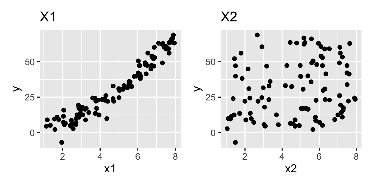
Figure 10.1 shows scatterplots of \(Y\) against the predictors, showing the curved relationship with \(X_1\) is obvious, though the relationship with \(X_2\) is hard to see in this plot.
If we do not know the true population relationships, we might choose to fit a quadratic for both terms, since the scatterplots have made us suspicious. We can do this by using the I() syntax described in Section 6.2:
quadratic_fit <- lm(
  y ~ x1 + I(x1^2) + x2 + I(x2^2),
  data = quadratic_data
)quadratic_fit.
| Characteristic | Beta | 95% CI | p-value |
|---|---|---|---|
| x1 | 0.15 | -1.3, 1.6 | 0.8 |
| I(x1^2) | 0.97 | 0.81, 1.1 | <0.001 |
| x2 | 2.3 | 0.64, 3.9 | 0.007 |
| I(x2^2) | -0.14 | -0.32, 0.03 | 0.10 |
| Abbreviation: CI = Confidence Interval | |||
Table 10.1 gives the parameter estimates from this model. We can see the estimates are reasonable, though the confidence intervals can be somewhat wide. A larger sample size would be helpful here.
While adding polynomial terms individually, as in Example 10.1, is perfectly reasonable, it can have numerical disadvantages. If the predictor \(X_1\) has a large range, \(X_1^d\) can be very large (for large \(X_1\)) or very close to 0 (for \(|X_1| < 1)\), and in both cases floating-point numbers may not be sufficient to represent \(X_1^d\) with full accuracy. This will cause the estimated \(\hat \beta\) to differ from what it should be when calculated precisely. Also, again depending on the range of \(X_1\), the regressors \(X_1^d\) and \(X_1^{d+1}\) can be highly correlated (i.e. nearly linearly dependent), causing the estimated variances for their coefficient estimates to be very large.
An alternative approach is to use orthogonal polynomials. Instead of producing regressors \(X_1\), \(X_1^2\), \(X_1^3\), and so on, we produce regressors that span the same space but are constructed so their columns of \(\X\) are orthogonal to each other. (For a brief description of a common approach to constructing such regressors, see Gentle (2017), section 8.8.2.) These avoid the numerical issues but let us fit the same model, with the disadvantage that the coefficients are now coefficients for the orthogonal basis vectors, rather than the interpretable terms \(X_1^d\).
Exercise 10.1 (Orthogonal polynomials) If the design matrix is constructed using an orthogonal polynomial basis, what special property will the matrix \(\var(\hat \beta) = \sigma^2 (\X\T \X)^{-1}\) have?
Example 10.2 (Orthogonal bases in R) Returning to Example 10.1, we can fit the same model using the poly() function, which automatically constructs orthogonal regressors:
orth_quadratic_fit <- lm(
  y ~ poly(x1, degree = 2) + poly(x2, degree = 2),
  data = quadratic_data
)orth_quadratic_fit. Compare these to Table 10.1.
| Characteristic | Beta | 95% CI | p-value |
|---|---|---|---|
| x1 | |||
| poly(x1, degree = 2)1 | 197 | 191, 203 | <0.001 |
| poly(x1, degree = 2)2 | 38 | 32, 44 | <0.001 |
| x2 | |||
| poly(x2, degree = 2)1 | 19 | 13, 25 | <0.001 |
| poly(x2, degree = 2)2 | -5.1 | -11, 1.0 | 0.10 |
| Abbreviation: CI = Confidence Interval | |||
The coefficients, shown in Table 10.2, can’t easily be interpreted directly: they are the coefficients for the orthogonal polynomials, not for \(X_1\), \(X_1^2\), and so on. But the model is identical to that in Example 10.1, as we can see by comparing their fitted values \(\hat \Y\):
max(abs(fitted(quadratic_fit) -
          fitted(orth_quadratic_fit)))
[1] 7.105427e-14This tiny difference is due to numerical differences in the fit procedures and construction of the regressors, rather than representing a true difference in the least-squares estimate.
10.1.3 Interpretation
When a predictor enters our model through multiple polynomial regressors, interpreting the coefficients individually is difficult. Consider a simple quadratic model with one predictor, where \[ Y = \beta_0 + \beta_1 X + \beta_2 X^2 + e. \] The sign of \(\beta_1\) indicates the overall trend, and the sign of \(\beta_2\) tells us if the relationship curves upwards (\(\beta_2 > 0\)) or downwards (\(\beta_2 < 0\)). But just as we saw with interaction regressors in Section 7.5, we can no longer interpret them individually as changes in the mean of \(Y\).
For example, it would make no sense to say “\(\beta_1\) represents the change in the mean of \(Y\) when \(X\) is increased by one unit, holding the other regressors fixed”, because we cannot hold the other regressors fixed: increasing \(X\) by one unit will change \(X^2\).1 The relationship is nonlinear, so it can no longer be summarized by one slope. Similarly, a test of the null hypothesis \(H_0: \beta_1 = 0\) is likely not useful, since that would only test whether the slope is 0 when \(X = 0\); that might be useful to test some very specific theory, but more often we want to test whether \(X\) is associated with \(Y\) at all, in which case we want to test \(H_0: \beta_1 = \beta_2 = 0\). We will learn how to conduct these tests in Section 11.3.
Fortunately polynomial models (for reasonable degrees) are still simple enough that many audiences would understand a formula for predicting \(Y\). But to better illustrate the relationship, particularly when there are interactions or multiple predictors modeled with polynomials, effect plots are useful.
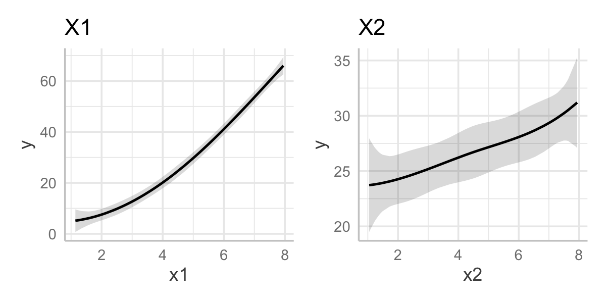
Example 10.3 (Effect plots for polynomials) In Example 10.1 and Example 10.2, we fit the model orth_quadratic_fit that was polynomial (with \(d = 2\)) in two predictors. We used orthogonal polynomials, making the coefficients difficult to interpret. Figure 10.2 shows effect plots for \(X_1\) and \(X_2\), in which the quadratic relationship for \(X_1\) and the nearly linear estimate for \(X_2\) are clear.
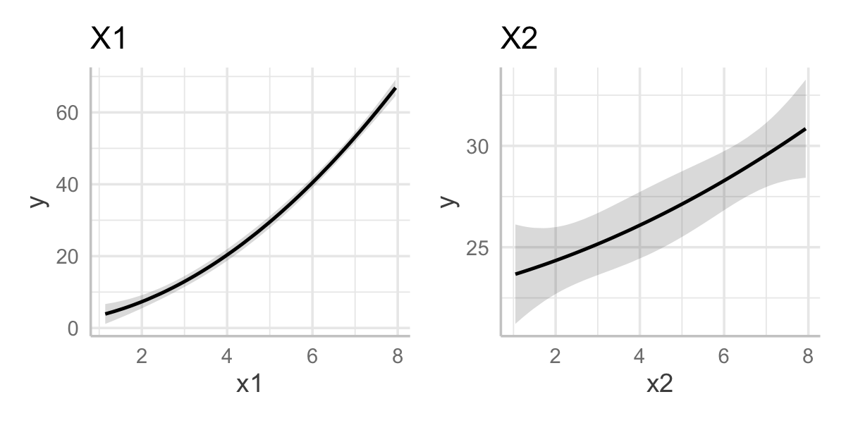
orth_quadratic_fit.
10.1.4 Downfall
The simplicity of polynomials is appealing, but they have significant weaknesses. First, and most simply, as \(x \to \pm \infty\), any univariate polynomial function \(f(x)\) tends to \(\pm \infty\)—and for degree \(d \geq 2\), the first derivative \(f'(x)\) also tends to \(\pm \infty\). If we observe data over an interval \(X \in [a, b]\), for values \(x < a\) or \(x > b\), a polynomial regression function will tend to diverge off towards \(\pm \infty\) with rapidly increasing slope. This makes them poor at extrapolation, sometimes even small amounts outside the observed range.
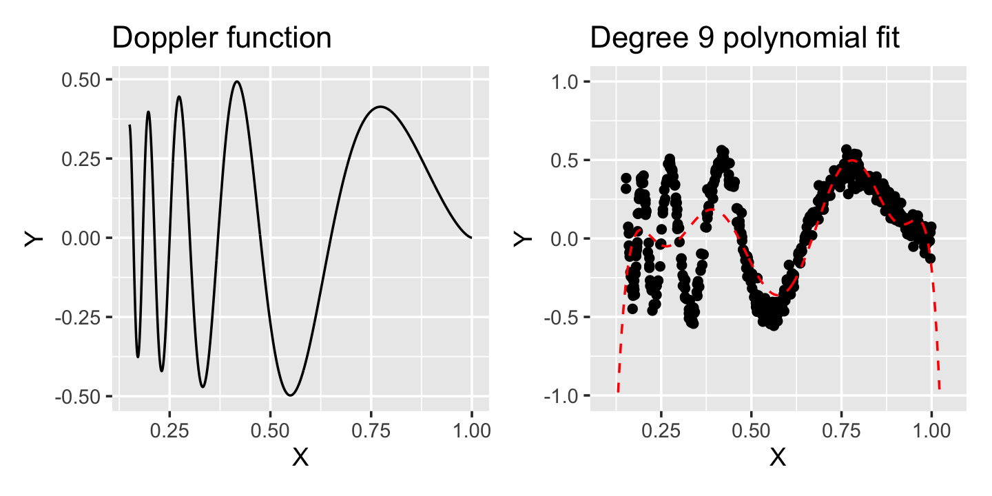
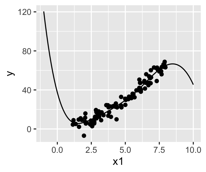
For more complex nonlinear relationships, polynomials can require a high degree and have strange behavior. The curve shown in Figure 10.3, known as the Doppler function, is more sharply curved on the left side and smoother on the right side of its range; but even with a 9th-degree polynomial fit, we cannot fit the data well. The polynomial cannot “adapt” to the local curvature of the data: it works well on the right, where the curvature is less, but is not flexible enough on the left, where more curvature is needed. It also diverges sharply just outside the range of the data.
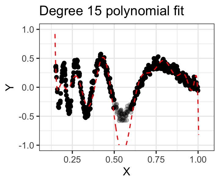
Moving to even higher degrees tends to only exacerbate these issues: the function will have more turning points (minima, maxima, and inflection points) because its first derivative has more roots. Figure 10.4 shows a fit with \(d = 15\) to the same data, but with observations where \(x \in [0.5, 0.6]\) removed. We can see the fit is still poor (and there are additional lumps on the right-hand side where they don’t belong), and additionally the regression function goes wild in the gap, illustrating another reason polynomials tend to extrapolate very poorly, even when extrapolation should be easy.
10.2 Splines
Splines attempt to solve some of the problems inherent to polynomials. To make polynomials more flexible to fit more complicated relationships, we need to add terms of higher degree, causing ourselves more and more problems; but in a spline, we can adapt to the relationships in the data while keeping the maximum degree fixed.
10.2.1 Regression splines
Regression splines model relationships as being piecewise polynomial. They require us to choose knots, which are the fixed points between which the function is polynomial.
Definition 10.1 (Regression splines) A regression spline of degree \(d\) with knots \(c_1 \leq c_2 \leq \dots \leq c_K \in \R\) is a function \(f(x)\) that satisfies the following properties:
- In each of the intervals \((-\infty, c_1]\), \([c_1, c_2], \dots, [c_{K-1}, c_K]\), \([c_K, \infty)\), \(f(x)\) is a polynomial of degree \(d\) at most.
- \(f(x)\) and its derivatives up to order \(d - 1\) are continuous.
It may seem as though constructing a spline function that meets these requirements and fits the data would be difficult; a piecewise polynomial regressor would be as easy as a polynomial regressor, but adding the constraint that the overall function be continuous and have continuous derivatives would imply complicated constraints on the coefficients. But this is not so: With some care, we can construct a basis of regressors that span the space of regression splines, with the constraints automatically satisfied.
Example 10.4 (A simple spline basis) Suppose we would like to construct a regression spline with degree \(d = 1\) and knots \(c_1\) and \(c_2\). With degree \(d = 1\), the regression spline is piecewise linear and continuous at the knots, but its first derivative is not continuous.
Consider defining the basis functions \[\begin{align*} h_1(x) &= 1 & h_3(x) &= \max\{0, x - c_1\} \\ h_2(x) &= x & h_4(x) &= \max\{0, x - c_2\}. \end{align*}\] Suppose we have one predictor \(X\). With \(n\) observations \(x_1, x_2, \dots, x_n \in \R\), we can construct the design matrix \[ \X = \begin{pmatrix} h_1(x_1) & h_2(x_1) & h_3(x_1) & h_4(x_1)\\ \vdots & \vdots & \vdots & \vdots\\ h_1(x_n) & h_2(x_n) & h_3(x_n) & h_4(x_n) \end{pmatrix}. \] We can now verify that for any \(\beta \in \R^4\), this represents a piecewise linear function that is continuous in \(X\). The fitted value at a location \(X = x\) is \[\begin{align*} r(x) &= \beta_1 h_1(x) + \beta_2 h_2(x) + \beta_3 h_3(x) + \beta_4 h_4(x)\\ &= \beta_1 + \beta_2 x + \beta_3 \max\{0, x - c_1\} + \beta_4 \max\{0, x - c_2\}, \end{align*}\] and it is easy to verify that at the knots \(c_1\) and \(c_2\), this function is continuous in \(x\). (Try it!)
Example 10.4 reveals a fundamental property of splines. With two knots, there are three regions: \(x < c_1\), \(c_1 \leq x \leq c_2\), and \(x > c_2\). If the function is linear in each region, there is a slope and intercept in each region; consequently there would be six total parameters. But we chose a spline basis that only required four parameters. That is because the two constraints—that the function must be continuous at \(x = c_1\) and \(x = c_2\)—removed two degrees of freedom; two of the parameters can be written in terms of the other four.
The basis in Example 10.4 is simple and easy to understand, but it is not the basis we typically use when doing regression. While it can be extended to higher degrees (see Seber and Lee (2003), equation 7.16), doing so can cause some of the same numerical problems we discussed for polynomials. Just as with polynomials, we can choose a different basis that spans the same column space but avoids the problem. The most common choice is the B-spline basis.
We will not get into the mathematical details here; for a detailed description of the B-spline basis, see Seber and Lee (2003) section 7.2.2. It is sufficient to point out that R can calculate the B-spline basis using the function bs() in the splines package (which is provided with R).
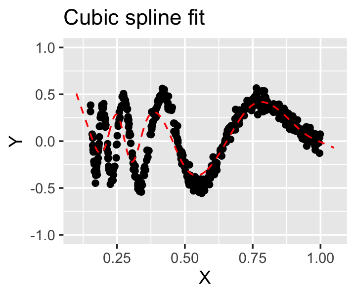
Example 10.5 (A simple spline) Let us again return to the data simulated in Example 10.1. Let’s try using regression splines of degree \(d = 3\), known as cubic splines. We will choose one knot per predictor, setting them arbitrarily to the middle of the range:
library(splines)

spline_fit <- lm(
  # knots argument is a vector of knot locations:
  y ~ bs(x1, knots = 4.5, degree = 3) +
    bs(x2, knots = 4.5, degree = 3),
  data = quadratic_data
)
spline_fit. Notice that because these are cubic splines, there can be multiple turning points on each side of the knot at \(x = 4.5\).
Rather than interpreting the coefficients (which would be difficult), we can look at effect plots to see the shape of the relationship, shown in Figure 10.5. We can see the spline has estimated the quadratic relationship with \(X_1\) quite well; the relationship with \(X_2\) has curvature but also large confidence bands indicating the relationship could be linear (or even curved the other way).
As is traditional in statistics, splines solve one problem (fitting nonlinear relationships) by creating new problems: now we must choose the degree and the knots! Fortunately the degree is easy to choose, as statisticians almost universally use \(d = 3\), creating cubic splines. Cubic splines are continuous in their first and second derivatives, making the knots almost visually imperceptible in plots of the spline; this is the lowest degree with this property, and higher degrees can cause problems similar to what we saw with polynomials. Coincidentally, the bs() function defaults to cubic polynomials if no degree argument is provided.
Choosing the knots is harder. Adding more knots makes the spline more flexible, so the number of knots should be related to the amount of data: if we have few observations, it would be hard to justify having numerous knots. One typical approach is to use quantiles of the data as knots, picking the minimum number of knots to achieve a good fit. Quantiles have the advantage of adapting the spline to the data. For example, if \(X\) is mostly concentrated in a small portion of \(\R\), with a few values outside that region, using quantiles as knots would concentrate most of the knots in that small portion of \(\R\) where there are many observations. This allows the model to be very flexible in that region, but restricts it (by restricting the number of knots) outside that region.
Another option is to make the knot choice even more data driven: make each unique value of \(X\) a knot. Obviously this cannot work without additional changes, as it would make more parameters than observations, but in Section 14.1.1 we will build on splines and penalization to make this possible.
10.2.2 Natural splines
Regression splines, despite their many advantages, do have one disadvantage. Consider a cubic spline \(f(x)\) with \(K\) knots at \(c_1, c_2, \dots, c_K\). When \(x < c_1\) or \(x > c_K\), the function is cubic, and will diverge towards infinity as we get farther from the knot. Figure 10.6 shows this phenomenon when cubic splines are fit to data with a smooth curve: outside the range of the data, the spline fits become very unrealistic. Extrapolation from this fit would be extremely unwise.
A solution is to require the spline to be linear outside the first and last knots. In principle we could do this for splines of any degree, but as cubic splines are the only degree commonly used, it’s generally only done for cubic splines.
Definition 10.2 (Natural cubic splines) A natural cubic spline with knots \(c_1 \leq c_2 \leq \dots \leq c_K \in \R\) is a function \(f(x)\) that satisfies the following properties:
- In each of the intervals \([c_1, c_2], [c_2, c_3], \dots, [c_{K-1}, c_K]\), \(f(x)\) is a cubic polynomial.
- In the intervals \((-\infty, c_1]\) and \([c_K, \infty)\), \(f(x)\) is linear.
- \(f(x)\) and its first and second derivatives are continuous.
Cubic splines limit the amount of mischief the fit can cause outside this range, since the slope will remain constant instead of diverging to \(\pm \infty\), and makes mild extrapolation less likely to be wildly erroneous.
Natural spline bases can be computed in very similar ways as regression spline bases, and R provides the ns() function in the splines package to do so.
Example 10.6 Let’s return the Doppler function shown in Figure 10.3 and see if a natural spline will fit it better. The data is in the data frame doppler_samp. In the data, \(x \in [0.15, 1]\), so we can choose knots in this range. We know the relationship is more complicated for small \(x\), so we can choose more knots in that region:
knots <- c(0.2, 0.25, 0.3, 0.35, 0.5, 0.75, 0.95)

doppler_spline <- lm(y ~ ns(x, knots = knots),
                     data = doppler_samp)
Here the knots argument defines the internal knots, and ns() by default adds boundary knots at the minimum and maximum values of the variable, outside of which the spline is linear.
As shown in Figure 10.7, this fits reasonably well—certainly much better than the polynomial we tried earlier. And this fit only has 9 parameters, compared to 10 for the degree 9 polynomial that fit so poorly!
This example reveals a strength of natural splines (and regression splines): they can adapt well to different data and strange relationships. But it also highlights a weakness: we must somehow choose the number of knots and their locations. There is no obvious way to do so a priori and no simple formula or technique to determine if a particular placement is best. When we return to splines in Chapter 14, we will discuss a different version of splines (smoothing splines) that bypass this problem, giving us a single tuning parameter to control the smoothness of the fit.
10.2.3 Multivariate splines
Splines can model complicated univariate relationships, but as presented so far, they do not allow for complicated multivariate relationships. If we have two univariate predictors \(X_1\) and \(X_2\), we could of course model \[ Y = f_1(X_1) + f_2(X_2) + e, \] where \(f_1\) and \(f_2\) are regression splines. But this model is additive: it assumes \(X_1\) and \(X_2\) have separate associations with \(Y\) that can be added together. Or, in other words, it assumes that \(X_1\)’s relationship with \(Y\) is the same regardless of the value of \(X_2\).
Unlike in linear regression, there is not an obvious interaction trick here: adding a product regressor \(X_1 X_2\) would allow the linear association of each predictor to vary based on the other, but we are using splines because the relationship is nonlinear.
For now we will leave this problem unsolved. We will return to splines in Chapter 14, when we will use them to build a much more flexible class of models and will discuss generalizations of splines to multiple dimensions. These generalizations will allow us to build a flexible multivariate function of the predictors directly.
10.2.4 Interpretation
As with polynomials, the interpretation of splines is not straightforward. There is no one-number summary that summarizes how the predictor is associated with the response variable, and while we can construct confidence intervals and tests for coefficients using the same methods we described in Section 5.4.1, the results would not be helpful to us.
If our research question asks “Is there an association between this predictor and the response?”, it may be sufficient to conduct a hypothesis test for whether there is any association at all. We will discuss a general procedure for this in Chapter 11.
But we are more often interested in the shape of the relationship, whether it is generally positive or negative, its minima or maxima, or other features. Here effect plots are again useful. Effect plots, introduced in Section 7.7, graphically summarize the shape of the relationships and are an excellent option. We could also be interested in whether the shape of the relationship differs by group—that is, if a continuous predictor has a different relationship with the outcome depending on the level of a factor predictor. We can achieve this by allowing an interaction between the factor and the regression spline regressors, which amounts to allowing the spline coefficients to vary by factor level. When we learn inference in Chapter 11, we will also see how to conduct hypothesis tests to determine if the interaction terms are statistically significant, which amount to tests of the null hypothesis that the different groups have identical relationships with \(Y\).
Example 10.7 (Splines with interactions) Let’s create a population with two predictors: \(X_1\) is continuous with a nonlinear association with \(Y\), while \(X_2\) is a binary factor with levels “duck” and “goose”.
interact_pop <- population(
  x1 = predictor(runif, min = -4, max = 4),
  x2 = predictor(rfactor, levels = c("duck", "goose")),
  y = response(
    by_level(x2, duck = 1, goose = -1) * x1**2,
    family = gaussian(),
    error_scale = 3.0
  )
)

interact_data <- interact_pop |>
  sample_x(n = 100) |>
  sample_y()
The regressinator provides rfactor() to make it easy to draw factors; by default, each factor level is equally likely. The by_level() function similarly lets us assign values to factor levels, so in this case, the relationship is \(Y = X_1^2 + e\) for ducks and \(Y = -X_1^2 + e\) for geese. The sample from this population is shown in the left panel of Figure 10.8.
We can fit an interaction model to this data similarly to how we would in any other regression. We will choose two knots, at \(X_1 = \pm 2\), and use natural splines. The right panel of Figure 10.8 shows the effect plot for this fit, demonstrating that the two groups effectively have different spline fits.
interact_fit <- lm(y ~ ns(x1, knots = c(-2, 2)) * x2,
                   data = interact_data)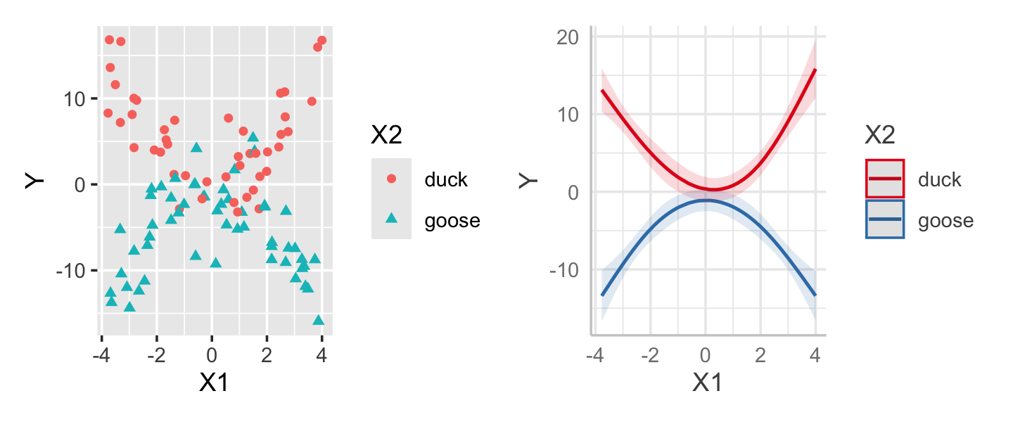
interact_fit.
Exercises
Exercise 10.2 (Regression spline degrees of freedom) Derive a formula for the minimum number of parameters required to describe regression splines of degree \(d\) with \(K\) knots.
Exercise 10.3 (Natural spline degrees of freedom) Derive a formula for the minimum number of parameters required to describe natural splines of degree \(d\) with \(K\) knots.
Exercise 10.4 (Splines for the SAT data) Let’s again return to the SAT data from Exercise 2.11 and Exercise 9.11. In Exercise 9.11, we built a model to determine which states have students who perform the best on the SAT relative to the money spent on education, after adjusting for confounding factors. However, you may have observed that some of the relationships appeared nonlinear, so let’s now try a similar analysis but with splines to allow nonlinear trends.
- Build a scatterplot matrix of the predictors and response variables plotted against each other. Include all the predictors you used in Exercise 9.11. Comment on which marginal relationships appear to be nonlinear.
- Refit your model but with natural spline terms for those predictors. Create effect plots for the relationship between takers and SAT score, and for the relationship between expenditures and SAT score.
- Produce an updated ranking of states. Compare it to your previous ranking. Comment on any differences in ranking: can you explain why those states changed their position in the ranking?
Notice that splines are useful in this problem because we do not need to interpret coefficients to give our answers: using a nonlinear model is reasonable because it allows us to better control for confounding but causes no problems in interpreting the results.
Unless \(X = -1/2\), in which case \(X^2 = 1/4\) and increasing \(X\) by one unit still produces \(X^2 = 1/4\).↩︎