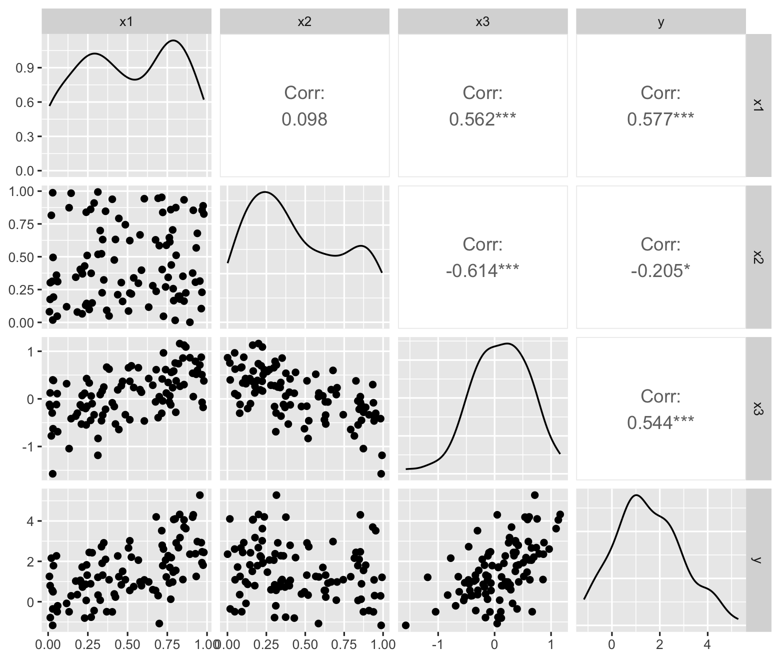
nice_pop <- population(
  x1 = predictor(rnorm, mean = 5, sd = 4),
  x2 = predictor(runif, min = 0, max = 10),
  y = response(
    4 + 2 * x1 - 3 * x2, # relationship between X and Y
    # errors are multiplied by this scale factor:
    error_scale = 3.0
  )
)

nice_sample <- nice_pop |>
  sample_x(n = 100) |>
sample_y()9 Regression Assumptions and Diagnostics
\[ \DeclareMathOperator{\E}{\mathbb{E}} \DeclareMathOperator{\R}{\mathbb{R}} \DeclareMathOperator{\RSS}{RSS} \DeclareMathOperator{\AIC}{AIC} \DeclareMathOperator{\bias}{bias} \DeclareMathOperator{\MSE}{MSE} \DeclareMathOperator{\VIF}{VIF} \DeclareMathOperator{\var}{Var} \DeclareMathOperator{\cov}{Cov} \DeclareMathOperator{\cor}{Cor} \DeclareMathOperator{\se}{se} \DeclareMathOperator{\trace}{trace} \DeclareMathOperator{\vspan}{span} \DeclareMathOperator{\proj}{proj} \newcommand{\condset}{\mathcal{Z}} \DeclareMathOperator{\cdo}{do} \newcommand{\ind}{\mathbb{I}} \newcommand{\T}{^\mathsf{T}} \newcommand{\X}{\mathbf{X}} \newcommand{\Y}{\mathbf{Y}} \newcommand{\Z}{\mathbf{Z}} \newcommand{\zerovec}{\mathbf{0}} \newcommand{\onevec}{\mathbf{1}} \newcommand{\trainset}{\mathcal{T}} \DeclareMathOperator*{\argmin}{arg\,min} \DeclareMathOperator*{\argmax}{arg\,max} \DeclareMathOperator{\SD}{SD} \newcommand{\dif}{\mathop{\mathrm{d}\!}} \newcommand{\convd}{\xrightarrow{\mathrm{D}}} \DeclareMathOperator{\logit}{logit} \newcommand{\ilogit}{\logit^{-1}} \DeclareMathOperator{\odds}{odds} \DeclareMathOperator{\dev}{Dev} \DeclareMathOperator{\sign}{sign} \DeclareMathOperator{\normal}{Normal} \DeclareMathOperator{\binomial}{Binomial} \DeclareMathOperator{\bernoulli}{Bernoulli} \DeclareMathOperator{\poisson}{Poisson} \DeclareMathOperator{\multinomial}{Multinomial} \DeclareMathOperator{\uniform}{Uniform} \DeclareMathOperator{\edf}{edf} \]
So far we have considered the regression model \(\Y = \X \beta + e\), with a variety of assumptions:
- The errors have mean 0: \(\E[e] = 0\)
- The error variance is constant: \(\var(e \mid \X) = \sigma^2 I\)
- The errors are uncorrelated: \(\var(e \mid \X) = \sigma^2 I\). (Yes, the math is the same, but we can violate it in different ways)
- The errors are normally distributed.
We’ve also assumed that \(\X\) is fixed, not random.
Assumptions are not magical. If I fit a regression model to data with non-normal errors with non-constant variance, I will still get an estimate \(\hat \beta\), and it may even be a reasonably good estimate. The assumptions are not necessary for fitting the model, only for some of the mathematical results we have derived about bias, variance, and tests for \(\hat \beta\). Let’s examine the consequences, using the regressinator to construct examples and simulations.
9.1 Residual diagnostics
As many of the regression assumptions involve the errors, plots of the observed residuals will be useful to determine if our model has fit well. Section 5.5 lists several varieties of residuals we can use:
- Raw residuals, i.e., \(\hat e = \Y - \hat \Y\)
- Standardized residuals
- Studentized residuals
- Partial residuals
To determine if the mean or variance of the residuals varies proportional to \(\X\) in some way, many of our residual plots will plot the residuals against individual predictors or linear combinations of them. To check the variance of the errors, the standardized or Studentized residuals are usually the best choice, because the raw residuals have unequal variance even if all regression assumptions hold (Theorem 5.8).
Consider plotting the Studentized residuals \(t_i\) against \(U \in \R^n\), where \(U\) is one of the columns of \(\X\) or a linear combination of them (such as the fitted values \(\hat \Y = \X \hat \beta\)). When all the model assumptions above hold,
- The residual mean function \(\E[t_i \mid U]\) is 0 everywhere. In a scatterplot, the residuals should be roughly equally above and below the \(x\) axis, and there should not be obvious trends or curvature suggesting the mean is higher in some places than others.
- The Studentized residuals have constant variance, so the scatter of residuals above and below 0 should be similar for different values of \(U\).
This means the ideal residual plot looks like a “null plot”, a scatterplot with no obvious trends or patterns.
Example 9.1 (Well-specified model) Let’s consider a well-specified model, where all assumptions hold, to see these residual plots in action.
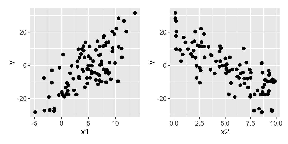
A good first step is always to plot the original data, to be sure there are no surprises. The plots in Figure 9.1 look reasonable. Let’s now fit a simple model.
fit <- lm(y ~ x1 + x2, data = nice_sample)To make diagnostics, we will use the augment() function from broom. As described in Section 6.4, this gives us a data frame of every observation, its fitted value, and the residuals. For example, we can plot the residuals against the fitted values, which is a good first check:
library(broom)

augment(fit) |>
  ggplot(aes(x = .fitted, y = .resid)) +
  geom_point() +
  geom_smooth(se = FALSE) +
  labs(x = "Fitted value", y = "Residual")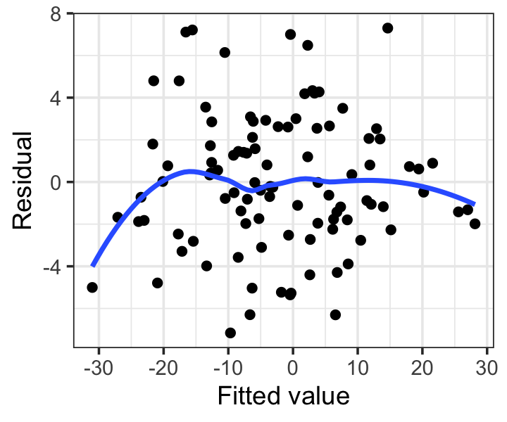
Notice we have added a smoothing line, which helps us check if the mean appears to deviate from 0. This plot looks okay: any deviations from a flat line are small, and appear to be driven by only one or two observations.
Scatterplots will not help us judge if the residuals are normally distributed, unless the scatterplot is particularly pathological (e.g., all the residuals only take on a few discrete values, or there is obvious skew). Instead, we can use a quantile-quantile plot of the standardized or Studentized residuals. If the assumptions are correct, they should be approximately normally distributed with equal variance. To check this, if there are \(n\) residuals, we calculate the expected value of the minimum of \(n\) draws from a standard normal distribution, the expected value of the second-smallest of \(n\) draws from a standard normal distribution, and so on; call these the “theoretical quantiles”. For each residual, we plot its actual value against the expected value: for example, for the smallest observed residual, we plot it against the expected value of the smallest of \(n\) draws.
In the ideal case where every residual is equal to its expected value, this plot will be a diagonal line; but of course the residuals are random, so some deviation is to be expected.
Example 9.2 (Q-Q plots of residuals) The quantile-quantile plot (Q-Q plot) for Example 9.1 is easy to make. The .std.resid column from augment() contains the standardized residuals:
augment(fit) |>
  ggplot(aes(sample = .std.resid)) +
  geom_qq() +
  geom_qq_line() +
  labs(x = "Theoretical quantiles",
       y = "Observed quantiles")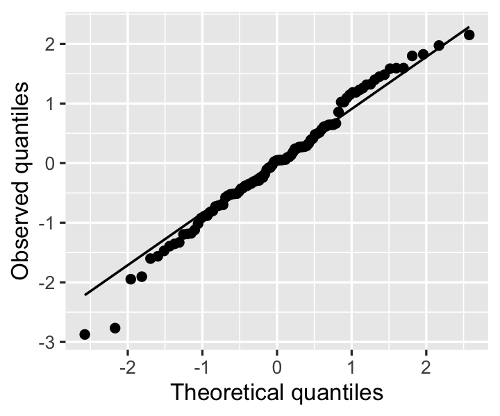
In this plot, we look for the residuals to fall roughly on the diagonal line, which would indicate the residuals are equal to their theoretical expectations if they are normally distributed. Slight deviations are not alarming: the residuals are standardized by their estimated variance, not the true variance, so they are not exactly normal.
To test for the errors not having mean 0—a sign that the true relationships are nonlinear—partial residual plots are easier to interpret than other residual plots. Partial residuals are not standardized and hence have unequal variance, but when the true relationship is nonlinear, partial residual plots may suggest what kind of transformation or additional terms could better fit the data.
Example 9.3 (Partial residuals of a well-specified model) The regressinator provides the partial_residuals() function to obtain partial residuals. Because there is a partial residual vector for every predictor, we can make one partial residual plot per predictor. We will plot the partial residuals, a smoothed line showing their trend, and a line (or curve) for the model predictions. (This line is the predictor effect, as defined in Definition 7.3, but shifted to align with the partial residuals.)
partial_residuals(fit) |>
  ggplot(aes(x = .predictor_value, y = .partial_resid)) +
  geom_point() +
  geom_line(aes(y = .predictor_effect)) +
  geom_smooth(se = FALSE) +
  facet_wrap(vars(.predictor_name), scales = "free") +
  labs(x = "Predictor value", y = "Partial residual")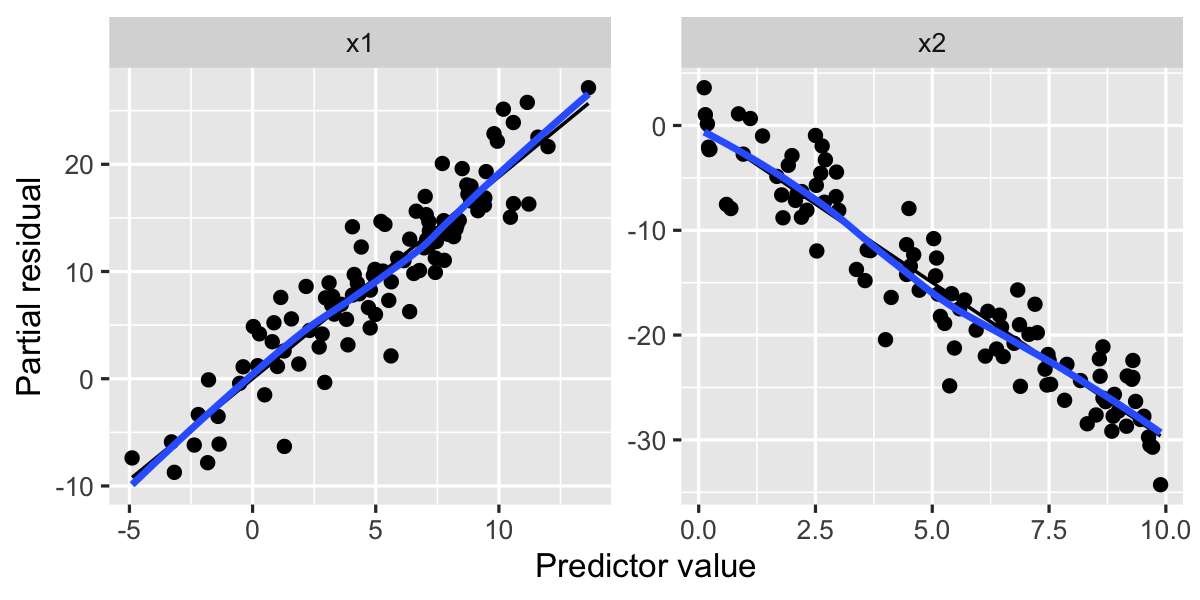
Both of these plots look quite linear, with no major deviations from a straight line, suggesting the relationships are indeed linear.
Now let’s consider a series of model misspecification scenarios and see how these residual diagnostics help reveal them.
9.2 Mean function misspecification
9.2.1 Nonlinearity
If we fit a linear model, but the true relationship between some of the predictors and \(Y\) is nonlinear, plots of partial residuals (Definition 5.5) may be the most useful way to diagnose this problem.
Example 9.4 (Nonlinear relationship) In this population, x1 is quadratically related to y, while x2 is linearly related.
nonlinear_pop <- population(
  x1 = predictor(runif, min = 1, max = 8),
  x2 = predictor(runif, min = 1, max = 8),
  y = response(0.7 + x1**2 + 0.8 * x2,
               family = gaussian(),
               error_scale = 4.0)
)

nonlinear_data <- sample_x(nonlinear_pop, n = 100) |>
  sample_y()

nonlinear_fit <- lm(y ~ x1 + x2, data = nonlinear_data)
We can quickly make the partial residual plot:
partial_residuals(nonlinear_fit) |>
  ggplot(aes(x = .predictor_value, y = .partial_resid)) +
  geom_point() +
  geom_line(aes(y = .predictor_effect)) +
  geom_smooth(se = FALSE) +
  facet_wrap(vars(.predictor_name), scales = "free") +
  labs(x = "Predictor value", y = "Partial residual")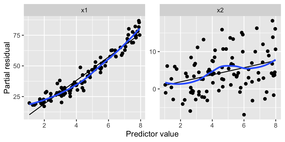
Notice that in the left plot, for x1, the smoothed residuals (in blue) resemble a plot of \(x^2\) from \(x = 1\) to \(x = 8\), while the right plot appears roughly linear. By examining the left plot, we determine we should try a model fit with a quadratic term, and indeed this fit has better partial residuals:
lm(y ~ x1 + I(x1^2) + x2, data = nonlinear_data) |>
  partial_residuals() |>
  ggplot(aes(x = .predictor_value, y = .partial_resid)) +
  geom_point() +
  geom_line(aes(y = .predictor_effect)) +
  geom_smooth(se = FALSE) +
  facet_wrap(vars(.predictor_name), scales = "free") +
  labs(x = "Predictor value", y = "Partial residual")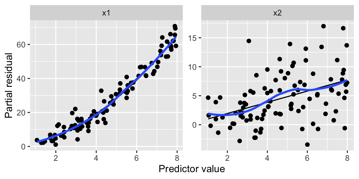
Here the smoothed lines and fitted lines match much better, particularly on the left, where the fitted line’s curvature matches the smoothed residuals very well.
9.2.2 Missing predictors
Another way a model can be misspecified is by not including relevant predictors. We do not always want to include every possible predictor; as discussed in Chapter 2, we can use causal diagrams to determine which variables we must include to measure our effect of interest. But what if one of the relevant variables is not available to us or we do not include it in our model? There is no diagnostic that will reveal this to us directly; our only defense is a strong understanding of the data, how it was generated, and what factors may influence the outcome.
We have already seen situations where the inclusion or omission of a predictor may strongly change our results, such as in Example 7.1 and Exercise 8.4. Omitting a confounding variable will bias our other estimates; this is known as omitted variable bias. You’ll explore example scenarios in Exercise 9.1.
9.2.3 Missing interactions
Detecting missing interaction terms can be difficult. They do not typically show up as obvious patterns in residual diagnostics. However, depending on the types of variables, it may be able to detect them with partial residual plots.
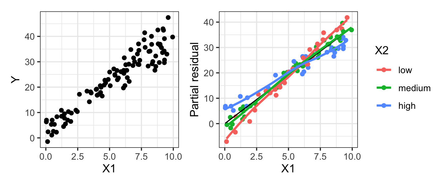
Example 9.5 (Missing factor interaction) Consider a population where \(X_1\) and \(X_2\) predict \(Y\), but with an interaction. \(X_1\) is a continuous variable and \(X_2\) is a factor with three levels. The factor affects both the intercept and the slope of the relationship between \(X_1\) and \(Y\), as shown in the population below.
miss_interact_pop <- population(
  x1 = predictor(runif, min = 0, max = 10),
  x2 = predictor(rfactor, levels = c("low", "medium", "high")),
  y = response(
    by_level(x2, low = 0, medium = 2, high = 4) +
      by_level(x2, low = 5, medium = 4, high = 3) * x1,
    error_scale = 2
  )
)

miss_interact_samp <- miss_interact_pop |>
  sample_x(n = 100) |>
  sample_y()

no_interact_fit <- lm(y ~ x1 + x2, data = miss_interact_samp)
Figure 9.2 illustrates that the interaction may not be visible in the scatterplot of \(X_1\) versus \(Y\), so exploratory data analysis alone cannot detect it. However, if we color-code the partial residuals of no_interact_fit by \(X_2\), we can see there appears to be a different slope for each level of \(X_2\), demonstrating that an interaction is present. Color-coding the scatterplot of the raw data would also work here, but would be less useful if there were many other predictors, as these would contribute variance to \(Y\) that would be removed in the partial residual plot.
As Example 9.5 illustrates, sometimes an interaction can be detected in partial residuals by color-coding by the interacting variable (or constructing separate plots for each level). If the interacting variable is continuous, this is more difficult; it may be possible to bin it into several variables for display purposes. Ultimately, however, most practitioners detect interactions using hypothesis tests, such as the partial \(F\) test of Section 11.3.
9.2.4 Incompletely observed predictors
In some cases, we may determine that we need to include several predictors in our model in order to estimate the desired association or causal effect, but some of those predictors are incompletely observed. For instance, in a medical study we might only observe a binary indicator of whether the patient has high blood pressure, not their actual blood pressure; in an economic study, we may know if a family’s income is below the poverty threshold defined by a government assistance program, but not know the actual income value; in a survey, respondents may be asked their age in a question that provides answer choices like “25–34”, “35–44”, and so on, rather than indicating their exact age.
Dichotomizing a variable (deliberately converting it to a binary indicator) or discretizing it (breaking it into discrete buckets) can also be done deliberately, not due to measurement limitations. For non-statisticians, it is often easier to interpret a result that says “Families below the poverty threshold have higher rates of illness”, rather than one giving a coefficient for the change in illness rate per unit of income. For doctors, it is often convenient to have a specific threshold to act upon—if the patient’s blood test result is above a specific number, give them a specific treatment—rather than weighing complicated factors and formulas.
But dichotomization and discretization must be used with care. If we must control for (condition on) a specific variable to estimate a causal effect, discretizing or dichotomizing that variable before adding it to the model may harm our ability to accurately control for it, as you will see in Exercise 9.2.
9.3 Error misspecification
9.3.1 Heteroskedastic errors
Suppose \(\var(e) \neq \sigma^2 I\), and instead the errors have non-constant variance, so that \(\var(e)\) is a diagonal matrix whose entries on the diagonal are not all equal. Errors with non-constant variance are called heteroskedastic.1
One common type of heteroskedasticity has \(\var(e)\) be proportional to one or more of the predictors, or to the response. For example, consider modeling the sale price of homes using information about their size, number of rooms, previous sale price, distance to amenities, and so on. Here the error represents the difference between the actual sale price, which may vary due to buyer preferences, negotiations, local market conditions, and so on, and the price estimated using the house’s features. We might expect that the typical error for less valuable homes is smaller than the typical error for very expensive homes. Expensive buyers have fewer potential buyers, more individual variation due to personal and artistic tastes, and potentially many expensive features not included in a model—after all, does your linear regression model have a term for the size of the wine cellar and the presence of a helicopter landing pad? If it doesn’t, those features will contribute to large potential valuation errors.
To detect heteroskedasticity, we can examine residual plots against the predictors and the fitted values, looking for unequal scatter of the residuals. If the residuals are tightly clumped on one side of the plot and widely spread on the other, they are likely heteroskedastic.
When errors are heteroskedastic, ordinary least squares estimates are unbiased, but our estimator \(\widehat{\var}(\hat \beta) = S^2 (\X\T\X)^{-1}\) is incorrect (Exercise 9.3). Theorem 5.6 relies on this estimator to construct hypothesis tests and confidence intervals for \(\beta\), so these will be invalid.
To correct the problem, textbooks used to recommend various transformations of \(Y\) that might stabilize the variance, or suggested estimating the variance so a weighted least-squares fit could be used. A simpler approach is the sandwich estimator.
Definition 9.1 (Sandwich estimator) A sandwich estimator for the variance of \(\hat \beta\) is an estimator of the form \[ \widehat{\var}(\hat \beta) = \underbrace{(\X\T\X)^{-1}}_{\text{bread}} \underbrace{\X\T \Omega \X}_{\text{meat}} \underbrace{(\X\T\X)^{-1}}_{\text{bread}}, \] where \(\Omega\) is an \(n \times n\) square matrix.
The sandwich estimator is based on Theorem 5.4, from which we can show that \[\begin{align*} \var(\hat \beta \mid \X) &= (\X\T\X)^{-1} \X\T \var(\Y \mid \X) \X(\X\T\X)^{-1}\\ &= (\X\T\X)^{-1} \X\T \var(e \mid \X) \X(\X\T\X)^{-1}, \end{align*}\] so \(\Omega\) needs to estimate \(\var(e \mid \X)\). The basic sandwich estimator uses a diagonal matrix with \(\hat e_i^2\) on the diagonal: if \(\E[\hat e_i] = 0\), then \(\var(\hat e_i) = \E[\hat e_i^2]\), and so we may estimate the variance of each error with its square. White (1980) showed this is a consistent estimator of \(\var(\hat \beta)\) even when errors are heteroskedastic.
However, astute readers will recall that \(\var(e \mid \X) \neq \var(\hat e \mid \X)\), as Theorem 5.8 showed the residuals \(\hat e\) have unequal variance even when the errors do not. Long and Ervin (2000) showed this estimator performs poorly for small sample sizes (say, \(n \leq 250\)) as a result, and recommended an adaptation in which \(\Omega\)’s diagonal entries are \(\hat e_i^2 / (1 - h_{ii})^2\), where the \(h_{ii}\)s are the leverages.2 This estimator is known as HC3 and performs well even in small samples.
Example 9.6 (Calculating the sandwich estimator) Here is a population where the error scales with \(X_2\), i.e., \(\var(e \mid X_2 = x_2) = (0.5 + x_2 / 10)^2\):
heteroskedastic_pop <- population(
  x1 = predictor(rnorm, mean = 5, sd = 4),
  x2 = predictor(runif, min = 0, max = 10),
  y = response(
    4 + 2 * x1 - 3 * x2, # relationship between X and Y
    family = gaussian(), # distribution of the errors
    error_scale = 0.5 + x2 / 10 # std. dev. of error
  )
)

heteroskedastic_sample <- heteroskedastic_pop |>
  sample_x(n = 100) |>
  sample_y()
The sandwich estimator can be obtained from the sandwich package in R. Let’s fit a model to this heteroskedastic data and estimate \(\var(\hat \beta)\):
library(sandwich)

hfit <- lm(y ~ x1 + x2, data = heteroskedastic_sample)

vcovHC(hfit) # uses HC3 by default
(Intercept) x1 x2
(Intercept) 0.067418607 -0.0051956840 -0.0073601367
x1 -0.005195684 0.0008062106 0.0001012265
x2 -0.007360137 0.0001012265 0.0018417220The car package provides a Confint() function that works the same way as R’s built-in confint(), but supports using alternate variance matrices:
library(car)

Confint(hfit, vcov = vcovHC(hfit))
Standard errors computed by vcovHC(hfit) Estimate 2.5 % 97.5 %
(Intercept) 3.649714 3.134378 4.165049
x1 2.004658 1.948304 2.061012
x2 -2.966742 -3.051917 -2.881567Finally, the estimatr package provides an lm_robust() function that replaces lm() and uses the sandwich estimator for all reporting:
library(estimatr)

robust_fit <- lm_robust(y ~ x1 + x2, data = heteroskedastic_sample,
                        se_type = "HC3")
When you suspect heteroskedasticity is present but want to conduct inference, just use the sandwich estimator. There is no need to conduct formal tests for heteroskedasticity first: the sandwich estimator works well (and could even be used by default), and basing your modeling on the results of hypothesis tests causes problems we will explore in Section 11.5.
9.3.2 Non-normal errors
The errors \(e_i\) are not always normally distributed. Sometimes the errors come from a distribution with heavier tails; sometimes their distribution is not symmetric; and sometimes they appear to come from a “contaminated” distribution, where most errors are normally distributed but a few are abnormally large. This contamination often is caused by occasional measurement errors or observations that come from a different population. First we’ll consider ordinary non-normality, then we’ll consider contamination in the next section.
Detecting non-normality is not as easy as it sounds: We do not observe the errors \(e_i\), only the residuals \(\hat e_i\), but it is the errors that are assumed to be normal in Theorem 5.4. We could test the normality of \(\hat e_i\), but the residuals are likely to be more normal than the errors (Weisberg 2014, sec. 9.6). The residuals can be written as (Section 5.5) \[\begin{align*} \hat e &= (I - H) \Y \\ &= (I - H) (\X \beta + e) \\ &= (I - H) e, \end{align*}\] because \((I - H)\X = \zerovec\). Thus \(\hat e_i\) is a linear combination of the other \(e_j\)s: \[ \hat e_i = e_i - \sum_{j=1}^n h_{ij} e_j. \] By the central limit theorem, the sum will be approximately normal, even if the errors \(e_i\) are not approximately normal, at least for moderate sample sizes. This is called “supernormality”, and you will demonstrate it in Exercise 9.14.
Even if we do choose to test the normality of \(\hat e_i\), we must be careful: we know from Theorem 5.8 that the residuals \(\hat e_i\) have unequal variance, so we must choose a test that does not require equal variance. We could use the standardized or Studentized residuals instead, but because they involve dividing by an estimate of variance, they will not be exactly normally distributed, making tests for their normality inappropriate—the null will always be false.
Supposing we do find a test of \(\hat e_i\) that reflects the normality of \(e_i\), the central limit theorem ensures that \(\hat \beta\) is approximately normal for large \(n\). Here “large” means, say, about 500, even with very non-normal errors (Lumley et al. 2002). Thus non-normality has little effect on our inferences in large datasets (Exercise 9.5).
For smaller samples where we’re concerned about non-normality, residual Q-Q plots are usually the best way to detect non-normal errors. Using the standardized residuals, we can detect gross deviations from normality while ignoring small deviations that will make little difference to our inference.
9.3.3 Outliers and contaminated errors
Sometimes the errors are mostly well-behaved, but a few observations have very large errors. This could happen for several reasons:
- Some people, animals, or objects are just weird. The relationship \(\E[Y \mid X] = \beta\T X\) is true for most cases, but the weirdos follow a different relationship in ways not accounted for by our current predictors, and so their observed \(Y\) is far from our estimated \(\E[Y \mid X]\).
- Measurement is prone to error, and so sometimes the outcome variable is measured incorrectly. We observe \(Y = Y^* + \delta\), where \(Y^*\) is the “correct” value and \(\delta\) is some offset or measurement error.
- Data is recorded and processed by humans who sometimes forget a decimal point, add an extra 0, put numbers in the wrong column of a spreadsheet, or otherwise mess things up.
The trouble is that observations with large errors can be highly influential: they can pull our \(\hat \beta\) away from \(\beta\), causing high variance in estimates and estimated regression lines that fit the data poorly. We call such observations outliers.
Detecting and dealing with outliers requires careful judgment. Even if \(e \sim \normal(0, \sigma^2)\), we will occasionally see very large errors; that does not mean those observations are “wrong”. Not all outliers have a major effect on the regression line, either, so their presence may not be a problem. We hence need a way to detect outliers and characterize their influence on the regression line, so we can then investigate the cause of problematic outliers. If we can determine the outlier is due to some kind of measurement or recording error, we can correct the error. If we cannot, we must make the difficult decision of whether to keep the outlier—and acknowledge that it may significantly influence our estimates—or to remove it and risk throwing away good information.
Let’s begin by quantifying the influence of individual observations on the regression line.
Definition 9.2 (Leverage) The leverage of observation i is defined to be \(H_{ii}\), the \(i\)th diagonal of the hat matrix (Definition 5.1).
This definition is reasonable because \(\hat \Y = H \Y\), and so \[ \hat Y_i = \sum_{j=1}^n H_{ij} Y_j = H_{ii} Y_i + \sum_{j \neq i} H_{ij} Y_j. \] One can show that because \(H\) is symmetric and idempotent, its entries must be between 0 and 1 (Christensen 2020, sec. 13.1.2). Consequently, if \(H_{ii} \approx 1\), \(\hat Y_i \approx Y_i\). Observations with high leverage hence have the potential to pull the fitted regression line to be close to them. Potential is the key word here: an observation with high leverage may already fall along the trend line set by the other observations, and so while \(\hat Y_i \approx Y_i\), that would be true even if the observation were omitted from the fit. Leverage tells us which observations could affect the fit, but not whether they have.
Another way to see this is to note that because \(H = \X(\X\T\X)^{-1} \X\T\), the leverage depends only on \(\X\). A point can have high leverage even if it is observed with a very small error \(e\), because \(\Y\) does not enter into the leverage calculation.
TODO average hat matrix diagonal value given on 302 of SeberLee?
Instead, we can measure the influence of an observation on the regression more directly, by measuring how its inclusion changes \(\hat \beta\). We could simply measure the difference in \(\hat \beta\) when the observation is excluded from the fit, but the components of \(\hat \beta\) have different variances. The Cook’s distance is designed to account for this.
Definition 9.3 (Cook’s distance) The Cook’s distance for observation \(i\) is \[ D_i = \frac{(\hat \beta^{(i)} - \hat \beta)\T \X\T \X(\hat \beta^{(i)} - \hat \beta)}{p S^2}, \] where \(S^2\) is the variance estimate from Theorem 5.2 and \(\hat \beta^{(i)}\) is the least-squares fit when observation \(i\) is excluded. This can be seen as the Mahalanobis distance \(\delta_M(\hat \beta^{(i)}, \hat \beta)\) between \(\hat \beta^{(i)}\) and \(\hat \beta\) (Definition 3.12), which rescales the distance according to the covariance of \(\hat \beta\), scaled to be comparable across datasets.
It would appear that calculating the Cook’s distances for each observation requires fitting the model \(n\) additional times, but this is not the case. The Cook’s distance can actually be calculated directly from the leverages.
Theorem 9.1 (Cook’s distance from leverage) The Cook’s distance can be written as \[ D_i = \frac{\hat e_i^2 H_{ii}}{(1 - H_{ii})^2 p S^2} = r_i^2 \frac{H_{ii}}{p (1 - H_{ii})}, \] where \(S^2\) is the variance estimate from Theorem 5.2, \(r_i\) is the standardized residual, and \(H\) is the hat matrix.
Proof. See Seber and Lee (2003), theorem 10.1 and page 309.
The vector of Cook’s distances can be obtained in R using the cooks.distance() function, and they are included in broom’s augment() output in the .cooksd column. Because Cook’s distances can be interpreted as a distance that is rescaled proportional to the variance of \(\var(\hat \beta)\), they have a consistent scale. We can look for large values—say, \(D_i \geq 1\), though this is again a matter of judgment—to indicate that a particular observation substantially changes the regression fit.
9.4 Random X
It almost goes without saying, but to estimate \(\E[Y \mid X]\) in the population, we require good measurements of \(Y\) and \(X\). Our typical modeling approach allows for the mean to be measured with error, because we observe \(Y\) with some random error \(e\). But what if \(X\) is measured with error, so we do not measure the true underlying value but some proxy to it? The conventional linear regression model treats \(X\) as fixed, so it does not account for measurement error in \(X\). How will estimates be affected?
Formally, the problem is that we want to estimate \(\E[Y \mid X]\), but we do so by estimating \[ \hat \beta^* = \argmin_\beta \|Y - \X^* \beta\|_2^2, \] where each row \(i\) in \(\X^*\) is \[ X_i^* = X_i + \delta, \] and \(\delta\) is an error vector with some distribution. This might be because \(X_i\) involves physical quantities that have to be measured with equipment that has inherent error; because \(X_i\) is a quantity that fluctuates over time but has only been observed at one time, and the relationship of interest is with its long-term average; because we are interested in some variable that cannot be measured and instead are observing an easy-to-measure variable that is only correlated with it; because \(X_i^*\) is obtained by surveying people who may give inaccurate or misremembered answers; or for a whole variety of other reasons.
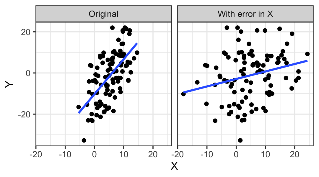
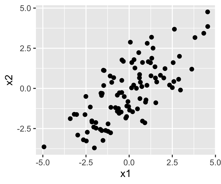
In this setting, \(\hat \beta^*\) is not unbiased for \(\beta\): \(\E[\hat \beta^*] \neq \beta\). In fact, one can show that for a regressor measured with error, \[ \E\left[\hat \beta_j^*\right] \to 0 \text{ as } \var(\delta) \to \infty. \] This is known as regression dilution: the slopes are “diluted” by the presence of measurement error. Figure 9.3 can help give us some intuition for this phenomenon: the slope is steep in the original data, but in the diluted data, adding error to \(X\) has made the relationship with \(Y\) much less obvious and reduced the slope. If we added even more error to \(X\), the scatterplot would be an amorphous blob.
The problem is similar to what we saw with dichotomization in Section 9.2.4: losing information about a predictor (because it is dichotomized or observed with error) biases our estimates for its coefficients, and if that predictor is correlated with other variables or is a confounding variable, our estimates for other predictors may also become biased (Exercise 9.9).
Regression dilution cannot be detected from the data. (How could you tell, just from a plot, that \(X\) is observed with error?) You must understand how the data was collected. For example, if you are studying a complex social question where socioeconomic status is a confounding variable, controlling for income is like controlling for socioeconomic status measured with lots of error—income is not the same as socioeconomic status, if you could even quantify socioeconomic status fully. In this context, income is a proxy variable that substitutes for socioeconomic status. It is a weak proxy because controlling for income will not control for other kinds of difference in socioeconomic status. As illustrated in Figure 9.4, this is a common problem.

You must also understand what your goals are. If you want to study the association between the predictor and response in the population, observing the predictor with error is a problem. But if you want to know the association between the predictor as observed and the response, that’s fine. For example, if you’re using self-reported income as a predictor in a regression, that has error compared to a person’s actual annual income as might be calculated by a forensic accountant; but if you want to know how self-reported income is correlated with self-esteem, it makes more sense to use what a person thinks their income is to know how they think about themselves. The measurement with error is actually the quantity of interest, not the “true” measurement.
Models to account for errors in measurement of \(X\) are available, and are called errors in variables models. They are outside the scope of this book, but you can find detailed information about them should you ever need do deal with measurement error.
9.5 Collinearity
You may have noticed that at the beginning of this chapter, when we listed the typical assumptions for a linear regression model, there was no mention of the structure of \(\X\). Unstated, perhaps because it’s too trivial to mention, is the requirement that \(\X\) have full column rank—and hence the requirement that \(\X\T \X\) be invertible. Lack of full rank would occur when some of the columns of \(\X\) can be written as linear combinations of the other columns. Such a design matrix is collinear.
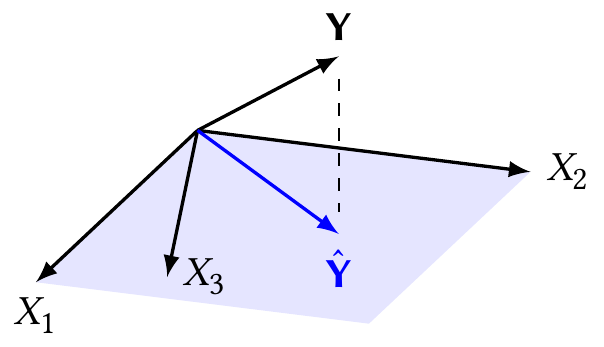
We can see the problem in Figure 9.5. When \(\X\) is not full column rank, its columns span a lower-dimensional space. There is still a unique perpendicular projection of \(\Y\) onto this space, and hence a unique \(\hat \Y = H \Y\). But the coordinates of that fit are not unique. As drawn, \(X_3 = 3 X_1 / 4 + X_2 / 3\), and we could write the best fit as \(\hat \Y = X_1/2 + 2 X_2/3\); but since we can write any \(X\) in terms of the others, there are infinite variations of this equation and hence infinite values of \(\hat \beta\) that correspond to the same \(\hat \Y\) and the same squared error.
If we care only about producing \(\hat \Y\), that is not a problem: there is still a unique value, and any of the infinite values of \(\hat \beta\) will do. But if we care about inference for \(\hat \beta\), this is a serious problem. Our data cannot distinguish between different predictors and we cannot uniquely identify their effects. We must either give up on estimating some parameters—remove those predictors from the model and hopefully make \(\X\) full rank again—or collect additional data for which the linear dependence is broken.
Perfect linear dependence seems like it would be unlikely to arise naturally, when our data is drawn from the real world, but there are some common situations.
Example 9.7 (Using proportions as predictors) Consider a set of predictors \(X_1, \dots, X_k\) representing \(k\) proportions out of a whole. For instance, each observation may be a county, and \(X_1\) is the proportion of residents who are ages 0–18, \(X_2\) is the proportion who are 18–24, and so on up to ages 100+.
The proportions must sum to one, so \[ \sum_{j=1}^k X_j = 1. \] The columns are hence perfectly linearly dependent. When using proportions in a regression, we typically leave out one category to prevent this, just as treatment contrasts drop one factor level (Definition 7.1).
Example 9.8 (Collinearity as confounding) Imagine a medical study testing a new treatment for a disease. One predictor records whether the patient received the new treatment (\(X_1 = 1\)) or the old treatment (\(X_1 = 0\)); the other predictor records whether they have a family history of the disease (\(X_2 = 1\)) or not (\(X_2 = 0\)).
Suppose the new treatment is given only to people with a family history of the disease. \(X_1\) and \(X_2\) are collinear. If people with the new treatment do poorly, we don’t know if that’s because the treatment is worse or because of their family genetics. Or, in causal terms, we cannot condition on family history to isolate the effect of treatment on their outcome:
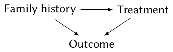
In such a situation, we would typically design the study so that treatment allocation is balanced: the treatment and control groups have equal proportions of people with and without a family history of the disease. This is known as blocking, a key tool in experimental design, and prevents the collinearity.
Perfect collinearity is easy to detect: indeed, if you provide R a dataset with perfect collinearity and run lm(), it will automatically detect it and set one or more of the collinear coefficients to NA, effectively removing them from the model. This permits a unique \(\hat \beta\) to be found.
However, more insidious is the case where \(\X\) is nearly collinear, when one or more columns can be approximately written as linear combinations of the others. In simple cases, one column can be written approximately in terms of one or two others; in difficult cases, all the columns are interrelated with each other.
Definition 9.4 (Collinearity) A design matrix \(\X\) is collinear if there exists a fixed vector \(a\) such that \[ \X a \approx \zerovec. \]
Generally, when we refer to “collinearity” we mean this definition, and use “perfectly collinear” for the special case when columns are exactly linearly dependent. We use “multicollinearity” to refer to collinearity when we want it to sound more complicated.3
Collinearity can be equivalently defined in terms of the eigenvalues of \(\X\T\X\), which will be very helpful to us.
Theorem 9.2 (Eigenvalues of collinear designs) A design matrix \(\X\) is collinear according to Definition 9.4 if and only if \(\X\T\X\) has one or more small eigenvalues.
Proof. A design is collinear if \(\X a \approx \zerovec\) for some vector \(a\), so we multiply both sides by \(a\T \X\T\) on the left: \[\begin{align*} \X a &\approx \zerovec\\ a\T \X\T \X a &\approx a\T \X\T \zerovec\\ a\T \X\T \X a &\approx 0. \end{align*}\] By Theorem 3.9, the minimum of \(a\T\X\T \X a\) is bounded by the smallest eigenvalue \(d_n\) of \(\X\T\X\), so this is equivalent to saying that \(d_n \approx 0\).
9.5.1 Statistical effects of collinearity
In principle, collinearity is not a violation of assumptions, because there are no assumptions on the structure of \(\X\) apart from having full rank. However, we can describe some of the properties of the regression estimators in terms of the amount of collinearity, which can be helpful for understanding the behavior of regression with collinear data. To do so, we will appeal to the eigenvalues of \(\X\T\X\), using results from Section 3.5.
Theorem 9.3 (Eigendecomposition of variance) Consider \(\var(a\T \hat \beta)\), where \(a\) is a fixed vector and \(\|a\|_2 = 1\). Let \(d_1, \dots, d_p\) be the ordered eigenvalues of \(\X\T\X\) and let \(u_1, \dots, u_p\) be the corresponding eigenvectors. Then \[\begin{align*} \max_{\|a\|_2^2 = 1} \var(a\T \hat \beta) &= \frac{\sigma^2}{d_p}\\ \min_{\|a\|_2^2 = 1} \var(a\T \hat \beta) &= \frac{\sigma^2}{d_1}. \end{align*}\]
Proof. By Theorem 3.8, the ordered eigenvalues of \((\X\T\X)^{-1}\) are \(1/d_p \geq \dots \geq 1/d_1\). We then apply Theorem 3.9 to \(\var(a\T \hat \beta) = \sigma^2 a\T (\X\T\X)^{-1} a\).
Because collinear design matrices have small eigenvalues, the maximum possible variance can be very large. As predictions \(\hat r(x)\) are made by taking a linear combination of \(\hat \beta\), models fit to collinear data can have very high prediction variance.
As a corollary, collinearity may cause high covariance between components of \(\hat \beta\). Suppose \(p = 3\) and the eigenvector \(u_3 = (0, 1/\sqrt{2}, 1/\sqrt{2}))\) corresponds to a small eigenvalue \(d_3\). Then, because the eigenvectors are orthonormal, \(\var(u_3\T \hat \beta) = \sigma^2 / d_3^2\), which may be large. But \[\begin{align*} \var(u_3\T \hat \beta) &= \var\left(0 \beta_0 + \frac{\hat \beta_1}{\sqrt{2}} + \frac{\hat \beta_2}{\sqrt{2}} \right)\\ &= \frac{1}{2} \var(\hat \beta_1) + \frac{1}{2} \var(\hat \beta_2) + \cov(\hat \beta_1, \hat \beta_2), \end{align*}\] so if this variance is large despite \(\var(\hat \beta_1)\) and \(\var(\hat \beta_2)\) being small, the covariance must be large. We can also see this in an example.
Example 9.9 (Collinear predictors) We define a population in which \(X_1\) and \(X_2\) are drawn to be positively correlated with each other. This ensures that in any particular sample, their sample covariance should be quite high:
library(mvtnorm)

collinear_pop <- population(
  x = predictor(rmvnorm,
                mean = c(0, 0),
                sigma = matrix(c(4, 3.75, 3.75, 4), ncol = 2)),
  y = response(
    4 + 2 * x1 - 3 * x2,
    family = gaussian(),
    error_scale = 1.0
  )
)

coll_sample <- collinear_pop |>
  sample_x(n = 100) |>
  sample_y()
Putting them in matrix form, it is clear they are highly correlated:
# obtain the design matrix without intercept
X <- model.matrix(~ x1 + x2 - 1, data = coll_sample)
X <- scale(X, center = TRUE, scale = FALSE)

cor(X)
x1 x2
x1 1.0000000 0.9352043
x2 0.9352043 1.0000000The eigen() function calculate the eigenvalues and eigenvectors, so we can obtain the eigendecomposition of \(\X\T\X\):
decomp <- eigen(t(X) %*% X)

# smallest eigenvalue is the last
decomp$values
[1] 695.48952 23.28187These eigenvalues do not look particularly small, but they do have a strong effect on the variance of predictions. Consider the eigenvector corresponding to the smallest eigenvalue:
decomp$vectors[, 2][1] 0.7017604 -0.7124130We can treat this as the coefficient vector \(a\) that results in the largest variance of \(\var(a\T \hat \beta)\), as shown above. This is confirmed in Figure 9.6, which shows the data, the least-squares fit, and the contour lines of \(\var(\hat r(X))\) for all values of \(X_1\) and \(X_2\). The variance of predictions increases most sharply as we move in the direction of the eigenvector, and increases most slowly in the direction perpendicular to it.
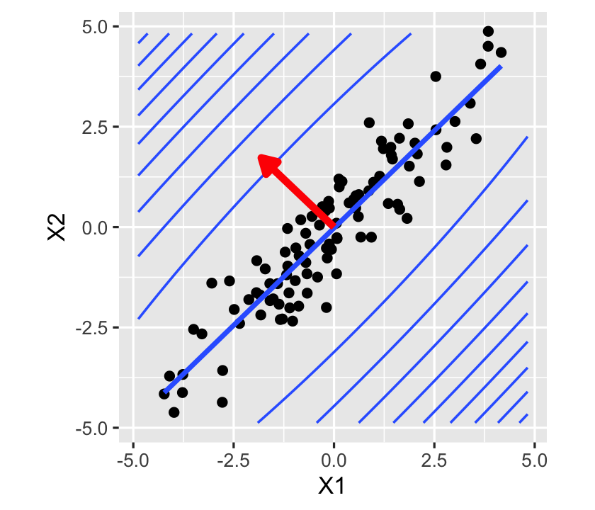
In short, collinearity can create high covariance between components of \(\hat \beta\) and gives \(\var(\hat r(X))\) a particular shape, with low variance along the axis of high correlation of predictors and high variance perpendicular to it.
9.5.2 Numerical effects of collinearity
Apart from its effects on \(\var(\hat \beta)\) and \(\var(\hat r(X))\), collinearity can create numerical issues in calculating \(\hat \beta\). Now, “numerical issues” is a phrase that is often treated as a boogeyman: my answer must be wrong because of numerical issues, we say, without understanding what “numerical issues” really means. Let’s try to be more precise.
The core problem is that computers cannot perform arithmetic on all numbers in \(\R\). Unless you use special libraries for arbitrary-precision arithmetic, calculations are done with limited precision. With 64-bit floating-point numbers, for instance, we can only store about 16 decimal digits; any change in the 24th decimal place can’t be represented.4 Studying the effect of this limitation is a core part of the field of numerical analysis, and you can read entire books on it (Stewart 2022; Trefethen and Bau 1997). We need only one key concept from numerical analysis, the condition number, and one result that shows how least-squares fits depend on it.
Definition 9.5 (Condition number) The condition number of a matrix \(A\) is defined to be \[ \kappa(A) = \frac{d_\text{max}}{d_\text{min}} \geq 1, \] where \(d_\text{max}\) and \(d_\text{min}\) are the largest and smallest eigenvalues of \(A\).
Theorem 9.4 (Conditioning of least squares fits) In an ordinary least squares model, perturbing \(\X\) by an amount \(\delta\) will perturb \(\hat \beta\) by \(\delta\) times an amount less than \[ \kappa(\X) + \frac{\kappa(\X)^2 \tan \theta}{\eta}, \] where \[ \tan \theta = \frac{\|\hat e\|_2}{\|\hat \Y\|_2}, \qquad \eta = \frac{\|\X\| \|\hat \beta\|_2}{\|\hat \Y\|_2}. \] When the fit is good, \(\tan \theta\) is thus small, and the first term dominates. Otherwise, the second term dominates. This is an upper bound, and the actual error may be much smaller in specific cases.
Proof. Trefethen and Bau (1997), theorem 18.1.
Why does this matter? If we measure \(\X\) with infinite precision, but then it must be rounded to be stored in computer memory, we have perturbed it by an amount \(\delta\). With 64-bit floating point numbers with 16 decimal digits of precision, that’s about \(\delta \approx 10^{-16}\). That perturbation is multiplied by \(O(\kappa(\X)^2)\). So, for example, if \(\kappa(\X) = 10^4\), then the error in \(\hat \beta\) can be on the order \(10^{-16} (10^4)^2 = 10^{-8}\), and we’ve lost eight digits of precision.
That doesn’t sound so bad, but consider that we often don’t measure \(\X\) with infinite precision. Perhaps one of our predictors is, say, age, rounded to the nearest year. That rounding may affect the ages by up to half a year; this imprecision is magnified by the condition number when we calculate \(\hat \beta\).
The problem is compounded when an algorithm has many intermediate calculations that each get rounded to the nearest floating-point value, as the errors accumulate. A great deal of effort has been spent on algorithms for least-squares problems that minimize this rounding error; see, for example, Seber and Lee (2003), chapter 11, or Stewart (2022), section 2.2.
9.5.3 Detecting collinearity
In simple cases, collinearity is easy to detect: two columns of the design matrix have a strong linear correlation that can be seen in a scatterplot or a Pearson correlation coefficient. One can visualize this with a pairs plot, which plots each pair of variables against each other. In R, the GGally package provides a generalized pairs plot that works with many variable types; Figure 9.7 gives an example for some of the key variables in the penguins dataset.
library(GGally)
library(palmerpenguins)

penguins |>
  select(species, bill_length_mm, flipper_length_mm, body_mass_g) |>
  ggpairs()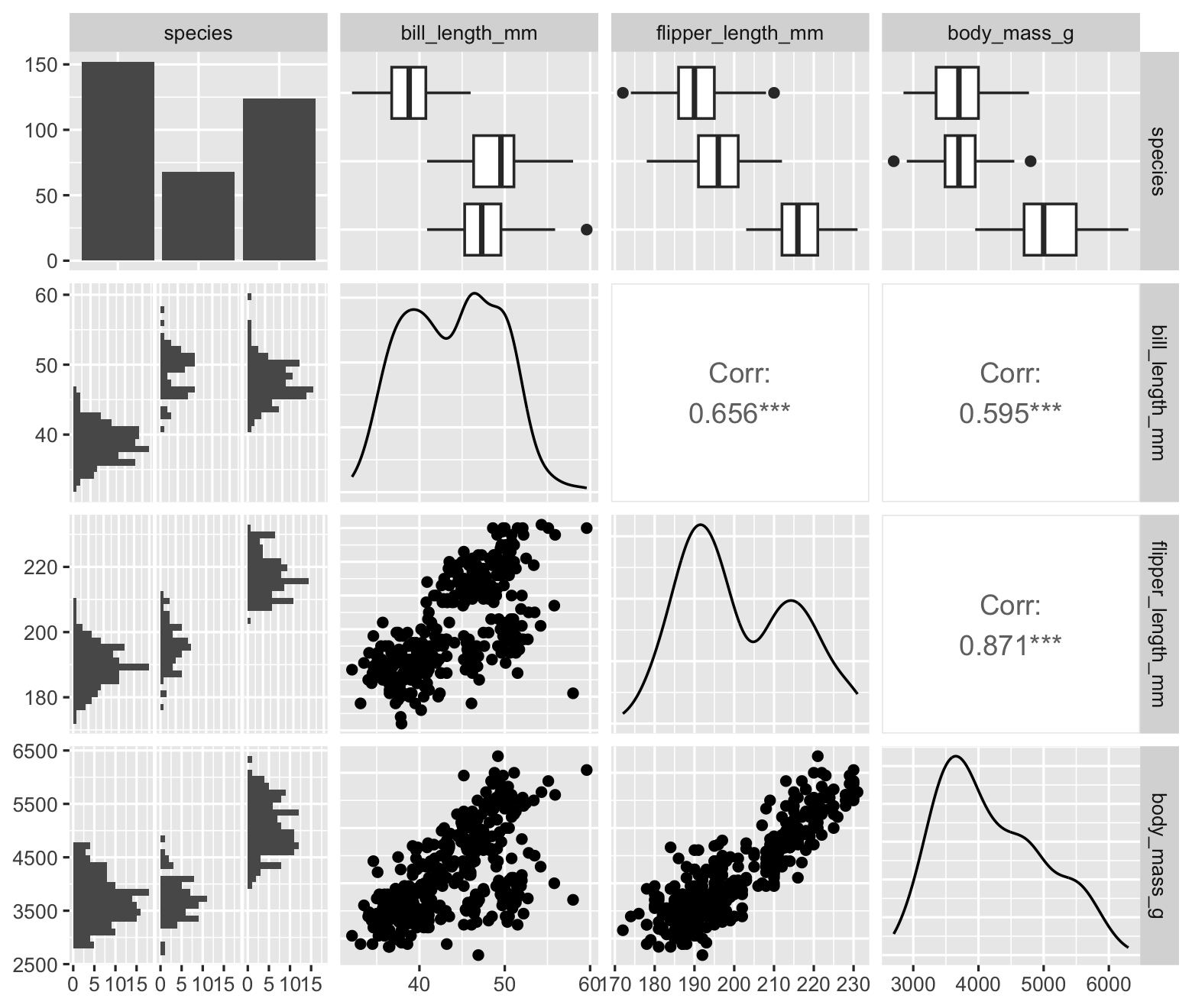
However, multiple variables can be collinear even when individual pairs of variables have low correlation.
Example 9.10 (Sneaky collinearity) In the population defined below, \(X_3\) is moderately correlated with \(X_1\) and \(X_2\), with a Pearson correlation of about 0.5 with each—but it has a much higher correlation of about 0.8 with \(X_1 - X_2\). In the pairs plot, shown in Figure 9.8, we see moderate correlations but nothing alarming. We would only notice the collinearity if we knew to plot \(X_3\) against \(X_1 - X_2\). The problem can be even more pronounced when the collinearity involves more than three predictors.
collinear_pop2 <- population(
  x1 = predictor(runif),
  x2 = predictor(runif),
  x3 = response(x1 - x2, error_scale = 0.25),
  y = response(1 + 2 * x1 - x2 + 0.5 * x3, error_scale = 1)
)
To detect collinearity more reliably, Theorem 9.3 suggests we should examine the eigenvalues of \(\X\T\X\). For example, the condition number \(\kappa(\X\T\X)\) would be the ratio between largest and smallest eigenvalues; when it is large, the ratio between the largest and smallest possible variance in Theorem 9.3 is large, showing there are directions \(a\) where the variance of \(\var(a\T \hat \beta)\) is much larger than others, just as shown in Figure 9.6. Fortuitously, \(\kappa(\X\T\X) = \kappa(\X)^2\), which shows up in Theorem 9.4, so this one condition number tells us about both statistical and numerical issues with our fit.
As the condition number depends on the scaling of the matrix, to make condition numbers comparable between datasets we typically rescale the columns of \(\X\) to have \(L^2\) norm 1. (Centering the columns is not required.) We then examine the condition number; there is no single cutoff indicating collinearity, but values larger than, say, 50 or 100 can be concerning.
Example 9.11 (Condition number in collinear data) In the data from Example 9.9, we can calculate the condition number using R’s kappa() function. We can scale \(\X\) first:
scaled_x <- scale(X, center = FALSE, scale = TRUE)
kappa(t(scaled_x) %*% scaled_x, exact = TRUE)
[1] 29.86624kappa(scaled_x, exact = TRUE)^2 # equal, as expected[1] 29.86624This is a moderate size—smaller than the suggested values of 50 or 100, but still enough for Figure 9.6 to show a direction with dramatically higher prediction variance.
In some cases, we are interested solely in the estimation of \(\hat \beta\), not in predictions and other statistics formed from linear combinations of it. In this case, the variance inflation factors can be used.
Definition 9.6 (Variance inflation factors) The variance inflation factor \(\VIF_j\) for regressor \(j\) is \[ \VIF_j = \|X_j\|_2^2 (\X\T\X)^{-1}_{jj}. \]
This has a natural interpretation that justifies its name.
Theorem 9.5 (Interpretation of variance inflation) Consider column \(j\) of the design matrix \(\X\). Construct a new design matrix \(\X^*\) where column \(j\) is identical but all columns are orthogonal. Let \(\hat \beta^*\) be the corresponding least-squares regression estimate. Then \[ \frac{\var(\hat \beta_j)}{\var(\hat \beta^*_j)} = \VIF_j. \]
Proof. Because \(\X^*\) is orthogonal, \((\X^*)\T\X^*\) is diagonal, and the diagonal entries are simply \(\|\X^*_i\|^2_2\), so \(((\X^*)\T\X^*)^{-1}\) is diagonal with \(\|X^*_i\|_2^{-2}\) on the diagonal. Consequently, \[ \var(\hat \beta^*_j) = \frac{\sigma^2}{\|X^*_j\|_2^2}. \] By Theorem 5.4, \(\var(\hat \beta_j) = \sigma^2 (\X\T\X)^{-1}_{jj}\), so the ratio is \[ \frac{\var(\hat \beta_j)}{\var(\hat \beta^*_j)} = \|X^*_j\|_2^2 (\X\T\X)^{-1}_{jj}. \] By construction, column \(j\) of \(\X^*\) was the same as column \(j\) of \(\X\), so this matches \(\VIF_j\).
Thus we can interpret the variance inflation factor as showing how much the variance of \(\hat \beta_j\) is inflated relative to a model where there is no collinearity and all columns are orthogonal.
In R, the car package provides a vif() function that calculates variance inflation factors. For instance, collinear_samp2 contains \(n = 100\) observations from the collinear population defined in Example 9.10 above:
library(car)

vif(lm(y ~ x1 + x2 + x3, data = collinear_samp2))
x1 x2 x3
2.142459 2.375373 3.425836 The VIF is highest for \(X_3\), which matches what we expect: it is collinear with \(X_1 - X_2\).
9.5.4 Dealing with collinearity
There are many superstitions surrounding collinearity; depending on the textbooks you have read, you may have been told that collinearity is inherently bad and should be corrected, or that collinearity can make estimates and standard errors “incorrect”. Yes, high collinearity, as indicated by an extreme condition number \(\kappa(\X)\), means the estimated \(\hat \beta\) is highly sensitive to small rounding errors in \(\X\). But when we use precisely measured data in carefully written statistical software, this is only a serious problem with very large condition numbers.
If the computer can correctly calculate \(\hat \beta\) and \(\var(\hat \beta)\), there is no inherent problem with collinearity. The reported least squares estimates are the correct ones given the model and predictors. Yes, it is inconvenient that some variances and confidence intervals will be quite large, but they should be, according to the data and model.
Collinearity does imply that we must be very careful with the interpretation of our coefficients: \(\beta_1\) is the change in the mean of \(Y\) when increasing \(X_1\) while holding \(X_2\) fixed—and if they \(X_1\) and \(X_2\) have a strong correlation, that may be very different than the change in the mean of \(Y\) when increasing \(X_1\) without holding \(X_2\) fixed.
If we are confronted with collinearity, then, the question to ask is “Have we chosen the correct predictors for the research question?” If we have, there is little to be done; if we have not, we can reconsider our choice of predictors and perhaps eliminate the collinear ones.
If we are interested in prediction rather than in the coefficients, collinearity is a problem insofar as it creates high prediction variance, and we might reconsider our model; we will return to this problem when we discuss prediction in Chapter 16, and will see in Chapter 18 that penalization is one option to reduce this variance.
Exercises
Exercise 9.1 (Correlated missing predictors) Using the mvtnorm package, we can define two predictors that are drawn from a multivariate normal distribution and are correlated with each other. (Because x is defined to be bivariate normal, the regressinator makes two predictors named x1 and x2.)
library(mvtnorm)

corr_omit_pop <- population(
  x = predictor(rmvnorm,
                mean = c(0, 0),
                sigma = matrix(c(4, 3, 3, 4), ncol = 2)),
  y = response(
    4 + 2 * x1 - 3 * x2,
    family = gaussian(),
    error_scale = 1.0
  )
)

corr_omit_sample <- corr_omit_pop |>
  sample_x(n = 100) |>
  sample_y()
In this population, \(\beta_0 = 4\), \(\beta_1 = 2\), and \(\beta_2 = -3\).
Because we typically treat \(\X\) as fixed in regression analysis, the population correlation is not as important here as the sample correlation between the predictor values, which we can see in Figure 9.9.
The true population slope for
x1is 2. Suppose we fit a linear model using onlyx1and notx2. What do you expect will happen to the model’s estimates of the slope? If you think they will be biased, be specific about the direction of the bias.Using
sampling_distribution(), fit the model omittingx2and obtain 1000 draws from the sampling distribution of its estimated slope. Does this confirm your prediction?Define \(\beta_1^*\) to be the slope such that \(\E[Y \mid X_1] = \beta_0^* + \beta_1^* X_1\). This is the slope of the population relationship when we ignore
x2.Draw a causal diagram with
x1,x2, andy. We know \(y = f_Y(x_1, x_2)\), so certain arrows must be present; include these in the diagram. However, there could be additional arrows beyond those implied by \(y = f_Y(x_1, x_2)\).Suppose we want to estimate the causal effect of
x1ony. Draw the arrows so that \(\beta_1^*\) is the correct target of estimation, and we should only includex1in the model, notx2.Draw another causal diagram, but this time draw it so that \(\beta_1\) is the correct target of estimation for the causal effect of
x1ony.
Exercise 9.2 (Dichotomized predictor) Let’s continue using corr_omit_pop from Exercise 9.1, and suppose that we want to estimate the coefficient for x1 while controlling for x2. However, we do not observe x2 directly: we only observe a binary indicator of whether x2 >= 0. We can fit a model using the dichotomized variable by including it in the model formula:
dichot_fit <- lm(y ~ x1 + I(x2 >= 0),
                 data = corr_omit_sample)
Assume that for the causal effect we want to estimate, it’s necessary to condition on (control for) x2.
- Predict what will happen. Will the estimated coefficient for
x1be unbiased? If it is biased, do you expect it to be too large or too small? - Using
sampling_distribution(), draw 1000 samples from the sampling distribution of \(\hat \beta\) and report the result. Does this match your prediction? - Would you expect the same result if
x1andx2were independent? Adjust the population and test the simulation again to test your prediction.
Exercise 9.3 (Estimator properties in heteroskedastic data) Return to Theorem 5.4, which showed that the least-squares estimator for \(\hat \beta\) is unbiased and has a particular covariance matrix. Repeat each derivation without assuming \(\var(e \mid X) = \sigma^2 I\). Show that the estimator is still unbiased, but the formula for its covariance is no longer correct.
Exercise 9.4 (Diagnosing heteroskedasticity) In Figure 9.10, we plot y against x2 in data sampled from heteroskedastic_pop (Example 9.6) to try to observe the heteroskedasticity.
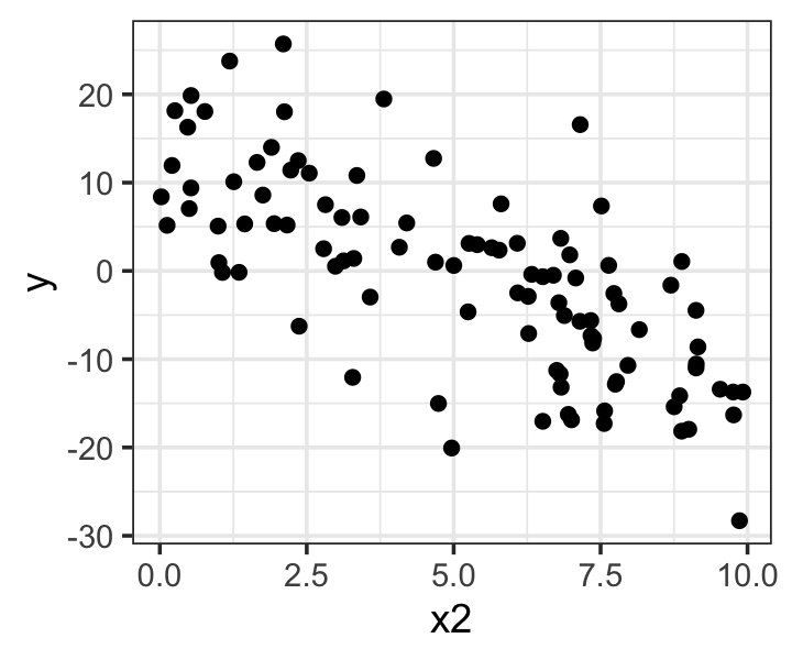
- Why don’t we see obvious heteroskedasticity in Figure 9.10?
- Fit a model of
y ~ x1 + x2. Construct a lineup of residual diagnostic plots. (See Section 8.2.) Comment on how easy or difficult it is to see the heteroskedasticity in these plots. - Using the
sampling_distribution()function, conduct the simulations necessary to establish if the least squares estimate \(\hat \beta_2\) is biased and if the confidence intervals have the correct coverage.
Exercise 9.5 (t-distributed errors) Suppose the errors have constant variance but are heavy-tailed. For instance, they could follow a \(t\) distribution with 3 degrees of freedom. We can model this by telling response() to use the ols_with_error family, which lets us choose the distribution the errors are drawn from.
heavy_tail_pop <- population(
  x1 = predictor(rnorm, mean = 5, sd = 4),
  x2 = predictor(runif, min = 0, max = 10),
  y = response(
    4 + 2 * x1 - 3 * x2,
    # distribution of the errors:
    family = ols_with_error(rt, df = 3),
    # errors are multiplied by this scale factor:
    error_scale = 1.0
  )
)

heavy_tail_sample <- heavy_tail_pop |>
  sample_x(n = 100) |>
  sample_y()
What consequences do you expect this will have on the parameter estimates and their covariance, as derived in Theorem 5.4?
Use
sampling_distribution()to simulate 1000 datasets fromheavy_tail_popand test your predictions. Are the estimates unbiased, and is the variance estimate accurate?A residual Q-Q plot is the obvious choice to detect this misspecification, but they can be hard to read. Examine the residual plots in Figure 9.11 and try to identify the plot representing the real fit. Run the code yourself so you can check your answer.
fit <- lm(y ~ x1 + x2, data = heavy_tail_sample)

model_lineup(fit) |>
  ggplot(aes(sample = .std.resid)) +
  geom_qq() +
  geom_qq_line() +
  facet_wrap(vars(.sample)) +
  labs(x = "Theoretical quantiles",
       y = "Observed quantiles")
decrypt("vAgi SKMK 7l 5y07M7yl hb")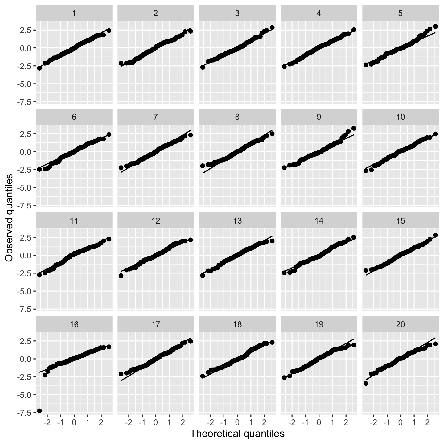
Figure 9.11: Q-Q plots of heavy-tailed data sampled from heavy_tail_pop.
Exercise 9.6 (Non-normal errors and skewed distributions) A common mistake is to check the distribution of \(Y\) for normality, rather than the distribution of the residuals. For example, analysts will make a histogram or Q-Q plot of \(Y\), observe that it is strongly skewed, and decide that the normality assumption is violated and the model must be changed. However, it is possible for \(Y\) to be skewed even though the errors are exactly normal. Another common mistake is to check the distribution of \(X\) for normality and assume it must be transformed if it is not.
Use the regressinator to construct a population in which \(Y\) is linearly related to the predictor \(X\) and the errors are normally distributed, but \(X\) and \(Y\) have severely skewed distributions. Show your code, draw a sample of \(n = 100\) observations, plot histograms of \(X\) and \(Y\), and make a Q-Q plot of the residuals.
Exercise 9.7 (Contaminated errors) One way to model outliers is with a “contaminated” error distribution. A contaminated distribution is a mixture of two distributions, where one is the “right” distribution and the other is the contamination. For instance, we could model \[ e \sim \begin{cases} \normal(0, \sigma^2) & \text{most of the time} \\ \normal(0, 10 \sigma^2) & \text{when you least expect it.} \end{cases} \] Let’s set up a population in the regressinator that has a contaminated error distribution. To do so, we create a function that draws from the normal distribution with probability 0.95, and draws from a distribution with much higher variance with probability 0.05.
rcontaminated <- function(n) {
  contaminant <- rbinom(n, 1, prob = 0.05)

  return(ifelse(contaminant == 1,
                rcauchy(n, scale = 20),
                rnorm(n, sd = 1)))
}
Let’s create a simple population where all assumptions hold except the errors are contaminated, again by using ols_with_error.
contaminated_pop <- population(
  x = predictor(rnorm, mean = 5, sd = 4),
  y = response(
    4 + 2 * x,
    error_scale = 3.0,
    family = ols_with_error(rcontaminated)
  )
)
What consequences do you expect this will have on the parameter estimates and their covariance, as derived in Theorem 5.4?
Write code to fit a linear model of
y ~ xand plotyversusxwith the fitted line overlaid,- the standardized residuals versus the fitted values, and
- Q-Q plots of the residuals.
Run this code using a sample of \(n = 20\) observations from
contaminated_pop. Run it at least 20 times, resampling \(Y\) but not \(X\) each time, and observe how the plots behave. (One way to do this is with thesampling_distribution()function: setting itsfnargument tobroom::augmentwill have it callaugment()on each fit it simulates, producing a data frame with all the data and residuals from all the simulations.)Write a few sentences describing the behavior you observe. In particular, look at how the outliers affect the regression line, and whether their effect depends upon the outlier’s value of \(X\).
Exercise 9.8 (Cook’s distance for fitted values) Following Definition 9.3 and Theorem 9.1, show that the Cook’s distance can also be written as \[ D_i = \frac{(\hat \Y^{(i)} - \hat \Y)\T (\hat \Y^{(i)} - \hat \Y)}{pS^2}, \] where \(\hat \Y^{(i)}\) is the vector of fitted values when the model is fit with observation \(i\) omitted.
Exercise 9.9 (Regression dilution) We can adapt Exercise 9.2 to create a covariate measured with error:
random_x_pop <- population(
  x = predictor(rmvnorm,
                mean = c(0, 0),
                sigma = matrix(c(4, 3, 3, 4), ncol = 2)),
  x2_err = response(x2, family = gaussian(),
                    error_scale = 2),
  y = response(
    4 + 2 * x1 - 3 * x2,
    family = gaussian(),
    error_scale = 1.0
  )
)
Because x2_err is defined as a response variable, it will have mean x2 with normally distributed error. This is like observing x2 with error. Note that the true population relationship still uses x2.
Sample data from this population and fit a model that uses x2_err instead of x2, i.e., y ~ x1 + x2_err.
- Predict what will happen. Will the estimated coefficient for
x1be unbiased? If it is biased, do you expect it to be too large or too small? - Using
sampling_distribution(), draw 1000 samples from the sampling distribution and report the result. Does this match your prediction? - Would you expect the same result if
x1andx2were independent? Adjust the population and test the simulation again to test your prediction.
Exercise 9.10 (Rent for agricultural land (Weisberg 2014, problem 9.17)) The alr4 package contains a dataset called landrent giving features of farmland in 1977. Each row of data represents one county in Minnesota, and the variables are:
Y: The average rent per acre paid by farmers using the land, among farmland used to plant alfalfa.X1: The average rent paid per acre for all tillable land, not just for alfalfa.X2: The number of dairy cows per square mile.X3: The proportion of farmland used as pasture for cows, rather than for growing crops.X4: Binary variable indicating if liming (the addition of calcium- and magnesium-rich minerals to soil to change its pH and help certain plants grow) is required to grow alfalfa in this county’s soil.
Alfalfa is often used as feed for dairy cows, so it’s plausible that in counties with more dairy cows, alfalfa is in higher demand and farmers would be willing to pay more rent to grow it; but since liming costs money, farmers may be less willing to grow alfalfa if liming is required, and hence only willing to grow it if rent is cheaper. Our goal is to test these theories.
Rename the columns in the data to more descriptive names. Conduct a brief exploratory data analysis to explore the relationships between the variables and the distribution of each variables, paying particular attention to any unusual outliers that might affect your analysis and to the shape of relationships between variables, which might determine the model you choose to build.
Present your EDA in the form of several relevant figures, with captions, and one or two paragraphs of text that refer to the figures, summarize what you have seen, and describe what models may be most useful to answer the research question, based on the results of your EDA.
Fit a linear model to predict rent using the covariates. Choose the covariates to use (and any transformations or other model features) based on your EDA and on your understanding of the research question and the implied causal diagram.
Present your model fit in the form of a table summarizing the regression coefficients (with meaningful names and column labels) and a short paragraph describing how you chose the model to fit.
Produce residual diagnostics to check your model. If it’s helpful, create some lineups (Section 8.2). Determine which model assumptions appear to hold and which do not.
Present your diagnostics by showing several figures (any diagnostic plots with unusual or problematic results, or that make important points), with captions, and one or two paragraphs describing the results of your diagnostics. Be explicit about the model assumptions that may be violated, and the effect these violations would have on how we can interpret the results.
For the moment, ignore any possible assumption violations. Give an answer to the research question by presenting the relevant model estimates in APA format (Chapter 25), with brief commentary on what conclusions these estimates let us draw.
Exercise 9.11 (SAT scores) Refer back to Exercise 2.11 for a discussion of the SAT dataset. The data is available in the Sleuth3 package in the data frame case1201.
Construct a model that you can use to answer the research question: Which states have the best SAT performance relative to the amount of money they spend, after accounting for the different populations of students taking the SAT in each state?
Describe the model you have chosen and present a table of its coefficients.
Produce diagnostic plots to check your model. If it’s helpful, create some lineups (Section 8.2).
Present your diagnostics by showing several figures (any diagnostic plots with unusual or problematic results, or that make important points), with captions, and one or two paragraphs describing the results of your diagnostics. Be explicit about the model assumptions that may be violated, and the effect these violations would have on how we can interpret the results.
Choose how to alter your model based on these diagnostics. Present the new model and cursory diagnostics to ensure it is reasonable.
Using the model, produce a table of states ranked by their performance relative to the money they spend. (To save space, you can present just the top 5 and bottom 5 states.)
Hint: If you can model SAT scores as a function of expenditure on education, and any relevant covariates, the residuals indicate performance above or below what is expected for a given SAT score.
Exercise 9.12 (Collinearity) Collinearity can affect linear model fits, increasing the variance of parameter estimates. But omitting variables can change the meaning of the \(\beta\)s, so we may need to include collinear predictors to answer our questions of interest.
To explore this, we’ll consider a specific example population. In this population, \[\begin{align*} X &\sim \normal\left( \begin{pmatrix} 0 \\ 0 \end{pmatrix}, \begin{pmatrix} 1 & 1.5 \\ 1.5 & 4 \end{pmatrix} \right) \\ Y &= 4 - \frac{1}{2} X_1 + 3 X_2 + \epsilon\\ \epsilon &\sim \normal(0, 3^2). \end{align*}\] Here \(X\) is a two-dimensional random variable whose components \(X_1\) and \(X_2\) are correlated. But \(Y\) is a function of both variables.
Based on the information above, state the true \(\beta_1\) when both \(X_1\) and \(X_2\) are included in a linear model.
We can also calculate the true \(\beta_1\) when only \(X_1\) is included in the model—that is, when \(X_2\) is excluded. When there is only one predictor, one can show that \[ \beta_1 = \frac{\cov(X_1, Y)}{\var(X_1)}. \] Calculate this and comment on the difference between the two \(\beta_1\)s. If you fit the wrong model (omitted \(X_2\) when you needed it, or vice versa), what would happen to your estimates?
Let’s explore the effect of collinearity when we fit linear models to samples from this population. We can define the population in the regressinator as follows:
# provides rmvnorm for multivariate normal variables
library(mvtnorm)

collinear_pop <- population(
  x = predictor(rmvnorm,
                mean = c(0, 0),
                sigma = matrix(c(1, 1.5,
                                 1.5, 4),
                               nrow = 2, byrow = TRUE)),
  y = response(4 - 0.5 * x1 + 3 * x2,
               family = gaussian(),
               error_scale = 3)
)

samp <- sample_x(collinear_pop, n = 100) |>
  sample_y()
Use the
sampling_distribution()function to obtain 1,000 samples from the sampling distribution of \(\hat \beta\) for both models: \(Y\) as a function of \(X_1\) and \(X_2\), and \(Y\) as a function of only \(X_1\).Plot histograms of the sampling distribution of each coefficient from each model. Comment on their centers and their width. Do the centers match what you’d expect?
For the model of \(Y\) as a function of \(X_1\) and \(X_2\), plot the estimates \(\hat \beta_1\) and \(\hat \beta_2\). Are they correlated? Positively or negatively?
Fit a linear model to
samp, the sample of size \(n = 100\) you drew in part 2. Include bothx1andx2as predictors. Use thevif()function from thecarpackage to calculate the variance inflation factors for both predictors.Suppose the variables in our model represent the following values, where each row is one student in a calculus class:
- \(Y\): Final grade in a calculus class, out of 100
- \(X_1\): Number of course units the student is taking this semester
- \(X_2\): SAT math score before entering college
The true relationships match our hypothetical population defined above, and the predictors are indeed correlated.
A math professor believes that SAT math scores are good predictors of final grades, so if you compare two students with similar workloads, the one with higher SAT score should have a higher final grade. To test this theory, should the professor fit a model with \(X_1\), \(X_2\), or both \(X_1\) and \(X_2\) as predictors? Which coefficient would provide information about the theory? Draw a causal diagram to illustrate your choice.
Suppose instead that the variables in our model represent the following values, where each row is one person with diabetes:
- \(Y\): Number of diabetes complications experienced (such as neuropathy, retinopathy, kidney disease, etc.)
- \(X_1\): Number of days with uncontrolled blood sugar
- \(X_2\): Time spent in the hospital for diabetes complications
Again, suppose the true relationships match our hypothetical population defined above, and the predictors are indeed correlated.
A public health official wants to know how uncontrolled blood sugar is associated with the number of diabetes complications. To answer this question, should you fit a model with \(X_1\), \(X_2\), or both \(X_1\) and \(X_2\) as predictors? Which coefficient would provide information about the theory? Draw a causal diagram to illustrate your choice.
This problem illustrates that collinearity cannot be resolved by simply deleting collinear predictors—indeed, sometimes the collinear predictors are necessary to estimate the quantity of interest.
Exercise 9.13 (Misleading marginal relationships) One of the first steps in any exploratory data analysis is to plot our predictor variables against the response. We can see if there are obvious relationships, judge if they appear linear, and decide how to set up our model.
But these marginal scatterplots, which can only plot one predictor against the response at a time, can be misleading. Using the regressinator’s population() function, define a population in which:
- There are two predictors,
x1andx2, - There is a response
ythat is a linear function ofx1andx2, - The errors are normally distributed and independent of the predictors,
- But plotting
x1againstyproduces a nonlinear scatterplot.
After defining the population, take a sample of \(n = 100\) observations and make the plots of x1 and x2 against y to demonstrate the issue. Also plot x1 against x2, and write a sentence or two explaining how you produced the nonlinear scatterplot.
Hint: See Section 9.5.3 for an example of defining a population with specific relationships between its predictor variables.
Exercise 9.14 (Supernormality of the residuals) Consider defining the following population:
pop <- population(
  x = predictor(rnorm),
  y = response(4 + 2 * x, error_scale = 0),
  y_err = response(
    4 + 2 * x,
    family = ols_with_error(runif, min = -1, max = 1),
    error_scale = 1)
)
Here y is observed without error and y_err is observed with \(e \sim
\uniform(-1, 1)\), which is very clearly non-normal.
Use sampling_distribution() to simulate 1,000 datasets from this population, each with \(n = 30\). In each, conduct a Shapiro–Wilk test of normality (using shapiro.wilk()) for both the true errors \(e\) and the residuals \(\hat e\). Report the fraction of tests with \(p \leq 0.05\) in each case. How does the power to detect non-normality compare between tests of errors and tests of the residuals?
Hetero- from the Greek ἕτερος for “other”, -skedastic from the Greek σκεδαστός, “capable of being scattered”.↩︎
Astuter readers will ask why HC3 uses \((1 - h_{ii})^2\) when standardizing the residuals would only use \((1 - h_{ii})\). The latter is indeed an option, called HC2. But Theorem 5.8, showing the residuals have variance proportional to \((1 - h_{ii})\), depends on the errors having constant variance. MacKinnon and White (1985) give a justification for HC3 based on the jackknife.↩︎
Some people use “collinear” when only two columns are involved and “multicollinear” when more than two are involved, but it makes no difference to the math, so there’s not much point to the distinction except that “multicollinearity” sounds scarier.↩︎
64-bit floats have 53 bits for the significand and 11 for the exponent, and \(\log_{10}(2^{53}) \approx 16\). To take two examples, with 64-bit floats, \(1 + 10^{-16} = 1\), and \(10^{16} + 1 = 10^{16}\). Both are true because expressing the correct answer would require another digit of precision.↩︎